Numbers has a My Stocks template that in the 30-Day History downloads and charts historical stock data, accessible via File > New in the menu in Numbers. You can easily extend the 30 days by inserting rows above the existing ones (select some rows and click a row number on the left and choose Add Rows Above), giving a 5-year price history. Change the table to 0 Header Columns (Table > Header Columns > 0), select the first two columns and Insert > Chart > 2D Scatter. Spend a few minutes cleaning it up as desired and you get something like this (the later rows in the table on the left are not visible in the screenshot).:
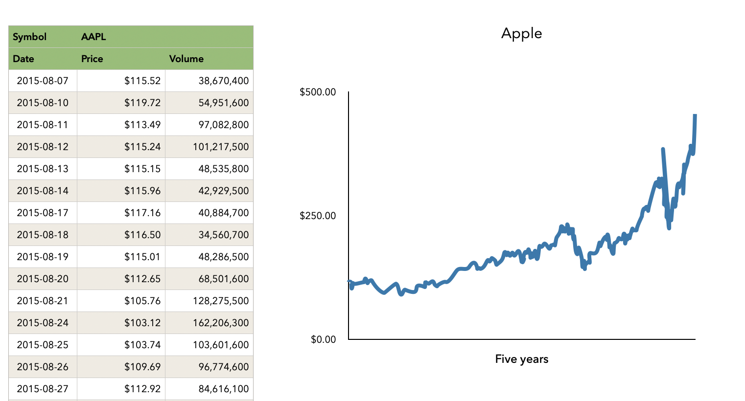
It's almost endlessly customizable. Here I simply turned off grid lines and x-axis labels, clicked on the series in the chart and in the Style tab set the Data Symbol to None and Connection Line to Curved, but you can do much more.
Once you've got the look the way you want it, you can create the same chart for other stocks simply by duplicating the sheet and changing the symbol in cell B1 in the table on the left (where AAPL is now).
The click the chart object, command-c, and paste into Keynote. If needed, you can even fine-tune the chart data once it is in Keynote.
SG