If you are interested in the largest remainder method, which I had totally forgotten about, here is a rough implementation just for fun.
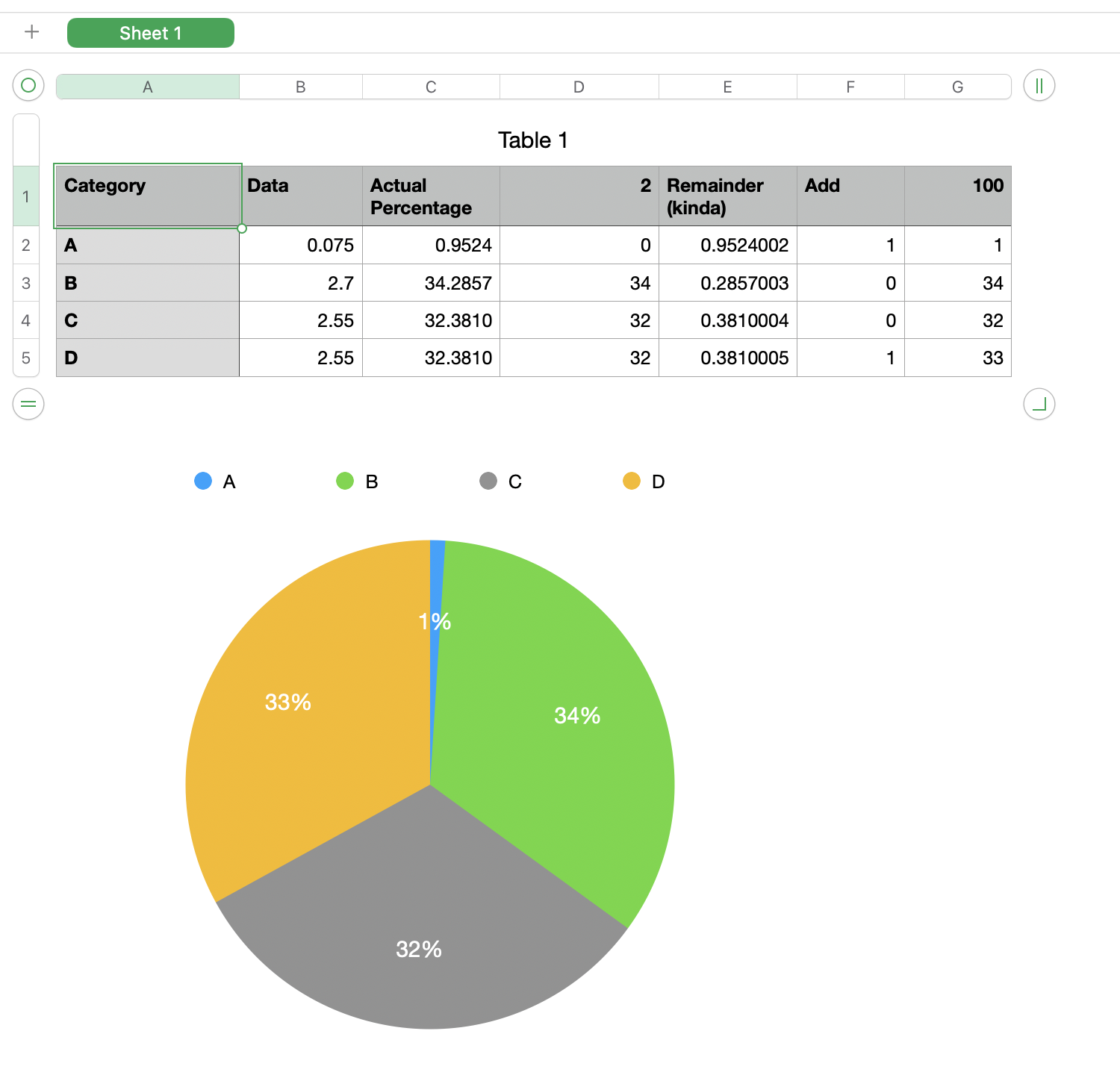
Column A is manually entered categories
Column B is the actual data for each category
D1 =100−SUM(D)
G1 = SUM(G) (just a check, not necessary)
C2=100×B2÷SUM(B)
D2=INT(C2)
E2=ROUND(C2−D2,4)+ROW()÷10000000
F2 =RANK(E2,E)≤D$1,1,0)
G2 =D2+F2
Chart uses column G as its data.
Column E is the remainder between the actual value and the rounded value except no two values can be exactly the same so I added a tie breaker. I rounded the result and tacked the row number onto the right of it. You can see the result in the last two rows. Two equal percentages in column C but one rounded up and the other rounded down. The method I used favors values in lower rows (in higher row numbers) but it guarantees uniqueness.