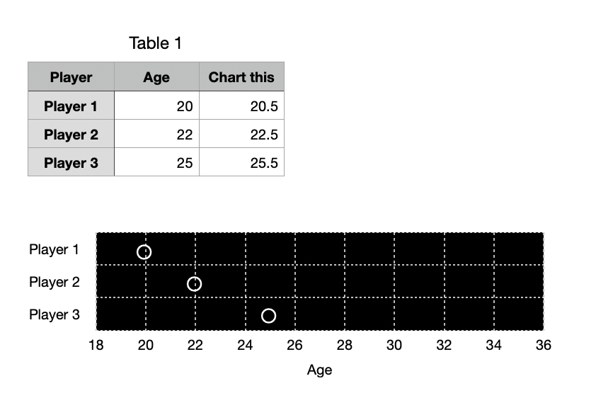
Something like this?
It's a little bit of a hack.
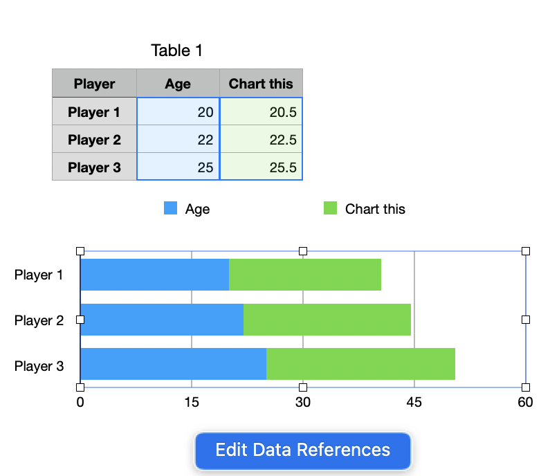
Add a column to your data table with slightly larger values than the actual ages. 0.5 worked here. Use 2d Stacked Bar and plot, giving you something like this.
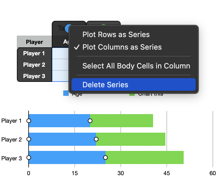
Click Edit Data References and delete the Age column from the references.
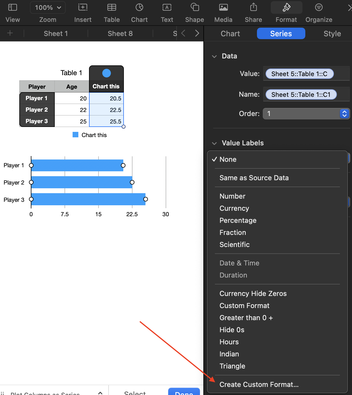
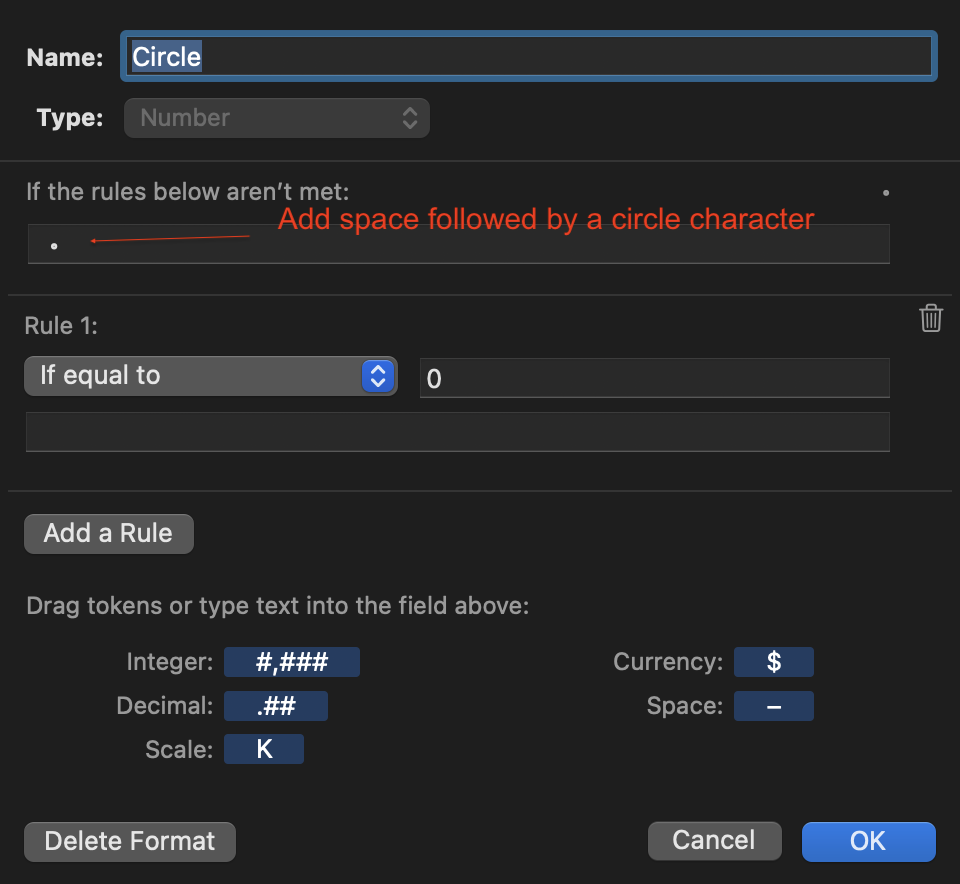
Click Create Custom Format under Value Labels:
Create a rule something like this:
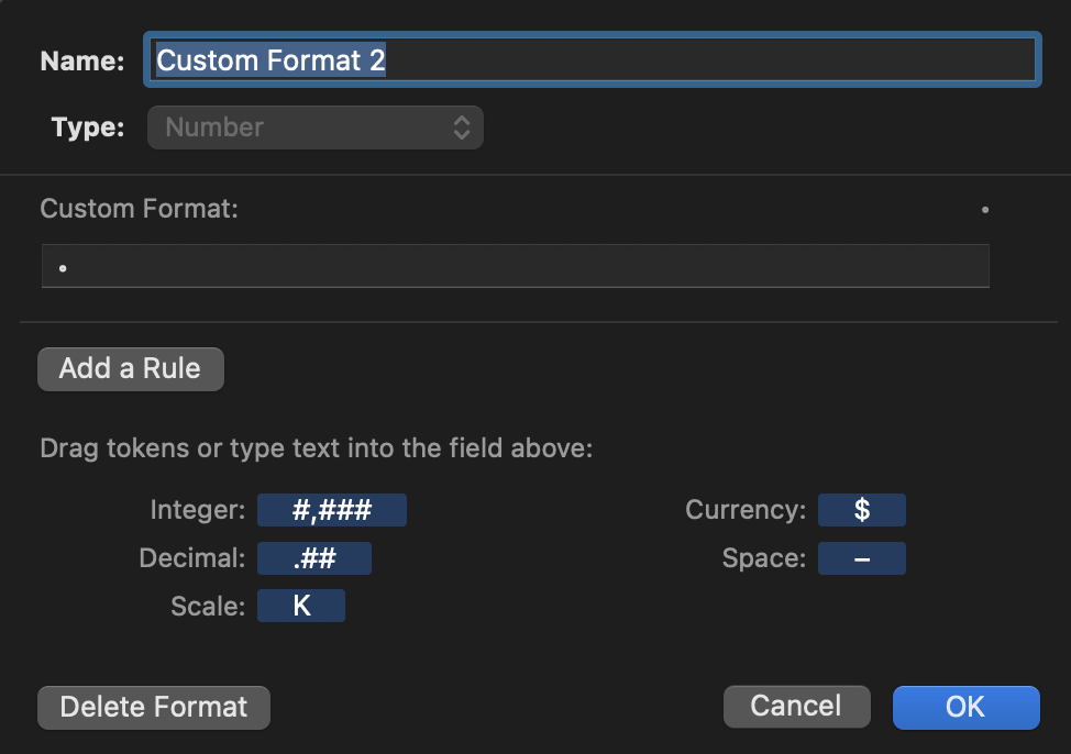
Or, even easier, just this seems to work:
I pasted in this for the circle character: ◦
You could use whatever other marker you want from Show Emoji and Symbols (under the input part of the Mac menu bar)
Click the series (bars) and in Style tab set Fill to No Fill.
Continue to format to taste, removing legend, varying the steps in the axes, etc., to get the scale in my top screenshot.
You may need to drag the chart slightly wider or narrower (and/or add leading spaces in the custom format) to get the circle markers to line up properly.
SG