Apple Intelligence is now available on iPhone, iPad, and Mac!

Looks like no one’s replied in a while. To start the conversation again, simply ask a new question.

Updated Apple Watch no longer has swipe up options

I am infuriated by the Apple Watch update that has deleted the swipe up option for finding phone, silent mode etc and replaced with weather, moon phases etc.

It’s BS! Apple, sort it out and do another update to bring back the best features of an Apple Watch!

Apple Watch Series 6, watchOS 10

Posted on Jan 3, 2024 4:10 PM

Reply
Question marked as Top-ranking reply

Posted on Jan 3, 2024 4:34 PM

NZJenB wrote:

I am infuriated by the Apple Watch update that has deleted the swipe up option for finding phone, silent mode etc and replaced with weather, moon phases etc.
It’s BS! Apple, sort it out and do another update to bring back the best features of an Apple Watch!

Apple is not here. This is a user-to-user technical support forum.


But you can send Apple feedback via:

Feedback - Watch - Apple


If enough users send feedback, it is more likely a decision maker will see it, and maybe take action.

The previous Control Center swipe-up has moved to a quick press and release of the flat oval side button (see picture)
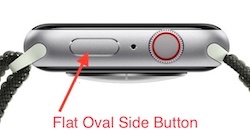
Use Control Center on Apple Watch - Apple Support


DO NOT hold the button, as that brings up Emergency services and the power off icon.

Getting the press and release timing just right can be an issue. You can make it more reliable by changing:


Settings -> Accessibility -> Side Button Click Speed


“Side Button Click Speed” can adjust the press and release timing, so you get the Control Center display every time. Adjusting The “Side Button Click Speed” is also useful for Apple Pay’s double press and release. There is “Default” (sub second timing of needed), “Slow” (up to a second between press and release), and “Slowest” (up to 2 seconds between press and release). I like the “Slow” setting.


NOTE: Slow and Slowest settings do not mean you have to wait a full second or 2 seconds between press and release. It just means you do not need to be super fast.

7 replies
Question marked as Top-ranking reply

Jan 3, 2024 4:34 PM in response to NZJenB

NZJenB wrote:

I am infuriated by the Apple Watch update that has deleted the swipe up option for finding phone, silent mode etc and replaced with weather, moon phases etc.
It’s BS! Apple, sort it out and do another update to bring back the best features of an Apple Watch!

Apple is not here. This is a user-to-user technical support forum.


But you can send Apple feedback via:

Feedback - Watch - Apple


If enough users send feedback, it is more likely a decision maker will see it, and maybe take action.

The previous Control Center swipe-up has moved to a quick press and release of the flat oval side button (see picture)

Use Control Center on Apple Watch - Apple Support


DO NOT hold the button, as that brings up Emergency services and the power off icon.

Getting the press and release timing just right can be an issue. You can make it more reliable by changing:


Settings -> Accessibility -> Side Button Click Speed


“Side Button Click Speed” can adjust the press and release timing, so you get the Control Center display every time. Adjusting The “Side Button Click Speed” is also useful for Apple Pay’s double press and release. There is “Default” (sub second timing of needed), “Slow” (up to a second between press and release), and “Slowest” (up to 2 seconds between press and release). I like the “Slow” setting.


NOTE: Slow and Slowest settings do not mean you have to wait a full second or 2 seconds between press and release. It just means you do not need to be super fast.

Apr 22, 2024 6:56 AM in response to Roscopcoletrain

Roscopcoletrain wrote:

Why do you Apple engineers think we want something different? I would simply swipe up if I was looking for my phone I had the option of having find my phone. If I wanted to silence, my phone do not disturb for an hour. It was a simple swipe up.

I think the change is great. Now, I can access the Control Center from any screen, not just the watch face. And it's the exact same number of steps as before. Win/win.

Apr 22, 2024 8:17 AM in response to Roscopcoletrain

Roscopcoletrain wrote:

Why do you Apple engineers think we want something different? I would simply swipe up if I was looking for my phone I had the option of having find my phone. If I wanted to silence, my phone do not disturb for an hour. It was a simple swipe up.

If I want to silence, my phone do not disturb for an hour. It is a simple button press. And I can even do it from the Workout screen, I don’t have to first press the crown to go back to a watch face screen, swipe up, then open Workout again. MUCH more convenient.

Apr 21, 2024 1:16 PM in response to Roscopcoletrain

Roscopcoletrain wrote:

Why do you Apple engineers think we want something different? I would simply swipe up if I was looking for my phone I had the option of having find my phone. If I wanted to silence, my phone do not disturb for an hour. It was a simple swipe up.
It’s like having a cleaning service coming to your house and then you come downstairs and find out they rearrange your furniture. Get a life and leave us alone!

Apple does not read this user-to-user technical support forum for feedback.


But you can send Apple feedback via:

Feedback - Watch - Apple


If enough users send feedback, it is more likely a decision maker will see it, and maybe take action.


Jan 3, 2024 4:32 PM in response to NZJenB

The way to access those options has changed but they still exist. There isn’t anything for Apple to sort out. They made a decision to change the way the interface works in WatchOS 10…which although isn’t the same as you are used to is still accessible. Although it’s not helpful now it’s always a good idea to delay updates until more is known in case changes are something you aren’t going to be happy with (although in some circumstances delaying may not be an option….such as anyone that updated their iPhone to iOS 17 or purchased an iPhone 15 series delaying the WatchOS wasn’t an option if you still wanted to be able to use your watch). You can of course submit feedback to Apple via the online form but otherwise you will need to learn the new actions in WatchOS 10. In this case you just need to click the side button (the flat button) to pull up control center to get to the features you mentioned.

Apr 21, 2024 11:57 AM in response to NZJenB

Why do you Apple engineers think we want something different? I would simply swipe up if I was looking for my phone I had the option of having find my phone. If I wanted to silence, my phone do not disturb for an hour. It was a simple swipe up.

It’s like having a cleaning service coming to your house and then you come downstairs and find out they rearrange your furniture. Get a life and leave us alone!

Updated Apple Watch no longer has swipe up options

Welcome to Apple Support Community
A forum where Apple customers help each other with their products. Get started with your Apple Account.