Ok -
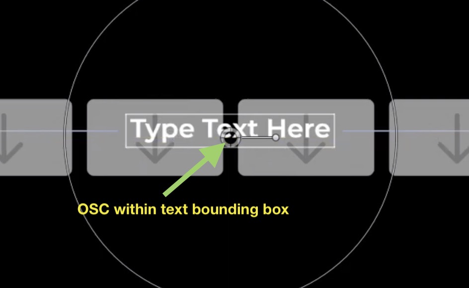
In Final Cut Pro, no matter how you prepare an OSC in Motion, you cannot grab the OSC when it's over text (within the Text's bounding box)

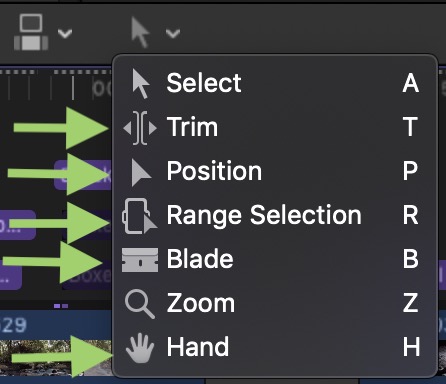
unless you change the "tool" to one of these:

When the mouse is in the Viewer area, you can use the keyboard shortcuts to change to tool - just remember to switch it back when you mouse back over the storyline so you don't make an accidental unwanted edit.
You linked the OSC position (Center) to the Text's Offsets... this does not have the effect you might think it does because moving the OSC changes the values of the Offsets **with respect to the center of the OSC's bounds** (the color solid it is attached to), and not the real position of the Text.
The Text's "position" is set at the point on the Baseline (of the first line in case of multi-line texts) where the text aligns (left edge, center or right edge). Admittedly, this creates many annoying challenges (especially centering text with an OSC...). This "baseline position" is essentially an "Anchor point" around which the text will be animated or controlled — which is why it needs to be considered when rotating the text with an OSC.
One way to offset the OSC from the baseline position is to go into the Link behavior controlling Text Position Y and instead of using -0.5, just offset this value slightly so that the OSC is just *over* the text bounding box, so that the Link's Y Offset is -0.54 or so (depending on text size); or for one-liners, you could go the other way and have the OSC just under the text bounding box so that Y Offset is -0.475 or so. [Font Ascents and Descents are almost always different amounts.]
Offseting Y Offset is still going to cause issues with Rotating the text because the rotation is offset from the OSC control... but it's usually something most people can live with.
You basically have a choice: you can change tools in Final Cut (making the OSC design straightforward and easier) or you can try offsetting the OSC far enough from the text so that the text bounding box does not interfere and put up with the "visual disparity" when rotating and/or resizing the text. It's a "design" decision.