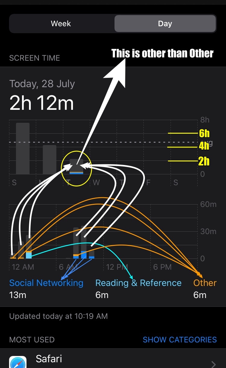
Refer to Pic 3 below, there are three Categories*** displayed Social "1" (Blue), Utilities "9" (Aqua), and Health & Fitness "8" (Orange).
Every other Category*** is shown as Grey. i.e. 2,3,4,5,6,7,10,11, and 12

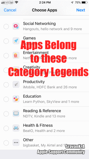
Refer to the list of Categories listed below and pic 1 where Category Serial No. 1 (Social), 7 (Reading), and 12 (Others) are shown Blue, Aqua, and Orange
In this case (Pic 1), all other categories serial nos. 2,3,4,5,6,8,9,10 and 11 are Grey
Pic 1
*** There are 12 board level Categories in Screen Time
- Social Networking: FaceBook, Hangout, Instagram
- Games: Scrabble, PUBG, Sudoku
- Entertainment: TV, Music, YouTube, Netflix
- Creativity: Photos, Camera, Google Photos
- Productivity: Shortcuts, Mailk
- Education: SkyView, Learn Python
- Information & Reading: Wikipedia, Magzter, Weather, Kindle, NDTV
- Health & Fitness: Journal, Tata 1mg, HeartRate Pro, Activity
- Utilities: App Store, Measure, Truecaller, Calculator
- Shopping and Food: Amazon, BigBasket, Shell Asia
- Travel: Apple Maps, Google Maps, FlightAware, Booking.com, Uber
- Others: Pinterest, iTunes Store, Kia Connect
The graph displays the top 3 (Time used by the user) category legends on the X-axis. Anything other than these legend categories is a Grey bar in the graph
Pic 3
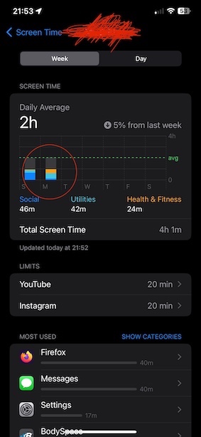
In the above pic, the Most Used apps are displayed. Tap on Show More to see all the apps.
Or tap Show Categories Scroll Down and tap Show more
Tap on Show Apps and Websites
For example:
If the user has used Games, Entertainment & Others category apps for the maximum time during a period then the graph will show these three categories in the X axis as legends and the remaining categories will be shown in Grey Colour.
The GIF below will illustrate the graph from 3 iOS devices
iPhone 6 iOS 12.4.5
iPhone SE iOS 13.3.1
iPad Pro 9.7" Wifi+Cellular iOS 13.3.1
GIF 1