None of those. The entire purpose of a profile is that it's an accurate mathematical description of the color response of the hardware it's for. All of the included profiles you mention are nothing but generic portions of Lab, and do not represent your monitor at all. Not even a little.
The only one that's even somewhat useful is the profile above the line, such as like this:
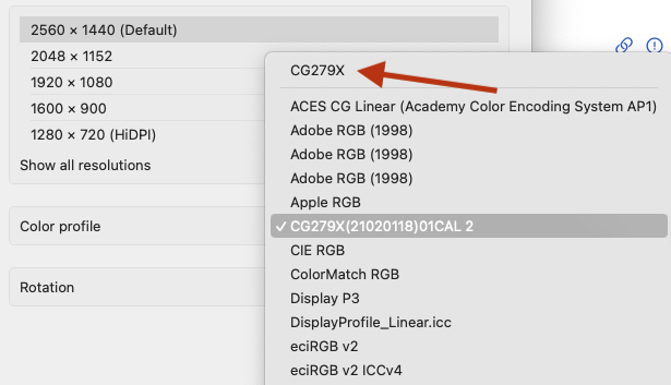
That's the default profile for your MacBook (whatever its name is) in the /Library/ColorSync/Profiles/Displays folder. But it's most likely a useless 6500K profile.
There's only one way to get an accurate profile. And that's with a monitor calibration system, such as the X-Rite Calibrate Display Plus HL. As far as color management goes, a good monitor calibrator is at the same time the most important, and least expensive piece of such equipment you can buy.
They have less expensive versions, but none of the others have the ability to handle the brightness of today's newer class of display panels. The next one down is the Pro at $280, but it can only handle 3,000 nits compared to the Plus version's 10,000 nits.
If you do purchase such a unit, these are the settings you need to use to match what a print shop uses:
Gamma - 1.8
Luminance - 80
Color - D50
The first step the included software does is set the monitor's response to the color settings above. That's the calibration. Then it runs a series of color patches to create a profile based on that calibration. This means you can never, ever manually change the brightness or other monitor settings away from that calibration. Otherwise, the resulting profile is meaningless.
In D50 (or D65, etc.), the D simply means daylight. The 50 is short for 5000 (the white and black point color). 65 is short for 6500, and so on.
However, don't mix up what you may see as separate choices for 5000K and D50. Despite both having 5000K white and black balance points, they don't have the same gray ramp. Straight 5000K will be a bit yellowish. D50 will create a center balance closer to slightly cooler 5200K. This is as close as we can get on a computer to natural sunlit color.