I saw your earlier thread, but I’m not sure if I have a direct solution for you …
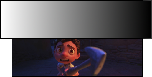
This scene seems to be from Luca (2021), available on Disney+. It is also available from Apple’s Store for movies.
Both left and right look extremely dark to me in the image that you included. How did you create this image? Either you monitor calibration is off, or your camera and/or your photo editing is off (much brighter than others have it).
The difference can be in how movies use the RGB color space, and whether or not the computer software tries to forcibly change that on computer monitors. The regular industry-standard range in a proper media file is 16–235, not 0–255, for the majority of the colors. [A separate gamma setting would influence the midpoint.] This allows to keep details in highlights and in shadows, and an occasional outlier when needed, without crushing shadows or bleached out highlights. Many darks are supposed to be dark but not black. A mismatch can bring over-saturated colors, and too much contrast (without detail in the extremes), or too low contrast in the other direction.
➔ Full RGB vs. Limited RGB: What’s the difference? - BenQ
(Some Apple software uses the terms RGB High and RGB Low for RGB ranges.)
This should be handled automatically in software. If there is no mismatch in intent and settings, then the player software should create the optimum, to show all the details that the content creator intended.
How to calibrate your monitor for perfect video - Unscreen