I understood your note to say that when "Color Matching" is set to ColorSync: Automatic the images in the file will first be converted through the monitor profile (in my case I'm currently using the "canned" LCD Display profile), then through the printer's profile (I have a desktop Fuji Xerox DocuPrint C1110B), correct?
Correct. Let's say you're using the working RGB color space of Adobe RGB in Photoshop. At all times, that color is being translated to the monitor color space by ColorSync for the rendition that is actually displayed. The file itself remains Adobe RGB, but that's not your monitor's profile, so it needs to be continuously converted for display.
When you print the image, the first thing ColorSync does is convert the color space from Adobe RGB to your monitor profile (all with temporary data, not to the original). Now the image is in the color space you were viewing, which is where is needs to be since the idea is for the print to match the monitor color you are looking at. But the printer is not a monitor, so the monitor profile color space the data is currently in is not correct for printing. So it goes through a second conversion from the monitor color space to the printer profile's color space. That is what finally gets sent to the printer.
This is where any automatic color correction must be off. You've already told ColorSync to use the proper profiles to achieve a print that will match the monitor as closely as possible. This assumes of course you have accurate profiles for both your monitor, and the printer with the paper being used.
As a further test, I then ColorSync to the AdobeRGB(1998) profile and made a new ps file. The RGB values in the distilled PDF were still the same as the Word doc.
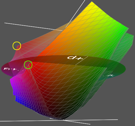
That's what throws people off. An RGB value isn't a specific color. It's a representation of where that RGB value falls in relation to *L*A*B. So a fully saturated red of 255,0,0 will look different in a short color space as opposed to a larger space. Here's an example (see image below). I have two different profiles overlapping each other. The red point circled in green is the most saturated red that can be attained in relation to *L*A*B in that smaller color space. The point circled in yellow is that larger space's most saturated red. In both cases (the confusing aspect), both will assign 255,0,0 to that point, but one would obviously be a richer red than the other. Think of it this way. 255,0,0 is the maximum color space that particular color space (profile) can handle within *L*A*B. It's not necessarily the maximum red we can see in the visible color spectrum.
So, your converted files look the same because ColorSync is generating the color based on your monitor profile for display. Since that's always the same, the color will look the same, regardless of the input RGB profile. At least as long as you don't use a really small RGB space as an assigned color space and squeeze it down to some noticeably dull color.
I'm a trainer for Fuji Xerox and am writing a course for our Mac users on Colour Management (in particular for our high-end production RIPs (Fiery/Creo/FreeFlow) with serious colour management being applied).
Fun! I've been doing prepress work as as in-home business for quite a few years now, but worked in a couple of different high end print shops for many years. Last thing I used on that end was a Scitex Brisque RIP. As I'm sure you know, Creo bought out Scitex. I'm sure RIPs have changed a lot since I last looked at one.
I only discovered the other day that the Mac OS has the "Color Matching" option and wondered if the OS was in any way bending the colour values before our RIPs have a chance to properly manage the colours. So far it looks like the setting is not having any impact.
It all depends on where your settings are on both the Mac and at the RIP. Too long of an explanation to go into here I think.
As a further note, I even tried setting ColorSync to the "Generic CMYK" profile and the distilled PDF still showed the correct RGB values. So, maybe the print to PDF option is ignoring the Color Matching settings or something else is at play but this setting is still a mystery to me...
ColorSync will only apply matching profiles on the fly. So something would already have to by CMYK before it would apply the Generic CMYK profile. Which no one in their right mind would ever use. It's the flattest, ugliest CMYK profile you will ever see.