Looks like no one’s replied in a while. To start the conversation again, simply ask a new question.

X Axis does not display correctly date and time intervals

On the graph I see the same distance between units even if the date interval is different.

If I enter a data every end of month and then every 10 days the interval of the 10 days is the same than the previous 30. This is wrong!

If for instance I like to check my weight progress the graph shows wrong intervals:

User uploaded file

MacBook Pro with Retina display, OS X Mountain Lion (10.8.2)

Posted on Mar 8, 2013 2:52 AM

Reply
16 replies

Mar 8, 2013 5:15 AM in response to francescofromvaprio d'agogna

Frances,


There are two basic kinds of Charts:


1. X-Value vs. Y-Value

2. Y-Value vs. Cagtegory Name


The first type of table assumes that the values are in pairs and the second type of table assumes that each Category has a value. There is constant spacing between the category names.


Guess which type of Chart you used.


The Value vs. Value Chart is called a Scatter Chart.


When charting value pairs, both parts need to be in columns formatted as values. Since body columns and rows are formatted as values by default, both halves of each data pair are normally placed in body columns.


When charting Categories vs. Values, the category names have to be in a row or column formatted as Text and the Values have to be in a row or column formatted as a Value. Since Headers are Text by default, we use a Header for Category names. Thus it's common to have the category name in a Header column (A) and the values in column B.


Jerry

Mar 21, 2013 10:56 AM in response to Jerrold Green1

Dear Jerry


Thanks for your efforts, however it did not help!


I did select date values and data values on my sheet and then applied scatter charts (and all types of bar charts but I prefer a line between points). On scatter charts the date/time are always greyed out and the axis are reversed, I see dots which make no sense.


The open problem is that when I select the date/time values on the X axis the visual intervals have no proportion between the time intervals even if I did format correctly the x values as Date.

I'm probably a dummy but I cant't solve my issue and I saw on the community that others have the same problem. The pict are self explanatory, the x values are on even intervals but the values are not!User uploaded file

Mar 21, 2013 6:27 PM in response to francescofromvaprio d'agogna

It can be done. Here is an example. There is only one chart called a scatter chart. Its icon looks like a shotgun blast. You used the plural (scatter charts) in your post which leads me to believe you are thinking the other line charts are also scatter charts. They are not.


For a scatter chart, all of the data must be in regular cells, none can be in header cells.


User uploaded file

Mar 21, 2013 9:48 PM in response to francescofromvaprio d'agogna

Hi Francesco,


Category charts do not have and "X axis". They have a "Value axis" and a "Category axis." "Categories" are always evenly distributed along the "Category axis"


For horizontal bar graphs and horizontal stacked bar graphs, the vertical axis is the "Category axis".

For vertical bar graphs, vertical stacked bar graphs, line graphs, area graphs and the two combination graphs at the bottom of the menu, the vertical axis is the "Category axis".


Only one chart in the list, the Scatter Chart, identified with this icon User uploaded filehas two "value axes," an x axis (horizontal) and a y axis (vertical).


A scatter chart will interpret the dates as values rather than category names, and will chart each data point using its x (date) and y (weight) values.


Here are two examples.

On the left is a Line chart, using data from the table on the left. In this table, the dates are in a Header Column. These are actual Date and Time values, identical to those in the second chart, but formatted to display only the day and month. Weight values are estimated from your similar chart above.


On the right is a Scatter chart, using the same data set. All data for this chart is in regular (non-header) columns. The labels at the top are in a Header row.

User uploaded file

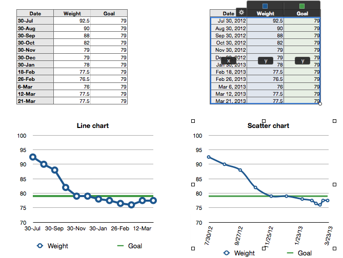
The Line chart uses default formatting, with two exceptions: Data symbol was set to 'none' for the Goal data series, and the number of steps on the value axis was raised from 4 to 6.


The Scatter chart uses default formatting with six exceptions: Data symbol for the Goal data series and number of steps on the Y axis were set as described above. The size of the data symbol for the Weight series was reduced from 10 points to 7. Both series were set to use a "curve" connector between data points. Stroke weight for both series' curve connectors was set to 3 points. The Date series labels were rotated to 75°, and the legend moved down to a position below the labels.


These format changes were made in the Chart Inspector and the Metrics Inspector. Here's the scatter chart, expanded horizontally. I've increased the number of steps on the x-axis to 8.

User uploaded file


Regards,

Barry

Mar 23, 2013 1:27 PM in response to albertros

Hi Peter,


There are times when the version number of an application (and of the operating system) are significant. That's why it's usually a good idea to include that information in the description of your issue. 🙂


Numbers '08 (v1.0.x) charts accept only numbers as data.


Date and Time values can be used as Labels in the Category charts, but will be ignored by a scatter chart.


Numbers '09 can chart Numbers, Durations and Date and Time values.


Represent your Dates using a number (number of days since the start of the values being charted, and your scatter chart can be made:

User uploaded file

One otherfeature that seems to having been added in '09 is the ability to connect the data points (found on this Inspector page in the Numbers '09 Inspector).


Regards,

Barry

Apr 4, 2013 7:41 AM in response to francescofromvaprio d'agogna

If you selected the Date, Weight and Goal columns when making the chart, the next step is to click on the gear (the one in the top left corner of the table in your screenshot) and choose "Share X Values".


I don't know why the min value for the Y axis is so low, assuming you left it as "auto" in the chart inspector. Maybe you can enter the min date and override the auto setting.

Apr 4, 2013 7:06 PM in response to francescofromvaprio d'agogna

"Moreover the x axis labels show wrong values although the date/time format is selected. Very strange...I use numbers 9 vers. 2.3, any suggestions?"


Settings for the values on either axis are done in the Inspector. You can leave them at 'auto', and Numbers will assign a maximum and minimum at or just below and above the range of values in your data, or you can set the minimum and maximum values manually by entering the values in the appropriate boxes.


Up to 11 values will be shown on the axis, depending on the number of steps you have set. Numbers default setting is (usually) 4 steps.


From the appearance of your x axis labels, I would guess you have accidently set the the minimum to 1/1/01, which Numbers has interpreted as January 1, 2001. Open the Chart Inspector, choose Axis, and delete whatever is in the Min box for Value Axis (X). Press tab to move out of the box, and check the effect on your graph, If not satisfactory, try entering the earliest date on your data table.


Regards,

Barry

Nov 1, 2013 1:22 PM in response to Barry

Can it be that Numbers in the latest version for Mavericks (Version 3.0 1470) has again lost the ability to use dates for x-values in Scatter-Graphs?

I've tried to do everything right according to the procedures here, but I get the correct data spacing but wrong x-axis labels. Numbers does not permit me to select "Date and Time" for the labels.


User uploaded file

X Axis does not display correctly date and time intervals

Welcome to Apple Support Community
A forum where Apple customers help each other with their products. Get started with your Apple ID.