how to make lines (notes, etc.) and borders (keypad) more bold, like IOS 6

The IOS 7 screens are harder to read than the IOS 6, which had bolder outlines and fonts. Two examples are: the missing lines in Notes; and the faint icons and names on the bottom of the Phone screen. Is there a way to convert the image to be more similar to IOS 6? Is there anything being done by Apple to address this?

iPhone 4S, iOS 7.0.2

Posted on Oct 6, 2013 7:13 AM

Reply
3 replies

Oct 8, 2013 6:58 AM in response to Normrd

Hello Normrd,


Thank you for your question, and I found a few settings that I think will help increase the visibility.


You can adjust the text and contrast in Settings:

Large and bold text

Display larger text in alerts, and in apps such as Calendar, Contacts, Mail, Messages, and Notes.

Go to Settings > General > Accessibility > Larger Type, where you can turn on Larger Dynamic Type and adjust the font size.


Display bolder text for all items on iPhone. Go to Settings > General > Accessibility and turn on Bold Text.


Increase text contrast on difficult backgrounds when possible. Go to Settings > General > Accessibility and turn on Increase Contrast.


Those steps are from page 131 of the iPhone User Guide:

iPhone User Guide

http://manuals.info.apple.com/MANUALS/1000/MA1565/en_US/iphone_user_guide.pdf


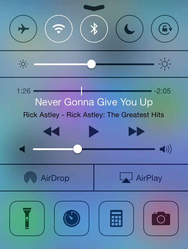
Additionally, you can adjust the brightness at any time using the Control Center in iOS 7:

You can access Control Center from anywhere in iOS—including the Lock screen. To access Control Center, swipe up from the bottom of the screen.To close Control Center, swipe down, tap the top of the screen, or press the Home button.

User uploaded file


Find out more about Control Center here:

iOS: Understanding Control Center

http://support.apple.com/kb/HT5858


Thank you for using Apple Support Communities.


Best,

Sheila M.

Jan 23, 2014 7:08 AM in response to Normrd

I made all the accessibility changes that were suggested in sheila-ms reply. However, the labels on the bottom of the screens like the Keypad, Notes, Clock are indecipherable for people like myself who need more contrast. I had no problem with iOS6 but iOS7 is a major challenge. Please return to the older contrast/font/colors to make it easier for folks like myself. Thank you.

This thread has been closed by the system or the community team. You may vote for any posts you find helpful, or search the Community for additional answers.

how to make lines (notes, etc.) and borders (keypad) more bold, like IOS 6

Welcome to Apple Support Community
A forum where Apple customers help each other with their products. Get started with your Apple Account.