Hi pv,
Name the three tables using XXX YYYY where XXX is the same text for each table and YYYY is the year for that table.
The Summary Table can have any name. With the formulas written for the example, the three data tables must follow your example exactly: Months in Calendar order in columns B-M, Days in ascending order in rows 1 - 32.
For the example I have used truncated versions of the tables, with only the first nine days of the first three months for each year:
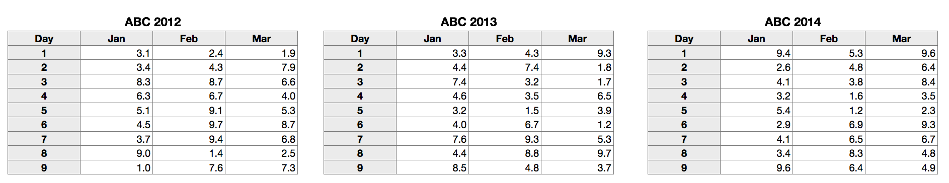
Although I developed all three tables (and the Summary table and chart) on the same sheet, they may be placed on separate sheets with no adjustments needed, provided the tables each have a name used nowhere welse in the document, and follow the naming pattern I have used (fixed text including one trailing space, followed by the year the table covers).
Here is the summary table and chart, along with a copy of that table used for a different date:
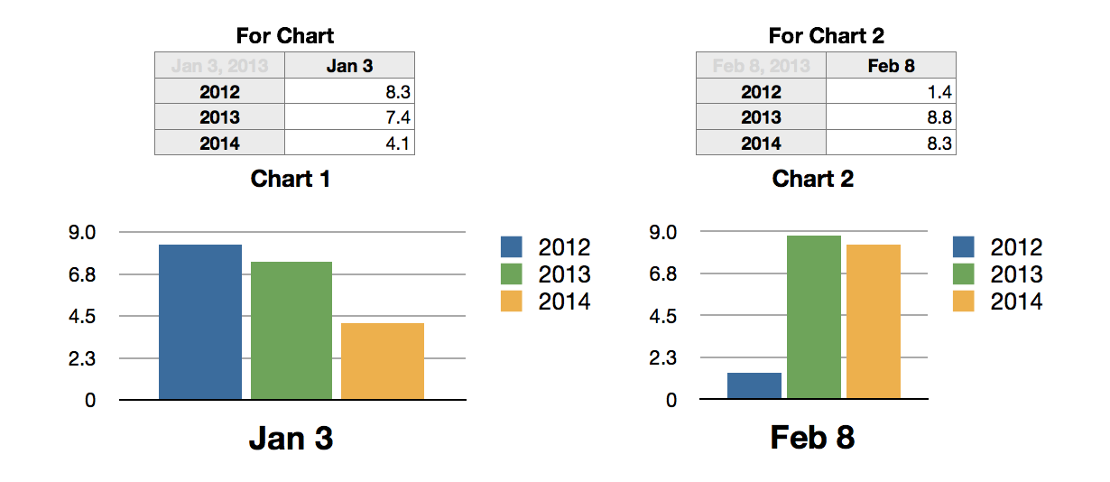
The table For Chart contains three formulas:
B1: =LEFT(MONTHNAME(MONTH($A$1)),3)&" "&DAY($A$1)
This extracts the leftmost three letters of the month name and the day number from the date in A1, and builds the text string in B1, used later as the category label for the chart.
A2, filled down to A4: =YEAR($A$1)+ROW()-3
YEAR($A$1) extracts the year number from the date in A1, then adds the row number of the row containing the formula and subtracts 3 to produce the list of three years, the year included in the entered date and the years immediately before and after that year.
The results become the Legend labels in the chart, and are used in the formula below.
B2, filled down to B4: =OFFSET(INDIRECT("ABC "&$A2&"::$A$1"),DAY($A$1),MONTH($A$1))
INDIRECT is used to construct the full address for the base cell of OFFSET, then DAY() and MONTH() are used to tell OFFSET how many rows down and months right to count from the base to get to the cell containing the value to be retrieved.
The Table For Chart 2 is a duplicate of For Chart. Entering a different date in A1 is the only change needed to collect the new values and create the new chart (after setting up the chart for that table).
Changes to the Chart:
The chart was created by selecting cells B2-B4 on the summary table, For Chart, then choosing the vertical Bar Chart from the Charts button menu. Clicking the small icon with three bars, locatd at top left of the table when the chart is selected, rotates th bars 90 degrees and applies separate colours to each bar. My other changes were to decrease the width of the Legend's box to force the names and colour dots to stack, move the legend to it's current location, and increase the font size of the category label to 18 points.
Regards,
Barry
Tables and charts constructed in Numbers '09.
Some features used may be unavailable in Numbers 3.