How do I add moving averages to my time series graph is there a function on numbers on tr iMac?

I've created a time series graph on numbers on my iMac but I need to add moving averages. Is there a function an if so where is it and if not is there a way to get around it

iMac

Posted on Feb 11, 2015 11:31 AM

Reply
6 replies

Feb 19, 2015 9:19 PM in response to Robert J McInnes

It makes sense the way it is. A moving average is the average of the past several data points. A moving average of period 10 requires you to have ten data points: the current one and nine earlier ones. Until you have ten data points, it is not possible to calculate a moving average of period 10. So the first 9 data points do not have a trendline on them.


SGIII's approach of creating the moving average in your table doesn't get around the definition of a moving average of period N but it does give you the flexibility to create a modified version that averages fewer data points until you have N data points to average. It sounds like that is what you want so I think it is the way you should go..

Feb 19, 2015 8:00 PM in response to Badunit

Badunit, (and SGIII),

Strangely, the plot of the Moving Average plot is shifted to the right.

That is, the first point of the moving average is plotted on the right end of the chart.


It would seem to me to be more logical to plot the most recent calculated Moving Average point at the left end of the chart.

The first few points from the right end of the plot would then be blank. If your period is, say (10), the first ten points of the graph from the right are (logically) missing.


The way it is handled by Numbers leaves the (10) most recent Moving Average values blank, the most recent Moving Average value is plotted (10) events ago,

instead of being the first point to be plotted from the left end of the chart (the most recent data).

This is not correct IMHO...


SGIII approach circumvents this issue.

Feb 19, 2015 9:21 PM in response to Badunit

Badunit,

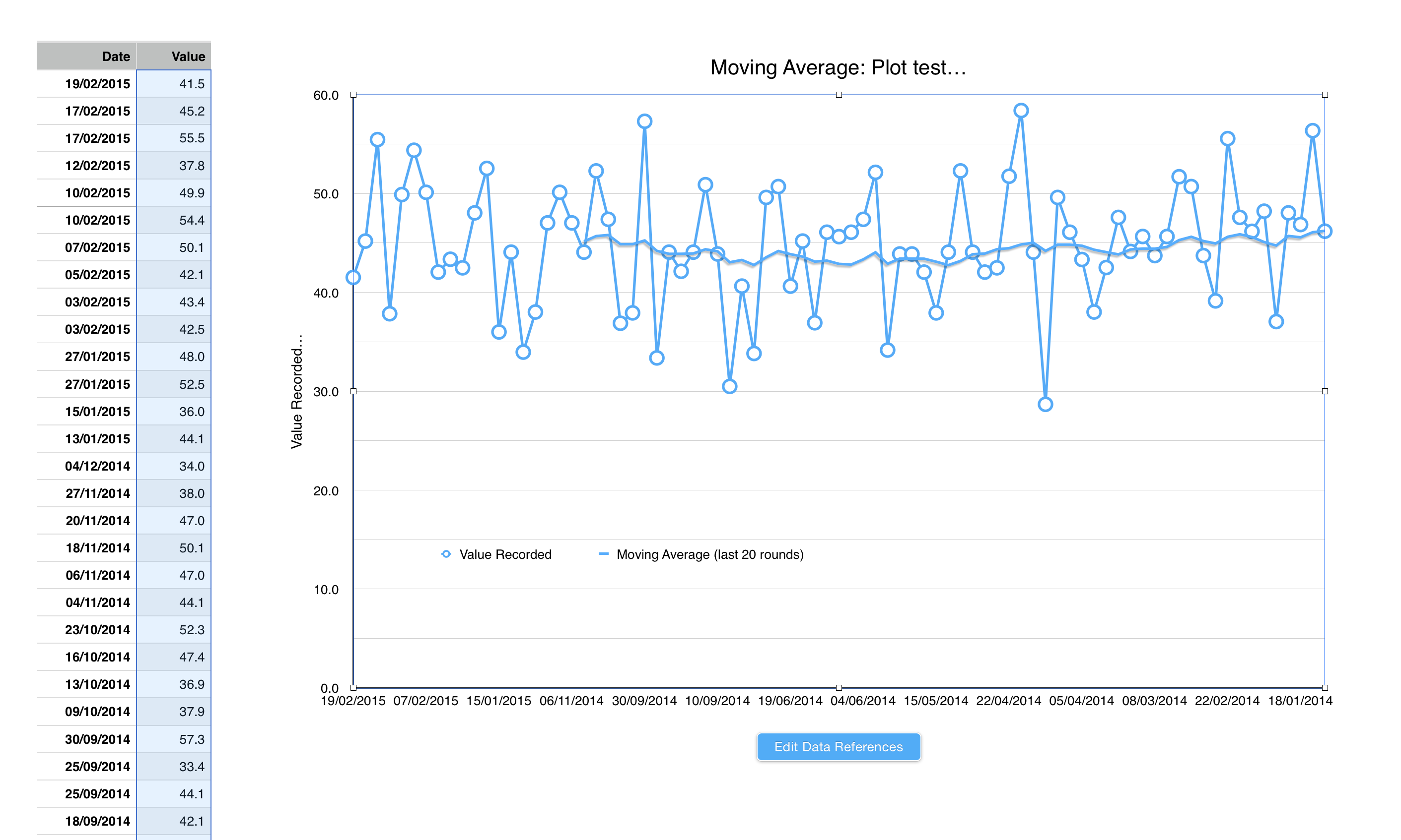
Here is an example plot, data sorted from most recent data at top of the table...

You can see the moving average (of 20) is plotted from right to left.

The Moving Average calculation is now wrong, and should have been calculated and presented from oldest to most recent.

User uploaded file

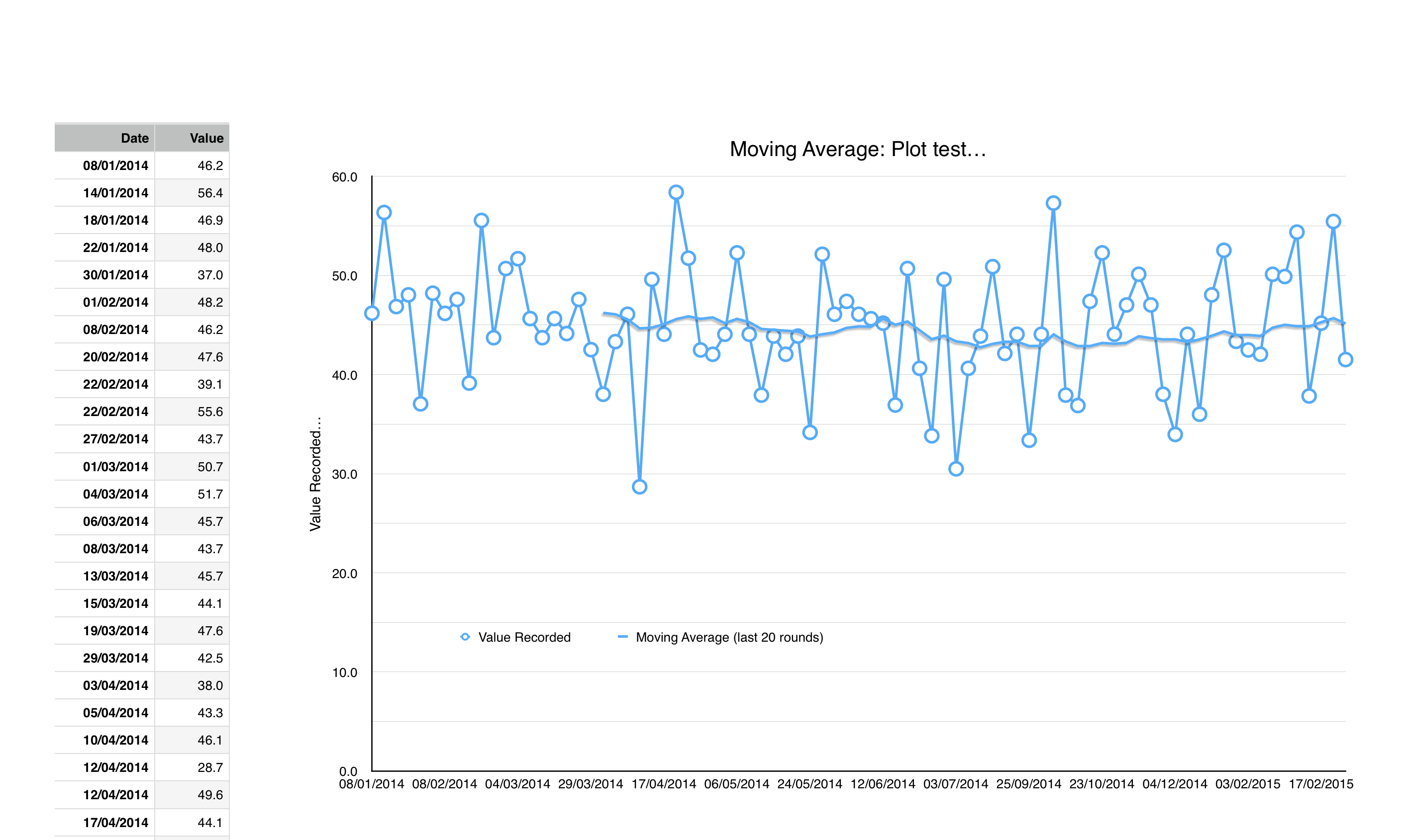
Here is the same data, with table sorted from oldest data at the top of the table.

The moving average is also plotted from right to left, and shows the correct Moving Average for the most recent data.

That is, it is calculated from oldest to most recent, with the last Moving Average data point plotted on "todays" date.

User uploaded file

What I want to see is my table displayed from most recent at the top (the top table), and moving average calculated and displayed as per the bottom graph.

Edit: So, think about this some more,

I need an option to tell Numbers to do the Moving Average calculation from the bottom of the table up, not from the top of the table down.

Feb 19, 2015 9:41 PM in response to Robert J McInnes

The charts you made appear to be line charts, not scatter charts. Is that what you want? It places each data point equally spaced across the X axis, not spread out according to the date. It treats the dates in your table as if they were text. The other choice would be a scatter chart.


It is late and I need to go. Try making a scatter chart. I am trying to figure out what Numbers is doing with the trendline when the data is sorted in the table ascending vs descending in a scatter chart. It changes from left to right.

This thread has been closed by the system or the community team. You may vote for any posts you find helpful, or search the Community for additional answers.

How do I add moving averages to my time series graph is there a function on numbers on tr iMac?

Welcome to Apple Support Community
A forum where Apple customers help each other with their products. Get started with your Apple Account.