You can make a difference in the Apple Support Community!

When you sign up with your Apple Account, you can provide valuable feedback to other community members by upvoting helpful replies and User Tips.

Looks like no one’s replied in a while. To start the conversation again, simply ask a new question.

How do I create a interactive bubble chart with a lot of data

Hello,


I'm trying to make an interactive bubble chart, with a lot of data.


Basically I'm trying to show the change in a vast number of species month by month


I cannot figure out how to get the interactive bubble chart to work properly


I would appreciate any help I can get


below is a sample of the table I am using


Thanks,


Rich

User uploaded file

Posted on Apr 26, 2015 2:54 PM

Reply
8 replies

Apr 26, 2015 2:55 PM in response to richljames


January

February

March

April

May

June

July

August

September

October

November

December


Allegheny Woodrat

0

0

0

0

0

0

0

0

1

1

0

0

Common Raccoon

5

6

4

5

4

3

4

3

7

9

9

9

Domestic Cats

2

2

7

5

2

3

4

5

6

6

6

9

Eastern Gray Squirrel

2

2

3

2

1

2

2

3

3

2

2

2

Brown Rat

8

8

12

14

14

10

14

10

14

15

12

15

House Mouse

14

8

8

15

16

23

17

22

31

17

20

25

Eastern Cottontail

0

0

0

0

1

1

1

1

1

0

0

0

Virginia Opossum

2

3

3

3

2

1

2

2

3

1

1

2

Eastern Chipmunk

0

0

0

0

0

0

0

2

2

2

2

0

Groundhog

0

0

0

1

3

3

4

4

5

3

3

3

Striped Skunk

2

2

2

5

5

4

3

2

2

2

2

2

Feral Pigeon

4

4

4

4

4

4

4

4

4

4

4

4

Monk Parakeet

0

0

0

0

0

0

0

2

2

2

2

2

Ruby Throated Hummingbird

0

0

0

0

0

0

0

0

0

0

0

0

Wood Duck

0

0

0

0

0

0

0

0

0

0

0

0

Canada Goose

0

0

0

0

0

0

0

0

0

0

0

0

Wild Turkey

0

0

0

0

0

0

0

0

0

0

0

0

Peregrine Faclon

0

0

0

0

0

0

0

0

0

0

0

0

Ring Billed Gull

0

0

0

0

0

0

0

0

0

0

0

0

Snowy Owl

0

0

0

0

0

0

0

0

0

0

0

0

Blue Jay

0

0

2

2

2

2

3

2

0

0

0

0

American Robin

0

0

0

2

4

2

2

2

0

0

0

0

Northern Cardinal

0

0

0

0

0

0

0

0

0

0


0

House Sparrow

6

6

6

6

8

14

8

6

10

12

13

14

Common Starling

2

2

4

6

4

2

2

4

6

8

10

12

Roseate Tern *

0

0

0

0

0

0

0

0

0

0

0

0

Piping Plover *

0

0

0

0

0

0

0

0

0

0

0

0

Checkered White Butterfly *

0

0

0

0

0

0

0

0

0

0

0

0

American Bumblebee *

0

0

0

6

8

6

6

6

0

0

0

0

American Dog Tick

0

0

0

0

0

0

0

0

0

0

0

0

Muticolored Asian Lady Beetle

0

0

0

6

8

24

15

12

0

0

0

0

Big Dipper Firefly

0

0

0

0

0

12

16

12

0

0

0

0

Brown Marmoted Stink Bug

0

0

0

0

0

0

0

0

0

0

0

0

Carolina Locust

0

0

0

0

0

0

0

0

0

0

0

0

Carolina Mantis

0

0

0

0

0

0

0

0

0

0

0

0

Carolina Wolf spider

0

0

0

0

0

0

0

0

0

0

0

0

Common Eastern Bumblebee *

0

0

0

0

0

0

0

0

0

0

0

0

Common Pill-bug

0

0

0

0

2

4

2

2

0

0

0

0

Dingy Cutworm Moth

0

0

0

6

6

6

6

0

0

0

0

0

Eastern Harvestman

0

0

0

0

0

0

0

0

0

0

0

0

Field Cricket

0

0

0

0

0

0

0

0

0

0

0

0

Forage Looper Moth

0

0

0

0

0

0

0

0

0

0

0

0

Giant Red Velvet Mite

0

0

0

0

0

0

0

0

0

0

0

0

Giant Water Bug

0

0

0

0

0

0

0

0

0

0

0

0

Grass Spider

0

0

0

0

0

0

0

0

0

0

0

0

Honey Bee*

0

0

0

0

1

3

1

0

0

0

0

0

House Centipede

0

0

0

2

3

4

2

2

0

0

0

0

House Cricket

0

0

3

3

3

4

5

6

0

0

0

0

Monarch Butterfly

0

0

0

0

0

0

0

0

0

0

0

0

Praying Mantis

0

0

0

0

1

0

0

0

0

0

0

0

Snow Mosquito

0

0

0

15

18

17

15

16

0

0

0

0

Thin Legged Wolf Spider

0

0

0

0

0

0

0

0

0

0

0

0

Housefly

0

0

0

8

16

12

18

16

0

0

0

0

Apr 26, 2015 7:09 PM in response to richljames

I think you need to set your data up correctly. You can get a hint of the expected data format by selecting the table with the data, then adding the Interactive Bubble Chart. Not select the chart, then click the "Edit Data References" button:

User uploaded file


you will now see the data in the overplayed on the source table as "X Y SIZE Y SIZE Y SIZE... etc".


you should modify the data so there is an x column followed by (y, size) coordinate pairs for each entry in the table. What do you image is the "interactive" part of this chart? the month? The species?


User uploaded file


In addition... I think you need to transpose your data so that months go down (in rows) and species go across (in columns)

Apr 27, 2015 2:53 PM in response to richljames

Starting with the table you presented earlier:

1) select the table

2) select the menu item "Table > Transpose Rows and Columns":

User uploaded file


Table will not look like this:

User uploaded file


First row and first column are headers.


select the non-header cells of the table (B2 thru DD13), then select the bubble chart from the charts menu.


now select the chart and open the Chart "Series" formatter:

User uploaded file


for the "Bubble Data" select "Bubble Diameter" for the "Represent Size Values Using" pop-up


The document I used to make the images in this post is here:

https://www.dropbox.com/s/nvxfolfq7urjkme/SpeciesBubble.numbers?dl=0

Apr 27, 2015 8:21 AM in response to richljames

richljames wrote:


Hi


Thanks for replying


I would like the count of species to move with each month, so the X axis would be the month, and the Y axis would be the species count.

Hi Rich,


Numbers 3 has some magnificent interactive graphs (Charts).

I am not sure if a Bubble Chart will do what you want. A Bubble Chart is a two-dimensional representation of a three-dimensional (X, Y, Z) relationship where Z (dimension 3) is represented by the Bubble size. That can become confusing with a large data set and many colours.


You can create your own interactive chart by “pulling” the relevant data into another table that supplies data to a Chart.


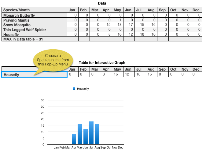
Here is an example of a 2-D Column Chart that may work for you. I assume that you want to view each Species Count over the months of a year. If that is not your aim, we can swap the variables (Rows and Columns) around. Easy!


I shortened the Month names to three letters. But that is not a problem. Numbers 3 Charts can cope with long names (you can rotate them).


The Data table has one Header Row (the Header Row is Frozen so it stays still while you scroll the table), one Footer row and one Header column:
User uploaded file

The Footer Cell contains this formula:

="MAX in Data table = “&MAX(B2:M54)

to show the maximum value (31) of all Species Counts in the Data table.

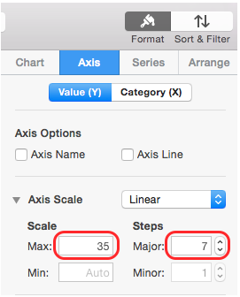
That helps you to set the Maximum Y axis value for the Chart. Click on the Chart and


Format Panel > Axis > Value (Y) > Axis Scale > Scale > Max

(I rounded this up to 35 from 31).

Format Panel > Axis > Value (Y) > Axis Scale > Steps > Major

(I made this 7 to give nice round numbers on the Y axis).
User uploaded file

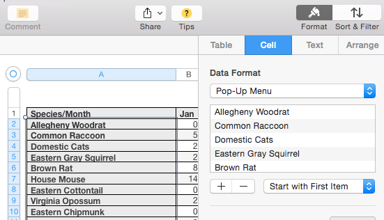
The Pop-up Menu in A2 of the ‘Table for Interactive Graph’ was created by selecting all the Body Cells of the Data table (double click on the A label to select them).
User uploaded file


Format Panel > Cell > Data Format > Pop-Up Menu


Now you have all Species Names in Pop-Up Menus in column A of the Data table. But you don’t need them there. That was just an easy way to create a Pop-Up Menu. Select A2 of the Data table, Copy and Paste into A2 of the ‘Table for Interactive Graph’ table. That is where you need the Pop-Up Menu.

You can now change the Data Format of column A of the Data table back to Automatic.


This seems like a long way round, but it uses the power of Numbers 3 to transfer items to a Pop-Up Menu much more easily than in Numbers ’09.


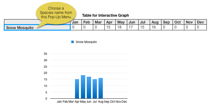
OK, here we go with Snow Mosquito. Click in the Pop-Up Menu in A2 of ‘Table for Interactive Graph’ and choose Snow Mosquito:
User uploaded file

Regards,

Ian.

How do I create a interactive bubble chart with a lot of data

Welcome to Apple Support Community
A forum where Apple customers help each other with their products. Get started with your Apple Account.