Hi miinujo / ka,
Adding to these excellent replies (Scatter Plot), perhaps you are looking for a 2D Line Chart (graph).
The Charting Basics template (Basic Charts Sheet) does not illustrate this. So here we go...
A 2D Line graph is one of the Category graphs where the X-axis consists of discrete Categories (in your example, Day Number).
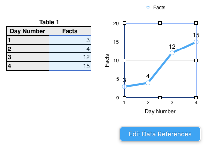
The X-axis has equally spaced values (ideally, one label for each Category).
For a Category graph, the X values must be in a Header Column, and the Y values must be in a non-Header column.
Row 1 is a Header Row.
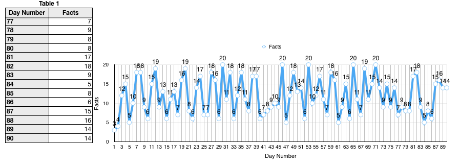
You can enlarge the table to 90 days
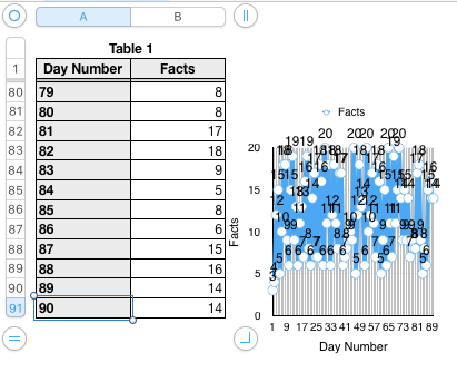
Now stretch the graph to the right
The X-axis has room for only every second label (Day 1, 3, 5... to Day 89).
To include every day, stretch the graph further to the right
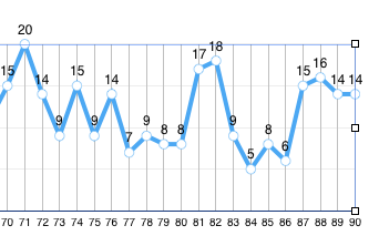
Good luck, this will not fit on one sheet of paper!
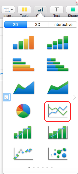
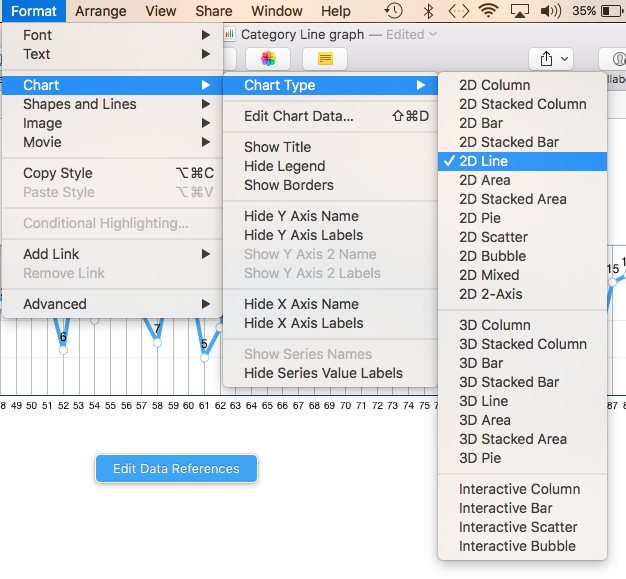
Hint, you can change the type of graph here:
And, yes, you can add a second line to a Scatter Plot or a 2D Line graph.
Regards,
Ian.