Numbers: chart column data from BOTTOM to TOP, LEFT to RIGHT in chart. How?

I have data with most recent at the top of the column. When I select the column, Numbers puts the most recent (top data) at the left; I want the oldest data (bottom of column) at the left, and the newest data at the right.


I can't find a way to flip the chart's fetch from the column. Dragging the chart backwards doesn't change the column-fetch order.


Why is the most recent data at the top? Because there's a lot of it, and when adding new data, I don't want to be scrolling all the time, I just want to insert a new row, enter the data, and be done.


TIA


Mac Pro, macOS 10.12

Posted on Apr 14, 2019 8:53 AM

Reply
Question marked as Top-ranking reply

Posted on Apr 14, 2019 12:15 PM

I see only a single column of data.


The chart is apparently a "line", which is a category chart, which charts numerical values (vertical axis) against 'categories' (horizontal axis). The 'categories are unspecified in your table, hence unnamed on the chart.


Category charts read the single column of data from top to bottom, and place the categories left to right on the horizontal axis, providing equal space for each 'category'. The data order left to right on a category chart can be changed only by reversing the order of the data on the table feeding the chart.


That order does not need to be changed on the table on which the data is recorded. It can be copied, in reverse order, to a second table, and that second table can be used to feed data to the chart.


Or you could use an XY scatter chart, that charts two series of numeric (or quasi-numeric, such as dates) values, one against the other, provide a series of ascending values to pair with the values you are currently charting, and use the exsisting data table to feed the scatter chart.


Regards,

Barry

Similar questions

6 replies
Question marked as Top-ranking reply

Apr 14, 2019 12:15 PM in response to fyngyrz

I see only a single column of data.


The chart is apparently a "line", which is a category chart, which charts numerical values (vertical axis) against 'categories' (horizontal axis). The 'categories are unspecified in your table, hence unnamed on the chart.


Category charts read the single column of data from top to bottom, and place the categories left to right on the horizontal axis, providing equal space for each 'category'. The data order left to right on a category chart can be changed only by reversing the order of the data on the table feeding the chart.


That order does not need to be changed on the table on which the data is recorded. It can be copied, in reverse order, to a second table, and that second table can be used to feed data to the chart.


Or you could use an XY scatter chart, that charts two series of numeric (or quasi-numeric, such as dates) values, one against the other, provide a series of ascending values to pair with the values you are currently charting, and use the exsisting data table to feed the scatter chart.


Regards,

Barry

Apr 14, 2019 2:51 PM in response to fyngyrz

Adding some examples…

Using a separate table, and a category chart:

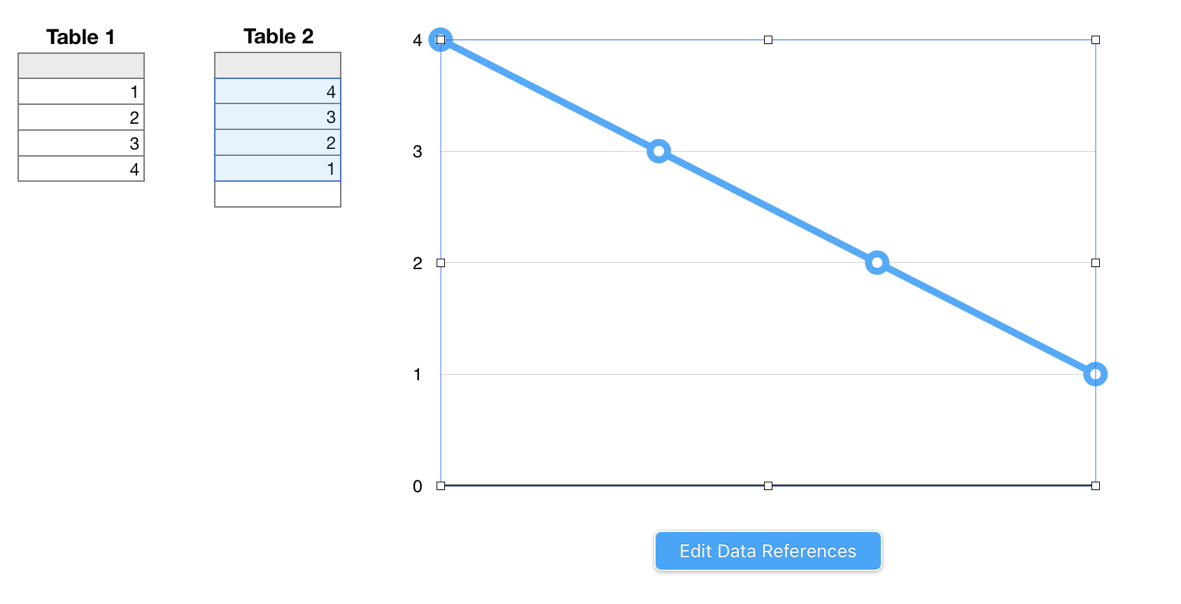
The chart i the same one used in your example, the 2d Line chart. Data feeding the chart is taken from column A of Table 2.

Table 2 contains this formula, entered in cell A2, and filled down.


Table 2::A2: IF(ROW()>ROWS(Table 1::B),"",INDEX(Table 1::B,ROWS(Table 1::B,headers)−(ROW()−2)))

The core part of the formula, shown in bold, reverses the order of the values in column A of Table 1. The IF statement, in which the core formula is wrapped, errors from extra rows on this table referencing non-existing cells on table 1, but does not prevent these 'empty cell' rows from being included in the chart as additional categories for which space must be allocated. This doesn't happen in the example, as a fixed number of selected cells (shaded blue) is feeding data to the chart.


If you want to always show ALL available data on the chart, this method will require continual maintenance to match the number of rows on Table 2 to match the number of rows on Table 1.

If you want to show a FIXED NUMBER of most recent data points, the formula can be revised to feed only the n most recently added (ie. those in the first n rows of Table 1) to the chart, starting with the nth most recent. That setup would require no regular maintenance.


Using an 'order' column, added to the main table (then hidden)

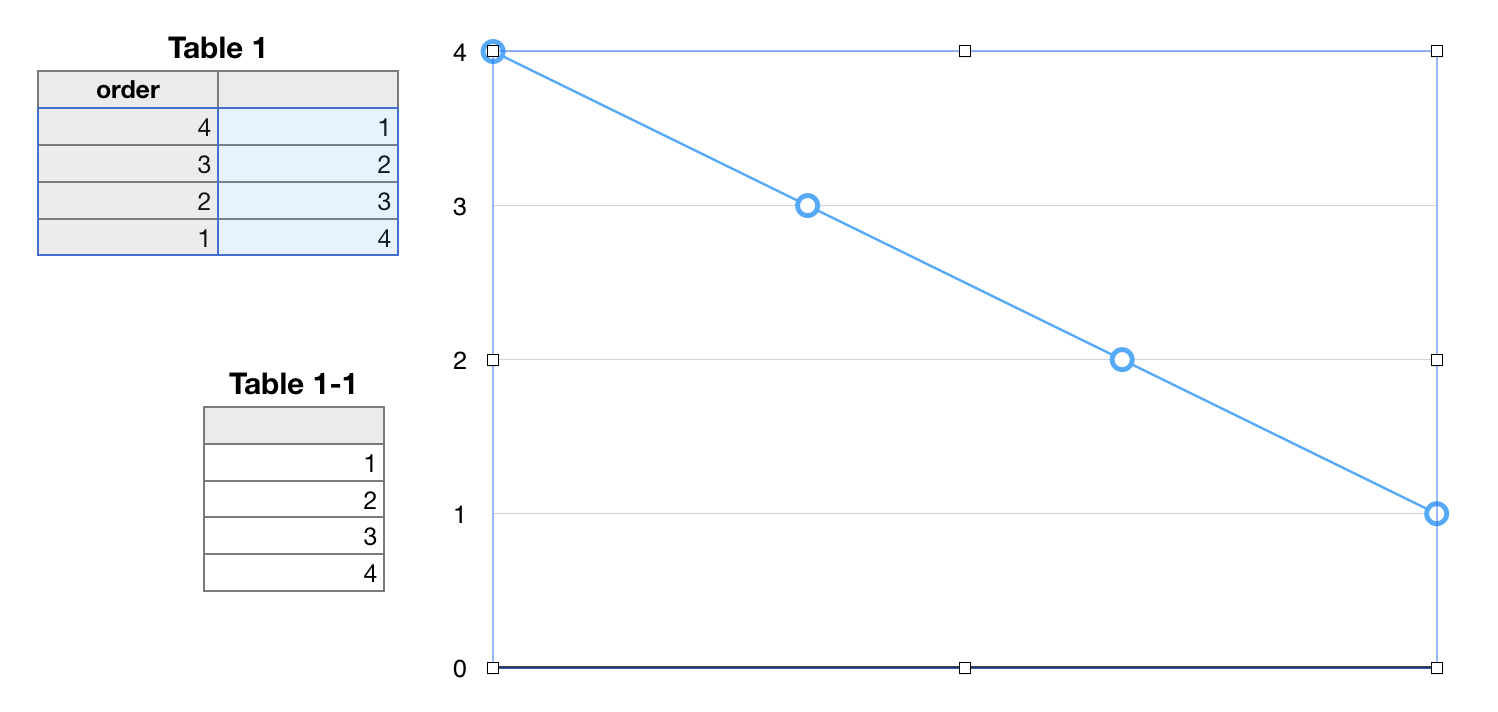
Table 1-1 in this image is not used in the solution. It is a duplicate of Table 1, showing the table as it would appear with the 'order' column hidden.


Column A ("order'") of Table 1 is added, and the formula below entered in A2, then filled down that column.


A2: ROWS(B)−(ROW()−1)


The chart in this example is an x-y scatter chart, with column A providing the x (horizontal) values and column B providing the corresponding y (vertical) values. The chart is set to collect all pairs of values from these two columns, then to graph each pair as a data point on the chart. In the Series panel of the Chart Inspector, the connection line between data points was set to "straight"


The chart will grow as new data is added to the table. As it grows, the newest datum (placed in the new row 2) will be placed at the left, and all other data pushed one step to the right, with the chart automatically adjusting the scale of the x-axis to maintain the current size of the chart, as in the example below after two data have been added:
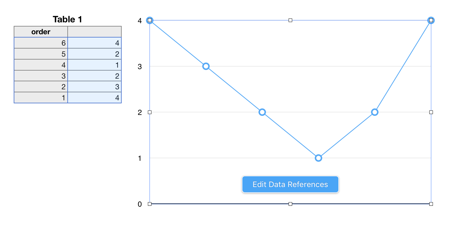

Regards,

Barry


Apr 15, 2019 10:58 AM in response to Barry

Thank you, Barry.


I had been spoiled by Excel, which simply lets me set a checkmark to reverse an axis.


After looking over your posts, I came up with a usable implementation that allows just inserting a new row on top, entering the data there, and then everything adjusts properly without any maintenance of the sheet's workings at all.


Here's the formula I am using in hidden column [D] in table "By Day" for the leftmost chart, "Daily"):


INDEX(Daily,(COUNTA(Daily,0))−ROW()+2)


And here are the resulting charts and tables:


Apr 14, 2019 11:12 AM in response to fyngyrz

Hi fyngyrz,


An oft stated fact in these communities:


We can't see what you see. We're not in the room with you, looking over your shoulder, and know only what you tell us.


What type of chart?


A screen shot showing the arrangement of the data used in the chart, and the same data plotted on the chart would be useful.


Regards,

Barry.


Apr 15, 2019 11:00 AM in response to fyngyrz

I should also add, for anyone who follows in my footsteps here, that once the column with the chart data is hidden, the chart goes blank, and then you have to set the "Hidden Data" checkmark for the chart itself, after which the chart's intended data will re-appear.


The tables ("By Day" and "By Week") grow downwards, and the bottom extents of them can be ignored as they get longer, while the charts continuously adjust as new data is added at the top of the related tables.

Apr 14, 2019 11:20 AM in response to Barry

Okay, here's a nice, simple demo:


I'll rephrase the question to match:


The chart reads the column data from top to bottom, and applies it to the chart from left to right.


How can I read the column data from bottom to top, or, apply the data to the chart from right to left.


The constraint is that the column data itself cannot be reversed top vs. bottom.


Thanks.


This thread has been closed by the system or the community team. You may vote for any posts you find helpful, or search the Community for additional answers.

Numbers: chart column data from BOTTOM to TOP, LEFT to RIGHT in chart. How?

Welcome to Apple Support Community
A forum where Apple customers help each other with their products. Get started with your Apple Account.