Looks like no one’s replied in a while. To start the conversation again, simply ask a new question.

If most recent data on the top, how to mirror this on the chart in Numbers for Mac?

I have the same problem discussed on this thread. I have a table with recent data on the top. I have a simple chart based on this data, showing the most recent data on the left. I want the most recent data in the chart to be always on the right side. I want an automatic solution, when I enter new data on the top row, the chart should be updated automatically. I think the best way to explain this is showing with a screenshot:

The thread that I linked above has some solutions but it is too complicated for me.

Could anyone please simply explain the steps that I should follow to solve this problem please?

Thank you in advance!

Posted on Jun 25, 2019 11:56 AM

Reply
Question marked as Top-ranking reply

Posted on Jun 25, 2019 7:56 PM

Hi mavisiyah,


Actually your issue appears to be the recverse of the one discussed in the linked discussion.


The OP in April wanted a chart that showed the most recent data on the left, and older data to the right. You want the data sorted left to right, with the earliest data on the left and the most recent on the right.


One solution to the April issue recommended what you are doing in your current table—entering new data at the top of the table, and placing the date in a header column.


Category charts, like the one in your example take no heed of the 'value' placed in a Header column. Anything presented to a Category chart in a header column or a header row is read as text, naming a 'category' or naming a 'series'.


There are two things you can do to create a chart with dates in ascending order: Move the dates in your table out of the header coumn and into a body column. With the example table, the easiest way to do that would be to insert a new column C to the left of the current column C (labeled Hours).


In C2, type = to open the Formula Editor, click on cell A2, then click the green checkmark.

This simple formula copies the value from A2 into C2, where it will be recognized as a date, and where it is immediately next to the hours column (now column D).


Fill the formula down column C to copy the rest of the dtes into that column.


Select both columns (C and D), then go to the Charts button and choose X/Y scatter chart (last choice in the left column).


When the chart appears, click n it to select it and open the Chart Inspector.

In the Inspector click to check the box labeled Hidden Data.

Click the Series tab at the top of the Inspector, then choose 'straight' from the Connecting lines pop-up menu.


Your chart should look like this:
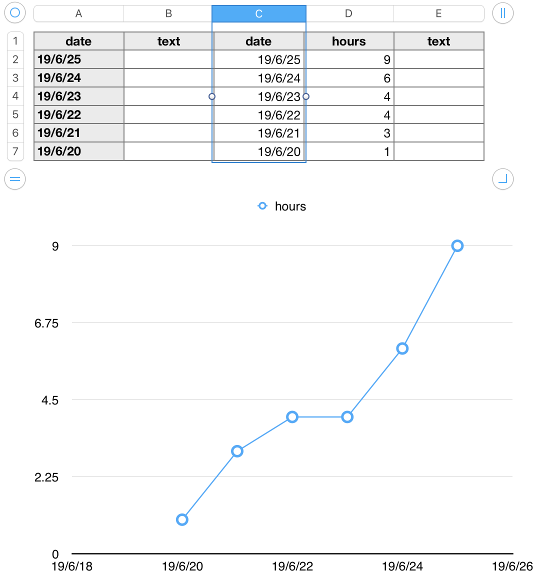
To avoid damage to the formula in column C, Click the reference tab for that column to select it, then place the pointer near the right end of the reference tab, click the v that appears, and choose Hide Column from the menu that appears.


Regards,

Barry


Similar questions

4 replies
Question marked as Top-ranking reply

Jun 25, 2019 7:56 PM in response to mavisiyah

Hi mavisiyah,


Actually your issue appears to be the recverse of the one discussed in the linked discussion.


The OP in April wanted a chart that showed the most recent data on the left, and older data to the right. You want the data sorted left to right, with the earliest data on the left and the most recent on the right.


One solution to the April issue recommended what you are doing in your current table—entering new data at the top of the table, and placing the date in a header column.


Category charts, like the one in your example take no heed of the 'value' placed in a Header column. Anything presented to a Category chart in a header column or a header row is read as text, naming a 'category' or naming a 'series'.


There are two things you can do to create a chart with dates in ascending order: Move the dates in your table out of the header coumn and into a body column. With the example table, the easiest way to do that would be to insert a new column C to the left of the current column C (labeled Hours).


In C2, type = to open the Formula Editor, click on cell A2, then click the green checkmark.

This simple formula copies the value from A2 into C2, where it will be recognized as a date, and where it is immediately next to the hours column (now column D).


Fill the formula down column C to copy the rest of the dtes into that column.


Select both columns (C and D), then go to the Charts button and choose X/Y scatter chart (last choice in the left column).


When the chart appears, click n it to select it and open the Chart Inspector.

In the Inspector click to check the box labeled Hidden Data.

Click the Series tab at the top of the Inspector, then choose 'straight' from the Connecting lines pop-up menu.


Your chart should look like this:

To avoid damage to the formula in column C, Click the reference tab for that column to select it, then place the pointer near the right end of the reference tab, click the v that appears, and choose Hide Column from the menu that appears.


Regards,

Barry


Jun 25, 2019 7:55 PM in response to mavisiyah

Instead of a '2D Column' chart, you can do a '2D Scatter Chart' with error bars, like this.


Make sure your column A is not defined as a Header Column. And make sure the dates in it are true dates recognized by Numbers (they will be right-aligned by default). I used a format recognized in my region. My region doesn't use 2019.06.25.


Insert '2D Scatter Chart' with data references as follows:


Click the series in the chart and choose 'Negative Only' in the dropdown for 'Y Axis Error Bars' in the panel at the right:


Choose Percentage in the 'Use' dropdown:


Change 'Range:' to 100, giving you something like this:


Now click an Error Bar in the chart and adust the 'Bar Style' to something like this:


Then, if you want, you can fiddle with the x-axis formatting to get the look you want:


And, finally, remove the data markers by clicking them and choosing None:


Giving you something like this:


Because it is a '2D Scatter Chart' (rather than a "category" chart like '2D Column') the x-axis will be ordered by oldest to most recent dates even if you have the dates in your table in a different order (i.e. most recent at the top).


SG

Jun 25, 2019 9:23 PM in response to Barry

Hi Barry,

Your answer solved my problem. As it does not require any maintenance I choose your answer as the solution. Thank you very much.


Hi SGIII,

Your answer is very helpful. I followed all the steps you have explained and it works. Only problem is, when I add more data to the table, the bars in the chart are quickly growing big and out of space, so the chart requires adjustments from time to time. Thank you very much for your help.


Jun 25, 2019 11:56 PM in response to mavisiyah

mavisiyah wrote:

Only problem is, when I add more data to the table, the bars in the chart are quickly growing big and out of space, so the chart requires adjustments from time to time.


I suppose the need to adjust might also be a shortcoming of the chart in your original post. My post assumed you wanted something similar to what you posted. Barry is a better mind reader!


Since both are 2D Scatter Charts I'm not sure it is entirely true that one will require adjustments whereas the other will not.


Anyway thanks for the star! (And keep in mind the power and flexibility of error bars.)


SG

If most recent data on the top, how to mirror this on the chart in Numbers for Mac?

Welcome to Apple Support Community
A forum where Apple customers help each other with their products. Get started with your Apple Account.