You can make a difference in the Apple Support Community!

When you sign up with your Apple Account, you can provide valuable feedback to other community members by upvoting helpful replies and User Tips.

Looks like no one’s replied in a while. To start the conversation again, simply ask a new question.

Date entry onto x axis in numbers on Mac

How do you enter data so that it is correct by date in the x axis of a chart? For example: $100 dollars on November 1, $110 on November 15, $95 on November 22 etc.

Y axis is the $ amount.


Thanks.


MacBook Air 13", macOS 10.15

Posted on Dec 20, 2019 10:57 AM

Reply
Question marked as Top-ranking reply

Posted on Dec 20, 2019 12:42 PM

Hi C'


There are two basic types of graph created by Numbers—Category charts, which compare values for a number of categories, and x-y value charts which track the relationship between two sets of values.


In your case, you want to track one value (money amounts) against another value (passage of time).


For Category charts, the category names are listed in a Header column, and the values associated with each category are listed on the same rows of a non-header column.

The chart created will have a "Category" axis and a "Value" axis.

The categories are spaced evenly along the category axis (the distance between Nov 1 and Nov 15 would be the same as the distance between Nov 15 and Nov 22).
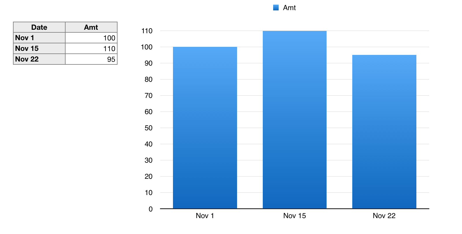

For x-y value charts, both x values and y values must be entered in body cells (non-header cells) of a table, with the paired values on the same row.

The position of the data points on the chart is proportional to the value itself. (the x distance betweenNov 1 and Nov 15 will be twice as much as the x distance between Nov 15 and Nov 22.
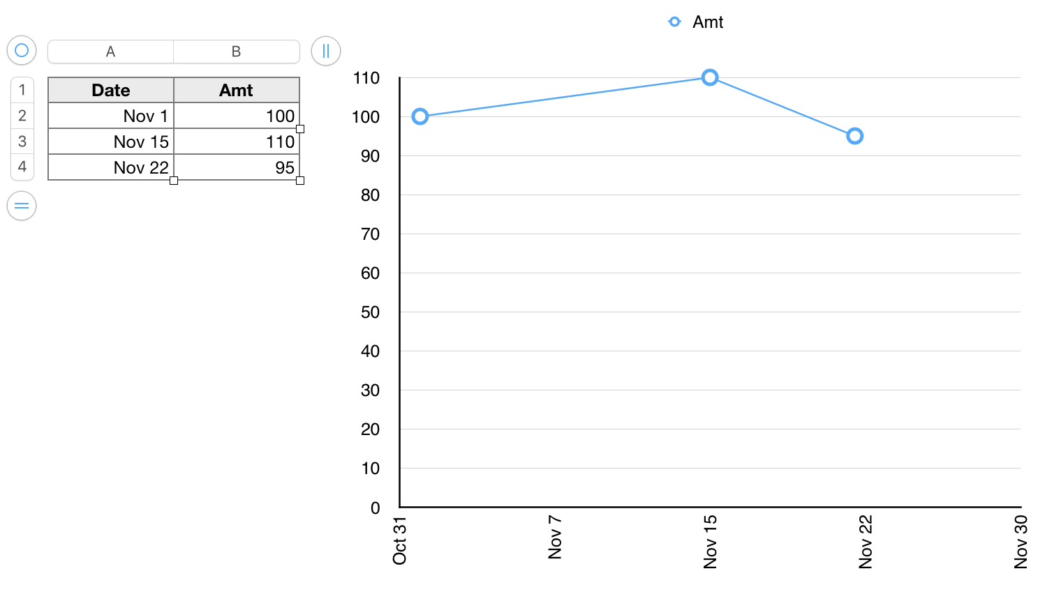

In both charts above, I have changes the minimum Y value setting from Auto to 0 and increased the number of steps to give the values without decimal parts as shown.


In the second chart, I've made a similar adjustment for the x axis, setting the Maximum date to Nov 30.

Take a look at the Basic Charting template in the Template Chooser for several examples of the various types of chart that can be created in Numbers.


Take a look at the document created by the Basic Charting template in Numbers' Template Chooser.

If New from Template Chooser does not display in the File menu, press and hold the Option key to display it. Keep the key pressed until you have selected the item.


Regards,

Barry

8 replies
Question marked as Top-ranking reply

Dec 20, 2019 12:42 PM in response to Clueless98

Hi C'


There are two basic types of graph created by Numbers—Category charts, which compare values for a number of categories, and x-y value charts which track the relationship between two sets of values.


In your case, you want to track one value (money amounts) against another value (passage of time).


For Category charts, the category names are listed in a Header column, and the values associated with each category are listed on the same rows of a non-header column.

The chart created will have a "Category" axis and a "Value" axis.

The categories are spaced evenly along the category axis (the distance between Nov 1 and Nov 15 would be the same as the distance between Nov 15 and Nov 22).


For x-y value charts, both x values and y values must be entered in body cells (non-header cells) of a table, with the paired values on the same row.

The position of the data points on the chart is proportional to the value itself. (the x distance betweenNov 1 and Nov 15 will be twice as much as the x distance between Nov 15 and Nov 22.


In both charts above, I have changes the minimum Y value setting from Auto to 0 and increased the number of steps to give the values without decimal parts as shown.


In the second chart, I've made a similar adjustment for the x axis, setting the Maximum date to Nov 30.

Take a look at the Basic Charting template in the Template Chooser for several examples of the various types of chart that can be created in Numbers.


Take a look at the document created by the Basic Charting template in Numbers' Template Chooser.

If New from Template Chooser does not display in the File menu, press and hold the Option key to display it. Keep the key pressed until you have selected the item.


Regards,

Barry

Dec 20, 2019 11:19 PM in response to Clueless98

Barry gave a full explanation. That may make using Numbers more complicated than it really is. You do, of course, have to learn the basics of Numbers. But just a few clicks and willingness to poke around a little will give you what you want here.


I highly recommend having a look at the templates at File > New in your menu. They give nice working examples of how to approach common tasks in Numbers. There is a template there called 'Charting Basics' that can save you a lot of time learning how to make a chart like the one you describe.


For example, I was able to do the chart below in less than five minutes without being a charting expert. I just went to the Scatter Chart sheet (tab) in the template, put dates in column A (I had to reformat the cells as Automatic) and dollar values in column B, and clicked around and experimented with chart settings in the panel at the right until I got something close to what I wanted.


.


SG


Dec 21, 2019 3:22 PM in response to Clueless98

Hi C'


"By this i mean that 12/1 plots in space next to 12/5 which plots next to 12/6. See what I mean?"


This means you have chosen one of the Category charts. Positions on one axis show values that are expressed numerically. Positions on the other axis are equally spaced—one for each category. In the case you describe, each 'Date" is the name of a category, and has no numerical value, You can space the dates proportionally only by including a row in the table feeding the chart for every date in the period covered by the chart. ALL charts in the top section of the Charts button menu are Category charts.

The menu is from an earlier version of Pages, so will look slightly different from yours.


The x-y scatter chart in the bottom row shows "Values" on both axes.

The Bubble chart shows three values—the position of each bubble is determined by the values assigned to the x and y axes; the third value determines the size of the bubble.


In your case, you want to show the Date's position on the x axis as a value, and the expenditure (or earnings) amounts position relative the values listed on the y axis.


To do that, you need a chart that uses both the horizontal axis and the vertical axis to show values—the x value (date) on the horizontal axis and the y value (amount) on the vertical axis.


Regards

Barry

Dec 21, 2019 10:05 PM in response to Clueless98

Have you tried the the Scatter Chart sheet (tab) in the Charting Basics sheet (tab) shown in the screen in my post above?


It’s already set up for you and it already works, so it’s just a matter of formatting cells in the first column as Automatic and inputting dates (and changing the names in the columns to suit).


Easier than starting from scratch, especially if you’re just learning about charting.


SG


Date entry onto x axis in numbers on Mac

Welcome to Apple Support Community
A forum where Apple customers help each other with their products. Get started with your Apple Account.