Hi Th3m3s,
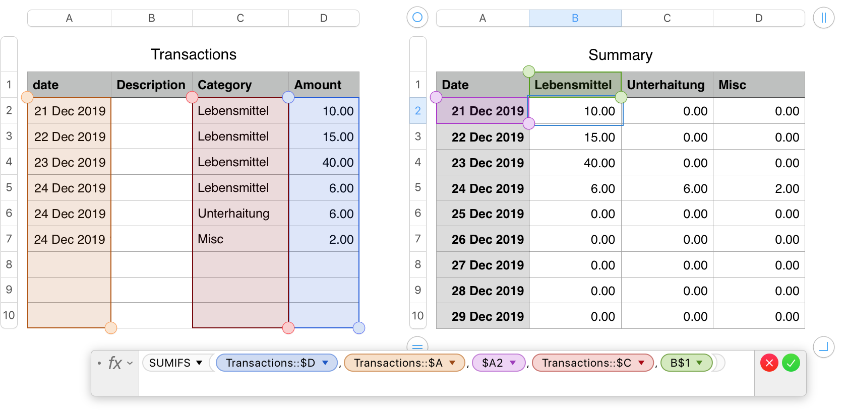
In addition to the table shown, you will need a Summary table to summarize the transactions by date and category.
I've named your original table "Transactions:, and included only the data that will be included in the chart.
The second table, Summary, uses theSUMIFS formula shown below the tables.
The formula is entered in cell B2 of Summary, then filled right to D2, and fied down to the last row of the table.
I added a third category, and a third transaction (using that category) to Dec 24 to show the effect on the chart.
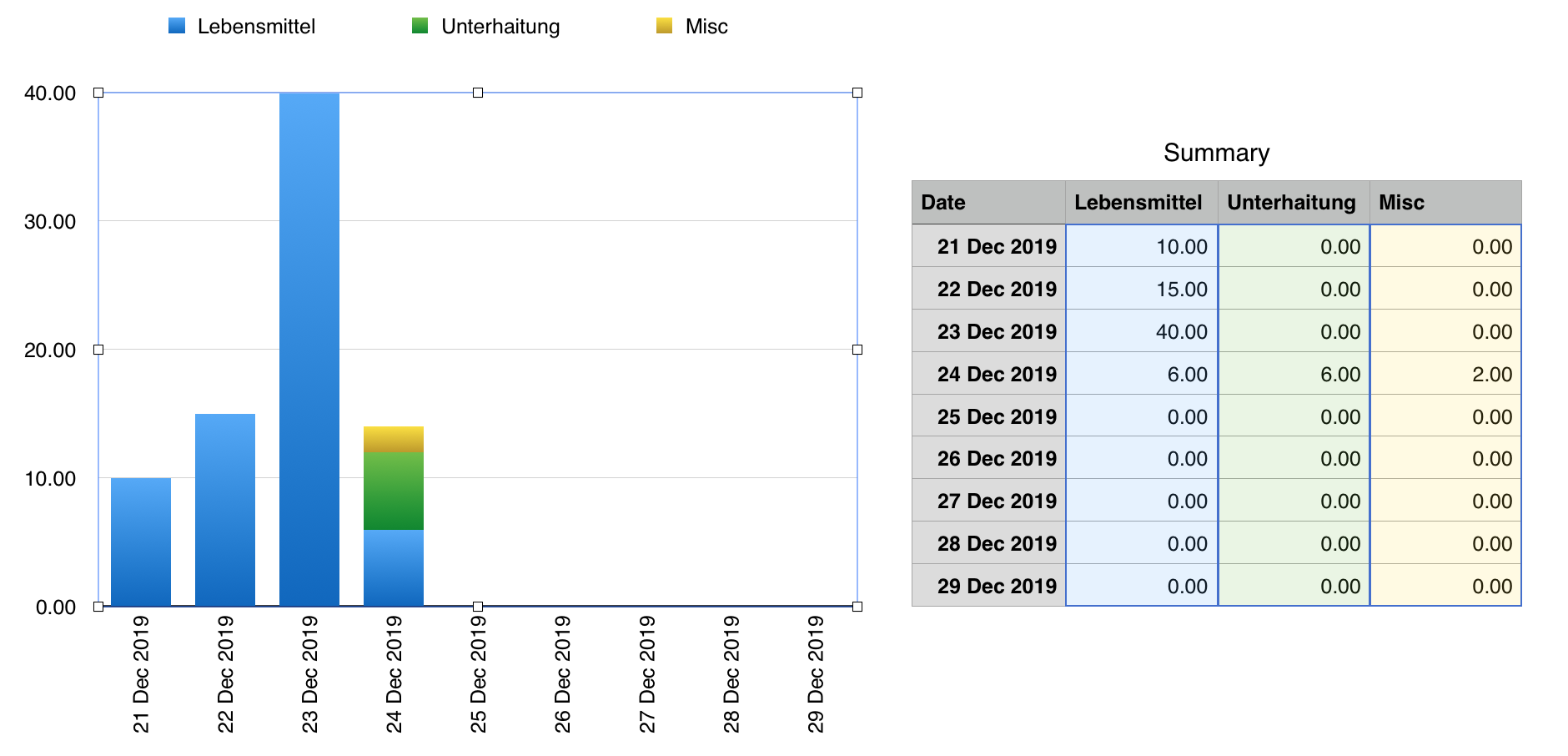
The second image, below, shows the same Summary table beside the chart produced.
The stacked bar chart is a Category chart, meaning each label in the Note that the dates in this table must be in a Header Column, where they are treated by the chart as Category Labels, not as Date and Time values. Categories are evenly spaced along the category axis, so column A needs each date entered once, even if there is no transaction on that day.
The table requires one column for each expense category to be summarised. With the Summary table completed, Select columns B, C and D, then click the Charts button and choose Stacked Bar Chart.
I made one change in the chart after the actions above—To fit more dates on the Category axis, I chose the Chart pane of the inspector, chose the Category axis (X), and set the Label Angle to Left Vertical.
All other settings were left at their default values.
Regards,
Barry
PS: In the formula, change the commas ( , ) to semi colons ( ; ) for your region.