Hi John,
Will this work?
How it's done:
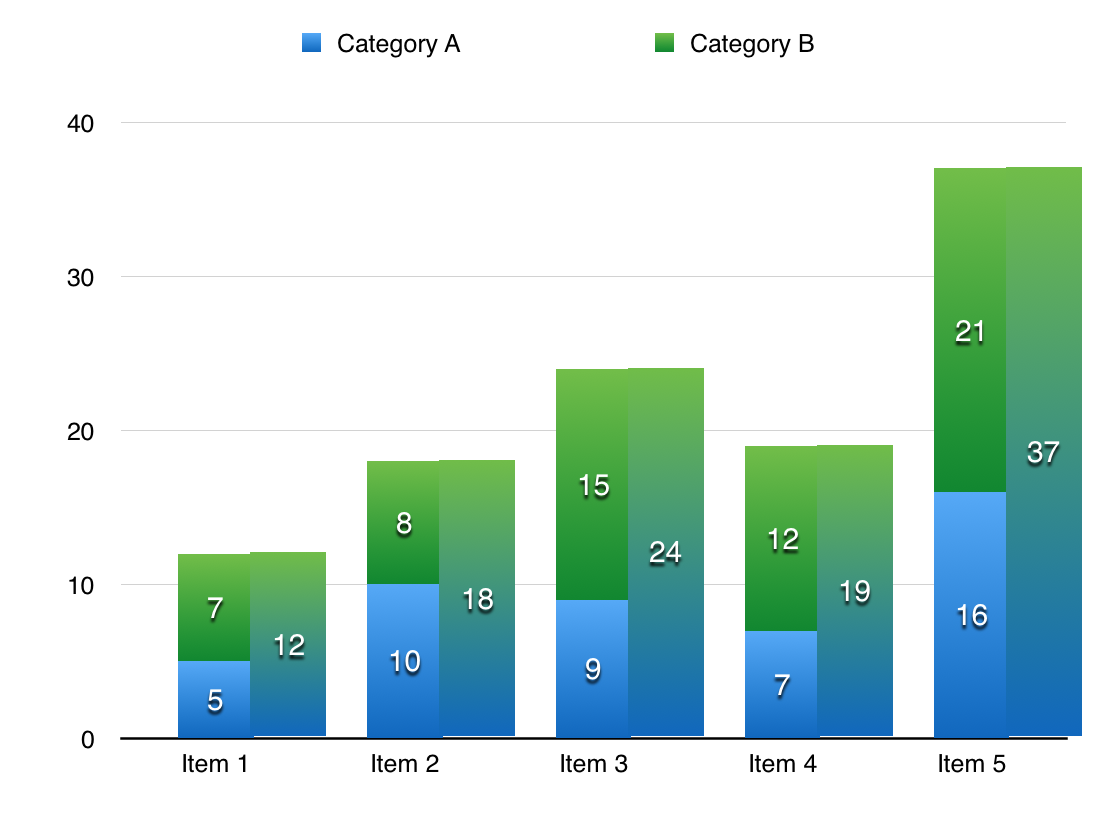
The chart is actually two charts, stacked one in front of the other.
I didn't take the time to make the alignment perfect, as can be seen at the top pf the Item 1 column, and th base of all columns.
(After inserting the image here, I used Arrange > Align > Top (after selecting the main areas of both charts) to bring them into better alignment.)
In your data table, add one column to hold the totals
Make the first chart as you have done, selecting columns B and C to supply data for the two stacked bars for each item.
For the second chart, I used a stacked bar chart, even though there'd be only one data series. The main reason for my choice was to get the same colour set for the bars in both charts.
After producing the second chart, go through the Chart Inspector and set all displayed items (except the bars themselves, and Values to be displayed on the bars) to 'none'.
Your final result (except for the lack of gradient shading in the bars and width of the bars) should look like this:
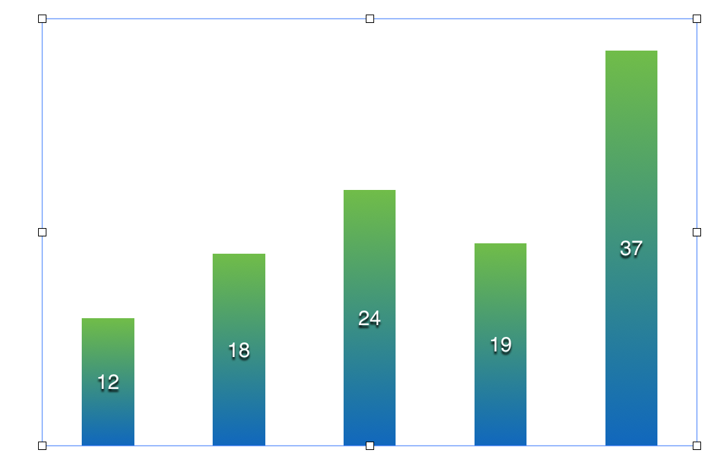
Click on one of the bars to select them, then, in the Inspector, choose Chart, scroll down to Gaps and set Between columns to 150%. (Do this in the main chart as well, as the values printed on the bars are aligned to the verticl centre line of the bars.)
With both charts now ready, Select the totals one, and use Arrange > Bring to Front to ensure that it is in a layer above the o
original chart.
Use the mouse/trackpad or the arrow keys (with shift down for greater speed, shift up for smaller steps and easier precision), slide the new chart onto the original, aligning top and bottoms of each column, and shifting the new chart to the right to expose both columns for each item.
Regards,
Barry