Hi bambilala,
Looking at your upper chart, I notice a different maximum value on the two Y axis scales.
The range on the left is zero to 4%, while that on the right is 0 to 3%
Since one scale applies to the green bars and the other to the orange bars, it's not surprising that the height of bars with similar values are not the same height.
What purpose does having two Y axis scales serve in this chart? If both value series were graphed against the same scale, I suspect this issue would disappear.
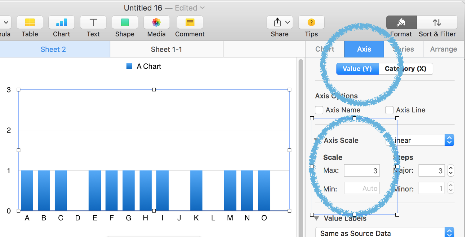
Setting a fixed minimum is done in the Chart Inspector.
Select the chart, then click the format brush to open the Inspector panel.
Choose Axis, then Value (Y). (Upper circle)
The change the Auto settings for Max and Min to the fixed values you want.
Also, check the checkbox labeled Show Minimum Value.
(This checkbox is located immediately below "Same as Source Data" on my screen. Yours may differ.
Regards,
Barry