Hi MrSalter,
Well, you are missing something, but what is wrong is just as bad as what you thought was wrong.
The bars, measured from the category axis to the tip of the rounded end are in the correct proportion.
But there's something amiss about the vertical scale lines—number 2 has gone AWOL.
Here's a screen shot, talke from your post above.
I pasted it into a Numbers document, then made a single row, five column table, placed it on top of the chart image, placed the left margin of the first column on top of the category axis, and dragged the handle at the center of the right margin of the fifth column right to sit on the scale line labeled '5'.
Note that each of the column borders line up quite well with the tip of at east one bar.
Then take a look at the value axis at the bottom of the chart (inside the red loop), and the lighter grey scale lines running up from that axis.
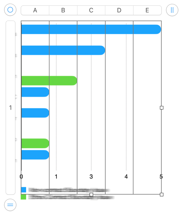
Adding one more step to the value axis scale should improve matters.
Regards,
Barry