Hi Liam,
I was working on this last night (and ran into the 'you can't post' glitch in this and other communities),
Today all was well—whether that was due to the glitch having disappeared or a result of following Apple Support's advice to clear the caches, I don't know.
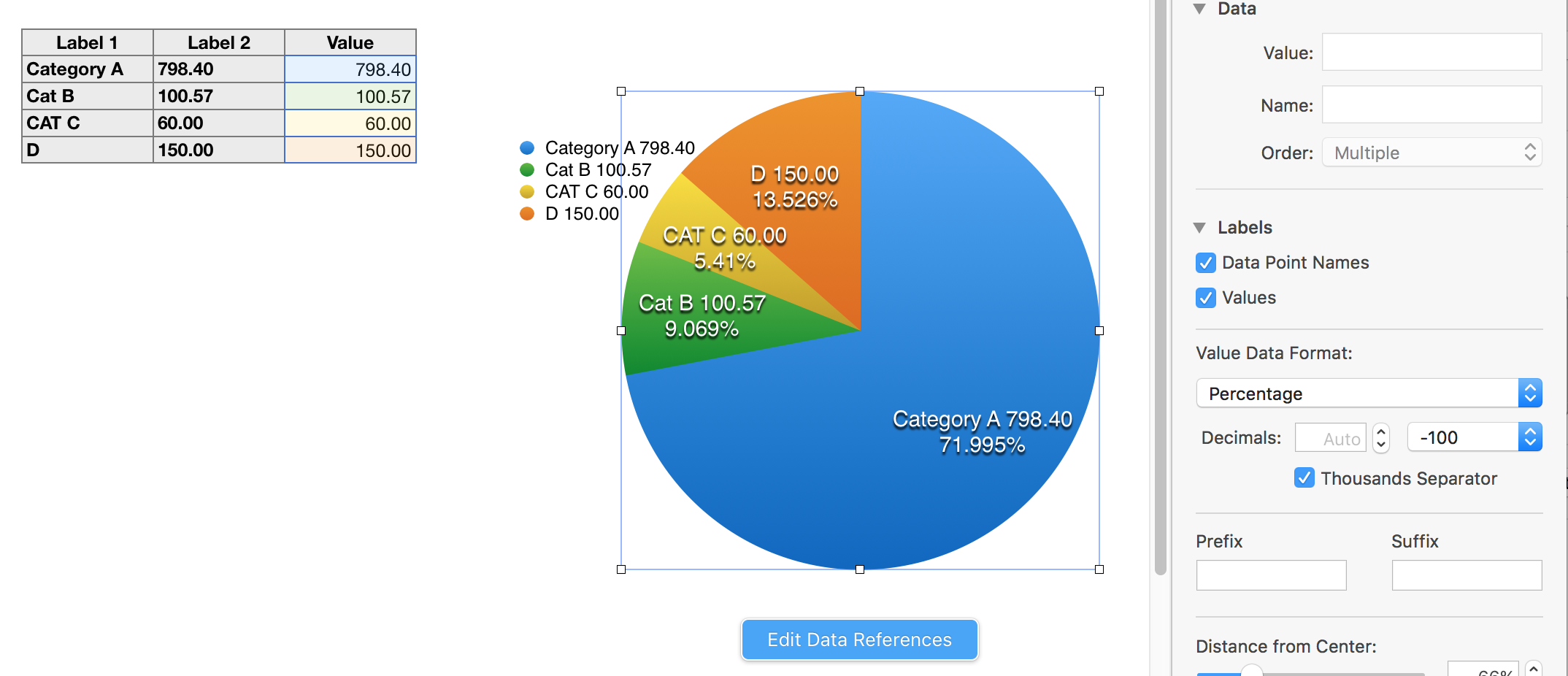
I got to pretty much the same conclusion as Yellowbox, but chose a slightly different display, using the settings shown for the wedges:
 :
:
There are a couple of issues with attempting the exact display you want.
- Numbers provides only two type of content for the wedges—Names, and Values
- While you can include more than one 'name' on each wedge, you can only have one Value.
- That Value can be expressed in only one format on the chart.
- Values for the pie chart are contained in a single column of 'body' cells.
- The chart can also pick up Labels (Names). These Labels must be in cells that are in Header rows or Header columns.
For the example above, the Values are in column C.
On the chart's wedges, those values are expressed as percentages of the full set of numeical values, and are displayed as such.
There are the Header columns, one containing the Category Names, the other a copy of the Value in column C, which, due to being in a Header column, can be used as a Label both on the wedges and in the chart's Legend.
Numbers automatically grabs all of the labels when asked to display Data Point Names, so you can't* use only the Category name on the Legend and both Category name and Amount as a label, or only the Amount label (and Amount value as percent) on the chart.
*can't?
Well, there is at least one workaround.
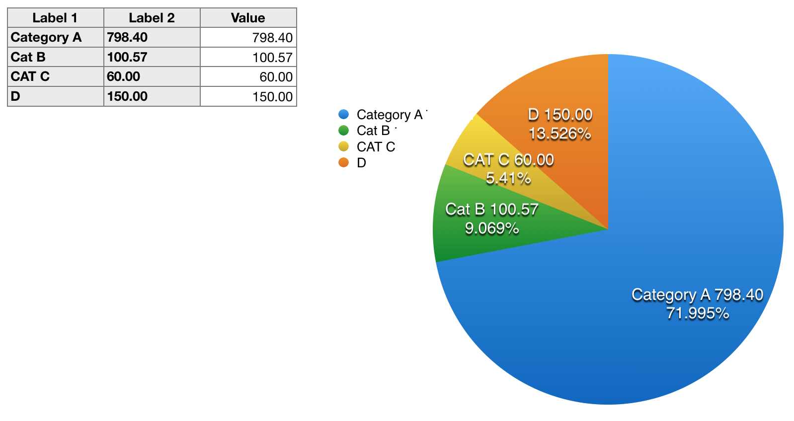
1: Make the chart as shown, then…
- Move the Legend box horizontally away from the pie graph to provide some working room.
- Insert a square shape onto the page.
- Replace the shape's fill colour with light grey, and set Borders and Shadow both to none.
- Reduce the height of the shape to the size needed to cover the numbers, but not the name in the bottom entry of the Legend.
- Duplicate the shape three times and adjust the width of the four rectangles to just cover the numbers at the ends of the labels
- With the shapes in place over the numbers, move the legend (horizontally) away from the shapes.
- Select all four shapes without moving them. Reset the Fill colour to white, then go Arrange > Group to group the shapes into a single object.
- Move the selected shapes object horizontally toward the chart, until you see the right edge of one of the rectangles appear in front of the chart. move the shape left until it is no longer hiding part of the pie.
- Now move the Legend rightward until it slides behind the grouped shapes and the shapes mask the numbers.
Final result should look like this:
Note: If you take care to use the arrow keys to move the items left and right, but avoid moving the Legend up or down once you've begun to size and place the masks, you'll find it easier to keep them aligned when you are putting them back together and into place.
Pressing the shift key when using the arrow keys will make each 'step' bigger and speed up the move.
Regards,
Barry