You mean like one of these? You said "line chart" but I included a bar chart, too. I swapped the numbers around in the example.
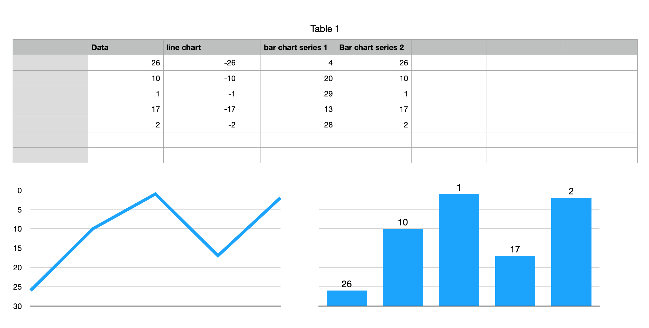
For the line chart I made a chart of the negative values, set the Y axis min and max to -30 and 0, respectively, and made a custom format for the Y axis value label so it would not show the minus sign.
For the bar chart, it is a stacked bar chart with the second series (your numbers) displaying its value labels, formatted in black, at the bottom of the bars and with no fill for the bars (so the bars are hidden). Series 1 is your numbers subtracted from 30. I turned off the labels for the Y axis. There were a few more tweaks but this is the gist of it.
If your largest number is going to exceed 30, you may need to change things up a little in the table and/or the chart. For the bar chart data, you could make the table adjust itself automatically (i.e., with a formula) based on the max value in your data. If you let the Y axis max (min for the line chart) on the chart be "automatic", it will adjust accordingly. For the line chart you would probably have to adjust the number of Y axis steps manually so the values stay as integers. For the bar chart I'd get rid of the horizontal gridlines.