Chart colours are assigned to a 'series' of values recorded in a single column of the table feeding the chart.
Add a new column to the right of the one holding that data. Use Cut (command-X) and Paste (command-V) to move the value you want plotted in a different colour to that column, leaving the cell in the same row of the original column empty. Enter the (text) label you want for the single value in the header row of the new column.
Select the chart, which will now be missing the dot to be highlighted and labeled.
With the chart selected, click the header cell on the column containing the single value to add that column to the chart.
Select the dot, hen use the Series section of the Chart Inspector to set that series (of 1 value) to have the attributes you want.
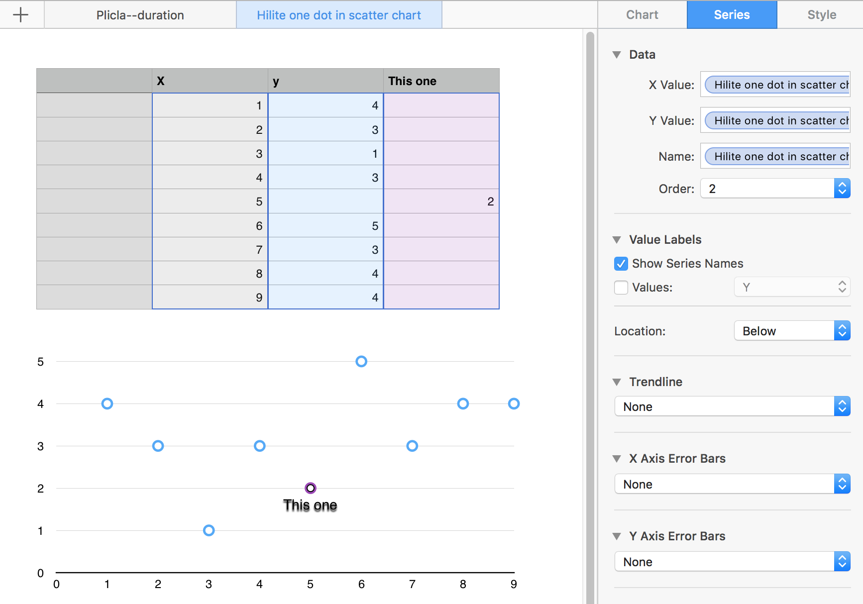
To select a different colour for the highlighted dot, click on the dot, then use the Style section of the inspector to set a new colour (and possibly choose a different shape for the data point).
Regards,
Barry
PS: The top three entries in the inspector were placed there by Numbers. I haven't investigated further, but you might explore and find that the 'extra column' holding the single point to be highlighted might not be necessary.
B.