It won't change the chart. On a chart, each series is given a color. Your series are January, February, March, etc. not Apple, Orange, Pear. If you "edit data references" and change it so the fruits are the series, each will have its own color but then they will be spread across the chart. The apples won't be clustered together, nor will the pears or the other fruits. The first group will be January for each fruit, then February for each fruit, etc. The X axis will be the months. And the legend will be the fruits, not the months.
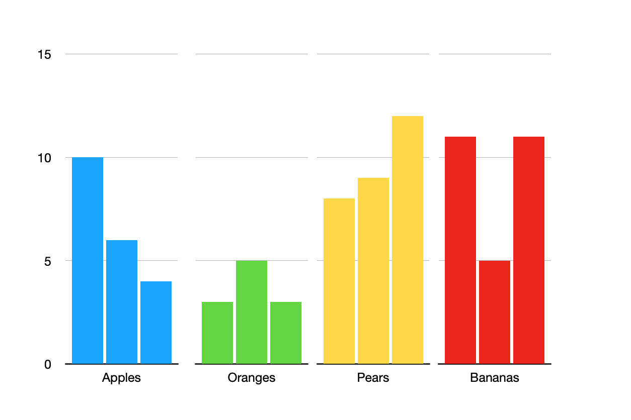
I was able to make the "chart" below but it takes some effort to make it and it will take additional effort to maintain it as you add more fruits and more months. It is actually four different charts, each plotting the data for a single fruit. Each bar in each chart is a month. I deleted the legends because all of the months in each chart are the same color so the legend was useless. I don't know what to suggest for a legend other than a text box of all the month names and a bunch of little squares positioned beside them with the chosen colors.
Here is what I did:
- I made the first chart for my row of apple data (I had only three months of data in the table). Make sure to set the Ymin and Ymax for the chart.
- Duplicated it 3 times (I had 4 fruits so need 4 tables)
- Removed the Y axis value labels from the three duplicates (select all the duplicates then make the change to all at the same time)
- Lined it all up.
- Edited data references for each chart to point to the correct row in my table
- Changed the bar colors for each chart (select all the bars in a chart and change them together).
If you add a new month to your table, you'll have to go into each chart and change the bar color for that new month. If you add a new fruit you'll have to duplicate one of the existing charts, edit the data references, and change the color of the bars.
For some changes, like if you need to change Ymin or Ymax later, you can select all of the charts and change them together vs one at a time.