Looks like no one’s replied in a while. To start the conversation again, simply ask a new question.

How can I create an x-axis on a Numbers line chart?

I suppose I've missed it, but in Numbers Help, it's easy to see how to generate a line chart with say a column of figures for the values (y-axis) but there doesn't seem to be a reference to how you tell numbers what data series you want for the x-axis. To take a simple example, suppose you have a set of values, one per a particular date. The obvious way to plot this is to have a linear series of dates along the x-axis with the corresponding values on the y-axis. I can't see how to do it - while you can alter the data source for the values (y-axis) quite easily, there doesn't seem to be a corresponding function for setting the x-axis. It seems to me to be the simplest possible thing you can do with a chart, but I can't find out how to do it! Some please tell me how to do it, or at least where to look in the Help for an answer.

iMac 27″, macOS 11.4

Posted on Jul 22, 2021 8:46 AM

Reply
Question marked as Best reply

Posted on Jul 22, 2021 11:09 AM

Not sure exactly what problems you are encountering, but here are two ways to make a chart that looks like a "line" chart when you have date in column A and a value in column B.


Note that column A is not a Header Column in the first table (for the 2D Scatter) but is a Header Column in the second table (for the 2D Line). A 2D Scatter can be a good choice, especially if you have dates at uneven intervals.


When making a chart I typically input the data in the table, select all of the two columns in the table, and Insert > Chart (followed by chart type).


Once a chart has been created you can click it and explore and change settings in Chart, Axis, and Series tabs in the inspector pane at the right.


If you haven't already, you should have a look at the Charting Basics template at File > New in your menu.


SG


SG

11 replies
Question marked as Best reply

Jul 22, 2021 11:09 AM in response to Living Fossil

Not sure exactly what problems you are encountering, but here are two ways to make a chart that looks like a "line" chart when you have date in column A and a value in column B.


Note that column A is not a Header Column in the first table (for the 2D Scatter) but is a Header Column in the second table (for the 2D Line). A 2D Scatter can be a good choice, especially if you have dates at uneven intervals.


When making a chart I typically input the data in the table, select all of the two columns in the table, and Insert > Chart (followed by chart type).


Once a chart has been created you can click it and explore and change settings in Chart, Axis, and Series tabs in the inspector pane at the right.


If you haven't already, you should have a look at the Charting Basics template at File > New in your menu.


SG


SG

Jul 22, 2021 2:17 PM in response to Badunit

Thanks for both replies. Oddly I thought I was doing exactly what SGII said: I had two columns next to each other. The first consisted of dates (I see now that I really wanted a scatter chart - thanks to Badunit I appreciate the difference between line and scatter charts); the second column contained a set of values. I simply want the first column to be the x-axis and the second the y-axis. Here's a tiny extract.


If I select this bit of my spreadsheet and choose "Chart" and pick one of the scatter charts and do some simple tinkering, I get something displaying my data but in a very odd format:


I really just wanted the dates to be along the bottom and the amounts in the tank to be on the vertical axis. This must be possible but it's not very intuitive, is it? There are oddnesses, like you can elect to have a title, but there's no obvious way to include a meaningful character string other than the word 'title'; and where did my column headers go? You'd think you could double-click the horizontal axis and get into formatting and editing it, but that ain't so. I will look at the Template since the Help really did not help with this at all. But of course I would love to hear what I did wrong from those who know!

Jul 25, 2021 6:45 AM in response to SGIII

Thanks for all the help so far. I am trying my best to reduce the general problem to one very specific one: creating a scatter chart with the type of data I have already mentioned - a column with dates (destined to be the x - horizontal - axis) and a column with integers (y-axis), so that there's one integer value per date - the dates rise throughout the column but the intervals between the vary, which is why we need a scatter chart. I am assuming that I will be able to format the data as I wish. Actually I found that the form 2-Feb-21 is not a standard date format, so to simplify matters before starting the graph I reformatted that column in the form 2 Feb 2021 which is standard.


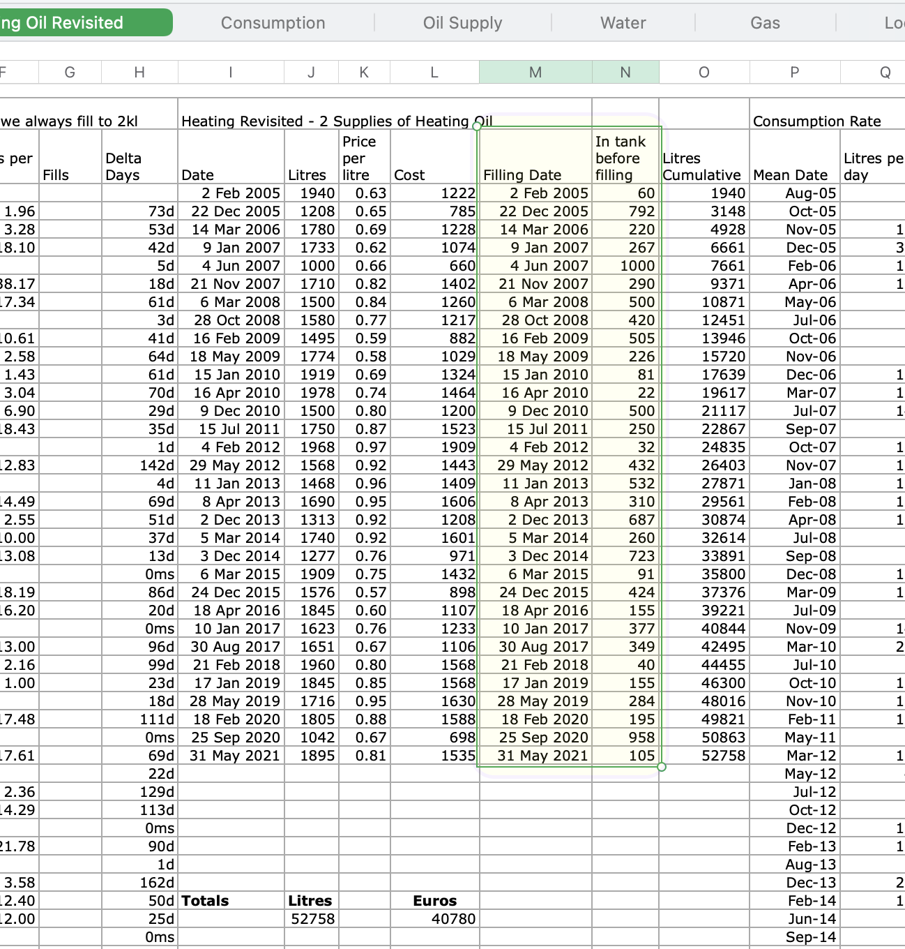
The information that I want to put on a graph is embedded in my spreadsheet which contains a lot of other data. I attach a screenshot where I've highlighted the bit I'm trying to be the source of my graph. You can see that I don't want to use the entire columns, just rows 2 to 34.


I selected my data area (including the column titles) and chose to draw a 2D scatter chart as recommended. The result wasn't what I expected (see next screenshot)


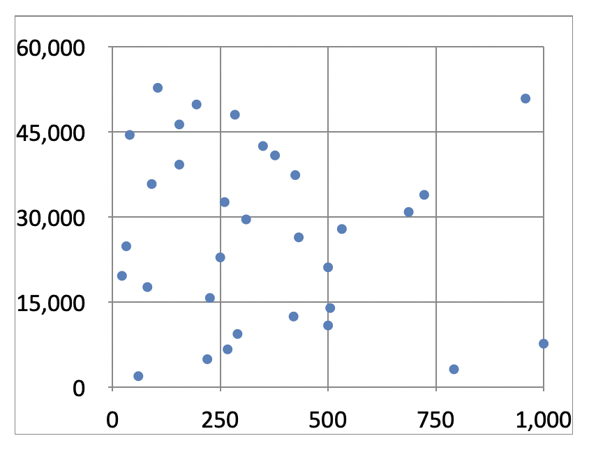
Obviously some of this is easily changed (for example the absence of lines between the dots), but I am still left with a very strange chart. Why does the 'y' axis go up to 60,000, even if the x and y are transposed? Where are my column headings?


Well, not to give up so quickly, I did all the editing that I could see was available. I re-transposed the columns, got the lines and values drawn in, named the axes - though not using the original texts at the top of the columns (they seem to be nowhere), but the critical problem is that I can't format the x-axis values -see screenshot.


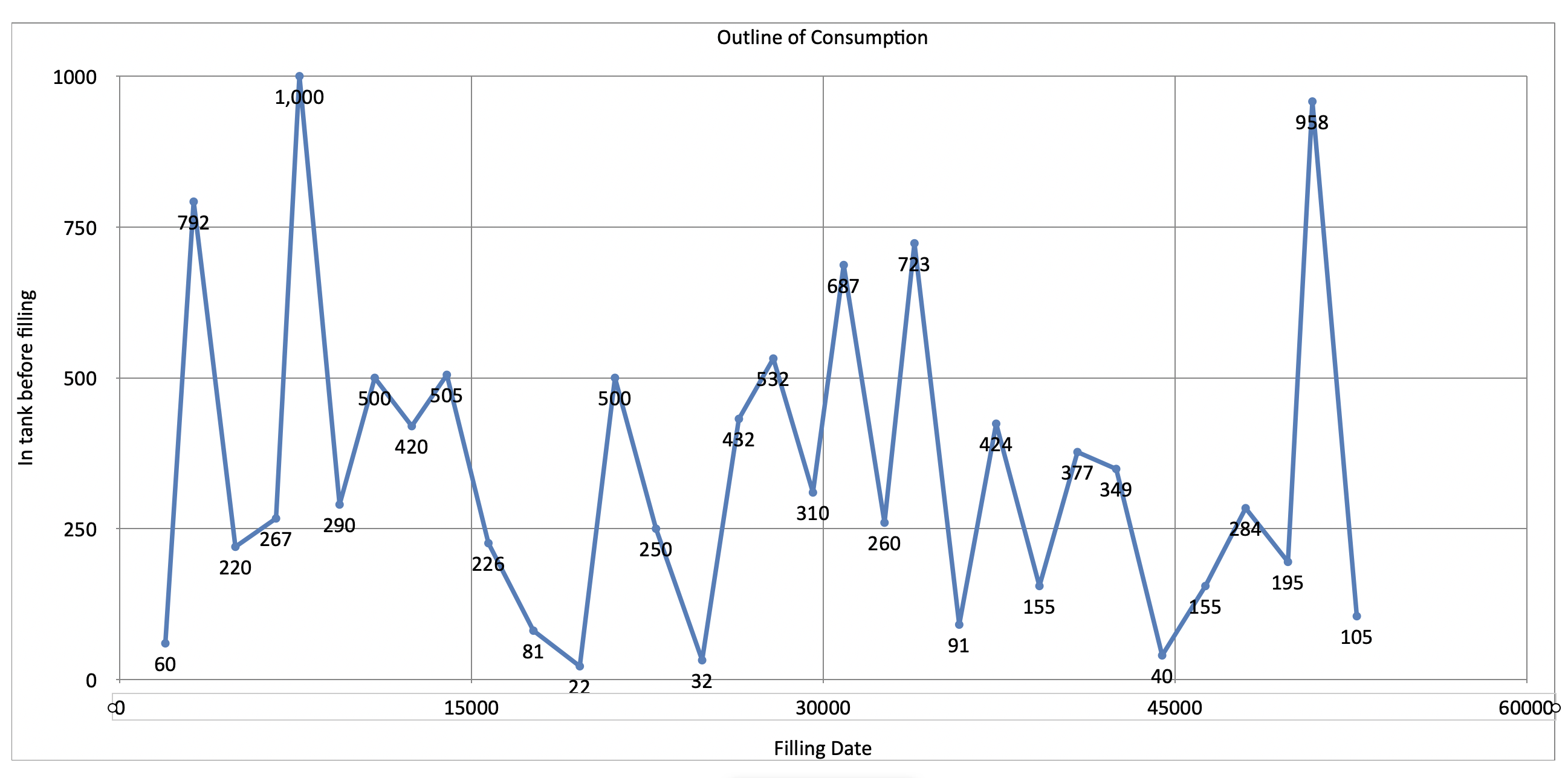
One is offered various formats, but 'date and time' which is the one I want, is dimmed. It is therefore still a struggle. I do regard the requirement here as very simple, but I just can't crack it. Sorry, though, there is more.


To make this even simpler, I tried to paste just the values of both columns into a new sheet and create the graph from that data. It kind of worked, but only after I realised that column A could not be used! Putting the data into columns B ad C produced a recognisable chart where the x-axis is what I wanted it to be, but why? What's the difference between the two approaches, and why was the one based on embedded data transposed? I simply can't understand it. Also, it's not really a solution, as it only uses values and isn't really linked to the other data on my sheet. Anyway thanks to anyone who has stayed with me, and here is the last view of my final attempt.


Jul 22, 2021 11:18 AM in response to Living Fossil

One point SGIII did not expand on was the difference between the scatter and line charts. The scatter chart is the only true X-Y chart. It needs numeric-like data for both X and Y. The line chart and the other charts are "category" charts. The X axis values are labels; they can be anything, they are treated like text. For the line chart they are spaced evenly across the X axis in the order they appear in your table.

Jul 22, 2021 7:32 PM in response to Living Fossil

I am wondering where those numbers on the X axis came from. They appear to be the number of seconds since Jan 1, 2001 or something close to that. Is that what appeared on the axis when you created your chart? Is there another column of data in that table that has numbers like these?


There is only one scatter chart, not "one of the scatter charts". Is this the scatter chart, the one that looks like a bunch of + signs? I am thinking it is because those numbers on the axis are exactly 1 year apart but I want to confirm.


Can you post a larger portion of your table, one that shows the header column(s) and row(s), if any, and shows from column A out to whatever column has your data and has the column letters and row numbers showing? That might help clue us in on what is going on.

Jul 22, 2021 10:38 PM in response to SGIII

I suggest keeping it simple and first getting it working with just two columns as shown in the posts above.


Make sure column A is formatted either as Automatic or as Date & Time.


When you reduce things to the basics I think you will "get it" and see that it is not complicated.


Two columns. The first column not a Header Column. Select both columns by clicking the column letters. Insert > Chart > 2D Scatter.


Then, once you've got that working, you can worry about other parts of your document (if needed).


SG

Jul 23, 2021 1:10 AM in response to SGIII

Thanks for the good advice. I'm off on a trip for a couple of days so will not be able to follow up for a bit, but I will report back on this thread. By the way, I never used the menu to start my chart - I just clicked on the little chart icon at the top of the window. I thought there were several scatter charts because one is offered different designs, perhaps different colours. But I agree there is only one basic scatter chart.

Jul 23, 2021 7:59 AM in response to Living Fossil

Living Fossil wrote:

I never used the menu to start my chart - I just clicked on the little chart icon at the top of the window.


I often use the icon in the Toolbar too. It's the same thing. When explaining to others, though, it's easier to say Insert > Chart > 2D Scatter than try to describe which icon to choose. I think in general that charts in Numbers aren't too hard if you start with the basics. They do require some poking around and trying different things. The same is true for Excel.


SG

Jul 25, 2021 9:44 AM in response to Living Fossil

Living Fossil wrote:

You can see that I don't want to use the entire columns, just rows 2 to 34.


In Numbers you generally don't want to have one big "Excel-like" expanse of cells such as is shown in your screenshot.


I think you will find that life gets much easier (for charting and otherwise) if you take advantage of the fact that Numbers is designed to allow more than one table on one sheet. And each table can have Header and Footer Rows. Your headings at the top of the table should be in Header Rows, and your totals at the bottom in a Footer Row(s).


That way in formulas can refer to entire columns (all the body cells in a column). I recommend having a look at the templates at File > New in your menu for good examples of how to make effective use of the unique design features of Numbers.


Also, keep in mind that using merged cells can cause unexpected results. You can achieve the same visual effect without them.


SG


Jul 26, 2021 8:41 AM in response to SGIII

Thank you for all that - I mean all the replies I've received in this thread.


It's back to school for me. For example, I didn't realise that the concept of a Table within a sheet really existed in Numbers. I have been trying to employ my intuition, coupled with my very out of date (30 years!) knowledge of Excel, which at one time was very extensive - I used to model entire businesses.


Sadly this mainly intuitive approach has not worked, and my attempt to use the Numbers Help material to answer very specific questions hasn't helped all that much either, because there are larger conceptual things one has to master first (like Tables - and how spreadsheets can be linked together, which I haven't yet started on!). I got on pretty well simply putting in data and making fairly elementary calculations, but everything else needs some kind of tutorial approach. Let's hope I find it in the templates as you suggest..


Anyway thanks for being patient enough to read what kind of problems I was having. I still don't really know why I had so much trouble with formatting a simple x-axis, but I see that creating an individual Table, albeit within a larger sheet, and creating a graph from that, is the way to go. And on the way I hope to understand what was so fatal about Column A in my second test. Well, it keeps your brain alive. Sincere thanks again for all the input.

How can I create an x-axis on a Numbers line chart?

Welcome to Apple Support Community
A forum where Apple customers help each other with their products. Get started with your Apple ID.