Apple Intelligence is now available on iPhone, iPad, and Mac!

Looks like no one’s replied in a while. To start the conversation again, simply ask a new question.

Widgets rearrange home screen after upgrade

Just upgraded my iPad from 14.x to 15.3.1 and after the reboot there were a bunch of widgets on my home screen. Most of the apps on the bottom two rows got scattered over the other pages. For many years, I've had all my favorite apps on the home screen, ordered just the way I wanted. Had I known this would happen, I would have taken a screenshot of the home page so I could move things back to where they were. After deleting the widgets, it took a lot of time finding and moving things back where I wanted them.

Next up is the upgrade to my iPhone and I'm hoping I won't have to go through this again. Anyone have any tips, other than taking the screenshot before the upgrade and moving things back manually afterwards? I'm really not interested in using any widgets right now.

iPad Air 2, iPadOS 15

Posted on Feb 23, 2022 3:48 PM

Reply
Question marked as Top-ranking reply

Posted on Feb 23, 2022 4:29 PM

As you have discovered, update to iPadOS15 introduced the ability to add Widgets to your Home Screens - some being added to your first Home Screen, by default, during the initial update to iPadOS 15.x. This behaviour, seen upon initial update to iPadOS15.x, cannot be avoided.


Widgets placed on a Home Screen now individually occupy one or more elements of a 4x6 icon grid. Home Screens without Widgets retain the familiar 5x6 icon grid. With the grid accommodating fewer icons when Widgets are present, other App and Folder icons may be displaced to the next Home Screen - and this may have a ripple-effect where Home Screens icon grids are fully populated.


Removing Widgets from a Home Screen does not cause displaced icons to be restored to their prior locations. Re-arrangement must be done manually. This is perhaps a less onerous task than might initially appear, as Home Screen icons should still follow their original sequence (reading left-to-right / top-to-bottom). With multi-selection of App/Folder icons, it is possible to simultaneously move several icons if you wish.


The easiest way to restore icons to previous positions is to start with the first Home Screen - and remove any Widgets that you don’t require. 


Next, select the second Home Screen; icons displaced from the first Home Screen are likely to be at those starting at top-left. Drag App/Folder icons back to the first Home Screen - each likely to having been originally those appearing last in the sequence of the first Home Screen.


When you’re done, move onto the third Home Screen - moving icons back to the second Home Screen - and so on.

Similar questions

12 replies
Question marked as Top-ranking reply

Feb 23, 2022 4:29 PM in response to JohnnyDawg

As you have discovered, update to iPadOS15 introduced the ability to add Widgets to your Home Screens - some being added to your first Home Screen, by default, during the initial update to iPadOS 15.x. This behaviour, seen upon initial update to iPadOS15.x, cannot be avoided.


Widgets placed on a Home Screen now individually occupy one or more elements of a 4x6 icon grid. Home Screens without Widgets retain the familiar 5x6 icon grid. With the grid accommodating fewer icons when Widgets are present, other App and Folder icons may be displaced to the next Home Screen - and this may have a ripple-effect where Home Screens icon grids are fully populated.


Removing Widgets from a Home Screen does not cause displaced icons to be restored to their prior locations. Re-arrangement must be done manually. This is perhaps a less onerous task than might initially appear, as Home Screen icons should still follow their original sequence (reading left-to-right / top-to-bottom). With multi-selection of App/Folder icons, it is possible to simultaneously move several icons if you wish.


The easiest way to restore icons to previous positions is to start with the first Home Screen - and remove any Widgets that you don’t require. 


Next, select the second Home Screen; icons displaced from the first Home Screen are likely to be at those starting at top-left. Drag App/Folder icons back to the first Home Screen - each likely to having been originally those appearing last in the sequence of the first Home Screen.


When you’re done, move onto the third Home Screen - moving icons back to the second Home Screen - and so on.

Feb 25, 2022 2:03 PM in response to JohnnyDawg

Dear JohnnyDawg,


As a long-standing Apple enthusiast, it’s upsetting to learn that updating your iPad has caused you such discontent. It really is a pity that the initial default iPadOS 15 start-up preview Home Screen - that is so disorientating - hasn’t been modified yet to stop iPad Updaters being thrown into confusion.


It’s a shame if you feel things haven’t started well for you as this may have obscured the brilliant new features in iPadOS 15 you should have been looking forward too.


Nevertheless, you will be happy to learn there are easy solutions inside your iPad that can change this unfamiliar Home Screen all around. They are a perfect remedy for the issues that put a lot of Updaters out of kilter when they first meet iPadOS 15. And you can be confident that every one of them is Apple recommended here in the Support Communities too.


Apple Recommended


In order to rearrange your Home Screen pages exactly how you like them, it would be helpful if I could see how you would like your layout to change. For example, It’s important to know if you use your iPad in landscape or portrait view or whether you are using or deleting a particular kind of widget that might be problematic.


Please can you follow the simple instructions below and include an uncropped picture of your Home Screen by return reply so that we can then discuss what you need to do. It is generally the case that the more information you can give community members, the easier it will be to get the help you need.


Many iPadOS 15 Updaters are now learning how to remodel their landscape or portrait view Home Screens back to they way they like them by rediscovering their bigger apps and bigger folders and bigger spaces again and returning their layouts to the familiar 5x4 20-icon grid pattern of previous operating systems.


The modifications produce a new iPadOS 15-a-14 Style Hybrid Home Screen that blends the swish elan of the icon layout in iPadOS 14 with all the cutting-edge dynamic time-saving enhancements of iPadOS 15.


No special Accessibility visual zooming aids are required either, as all the mainstream adjustment controls you need are already at your fingertips and inside your iPad just waiting to be tapped for free.


For despite your iPad initially appearing strangely distorted and unchangeable at the moment, the incontrovertible truth - that Updaters have welcomed with open arms - is as follows:


  • Apple hasn’t shrunk one single icon;
  • that wrongly accused Use Large App Icons toggle switch works perfectly well;
  • wayward disorganised icons can all be easily rounded up and caged back into a 5x4 20-icon grid pattern exactly how you like them organised and ordered again;
  • all those constricted squashed gaps between apps and folders can be massively re-inflated once more back up to their previous minimum sizes that made them easy to distinguish in previous operating systems, and;
  • iPadOS 15 doesn’t compel you to have giant widget weather boards and 30 icons in a 6x5 grid grouping on any Home Screen page against your will.


There are in fact only two actual physical changes to the new operating system Home Screen. One of them, that marginally alters the screen estate boundary, can be modified so that it causes no impairment to the user interface whatsoever. The second, that allows 30 icons to be set out within a 6x5 matrix, can be completely cancelled away.


Back Home


When you follow the basic steps to properly readjust the distorted perspectives of the iPadOS 15 default Home Screen back to a more familiar view, you’ll be enjoying your iPad without having to wade through the jumbled upheaval that’s blocking your path to the classic user interface all Updaters know so well.


You are guaranteed to be reunited with all your bigger icons from iPadOS 14 and earlier operating systems that you are unable to see at present. I am confident, that when we both study what is happening on your screenshot, we’ll be able to get it all sorted out in two ticks. Then you can lick your iPad back into shape and get it looking exactly as you liked it before once more again.


In the meantime, keep your pecker up and just ignore any silly nonsense that claims nothing can be done to alter iPadOS 15. All of it has been proven wrong time and time again.


Be assured that plenty of iPadOS 15 Updaters are currently all happily using their iPads the way they’ve always liked their devices laid out - exactly as described above. And more than a few (including me) have now found fifteen love with some very fast and clever multitasking improvements too.


Hoping to hear back from you soon.


Yours helpfully,

Jock M.


[Personal Information Edited by Moderator]


Feb 26, 2022 10:31 AM in response to JockMacAdam

Dear JohhnyDawg,


Further to my initial response above, I am posting the following details set out here as a general one-size-fits-all solution to the Home Screen upheaval you suffered following the initial default iPadOS 15 start-up sequence on your iPad.


The set instructions for remodelling iPadOS 15 should help the vast majority of iPad Updaters fix all of their so-called “shrunken” icons, “broken” toggle switches, squashed icon gaps and more. As also explained above, It will also return the classic 5x4 20-icon grid pattern that many Updaters miss the most.


However, as requested previously, I would still need to study a screenshot picture of your Home Screen if there are any out of the ordinary peculiar features that need to be re-established again.


Please remember, that despite your icons having the appearance of being smaller in the present tightly compacted distorted perspective of iPadOS 15, no apps or folders have actually been physically shrunk by Apple and the new operating system. When freed from their current constraints, you will once again “see” your large icons as they have always appeared - at the exact same size as previously.
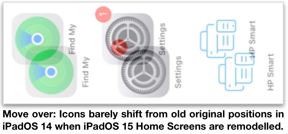


While all of this is comforting, there does remain one minor drawback. A new tighter screen estate boundary design, imposed by iPadOS 15, now means a small portion of your iPad Home Screen will have to be left barren when the remodelling methods detailed here are completed.


Nevertheless, many iPadOS 15 Updaters believe it is a very small price to pay to expand and restore all their cherished and carefully curated Home Screen icons to how they were previously arranged in earlier iPad operating systems.


As such, it is all good news. Once your Home Screen is remodelled, you will then be able to enjoy the swish popular elan of the iPadOS 14 5x4 20-icon grid pattern as now combined with some truly brilliant new features in iPadOS 15.


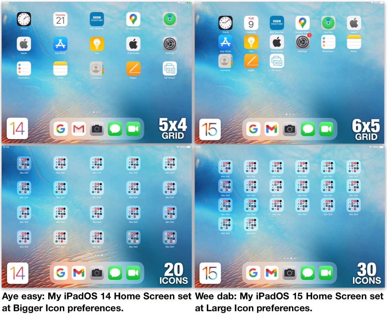
But before getting started, take a long look at the screenshots below. Make special note of the 12mm horizontal minimum gaps between icons in the iPadOS 14 Home Screens. Now compare those gaps to the tightly compacted 4mm horizontal gaps in iPadOS 15 that contract when Updaters remove their widgets.


This fix brings back (particular) widgets (in a special way) to re-inflate the new restricted iPadOS 15 gaps back up to the minimum 12mm distance enjoyed in previous operating systems.


Now it’s time to get your old iPal back again with your 10-Step Guide that will blow those iPadOS 15 woes away.


1. Confirm Use Large App Icons toggle switch is set at green on position.
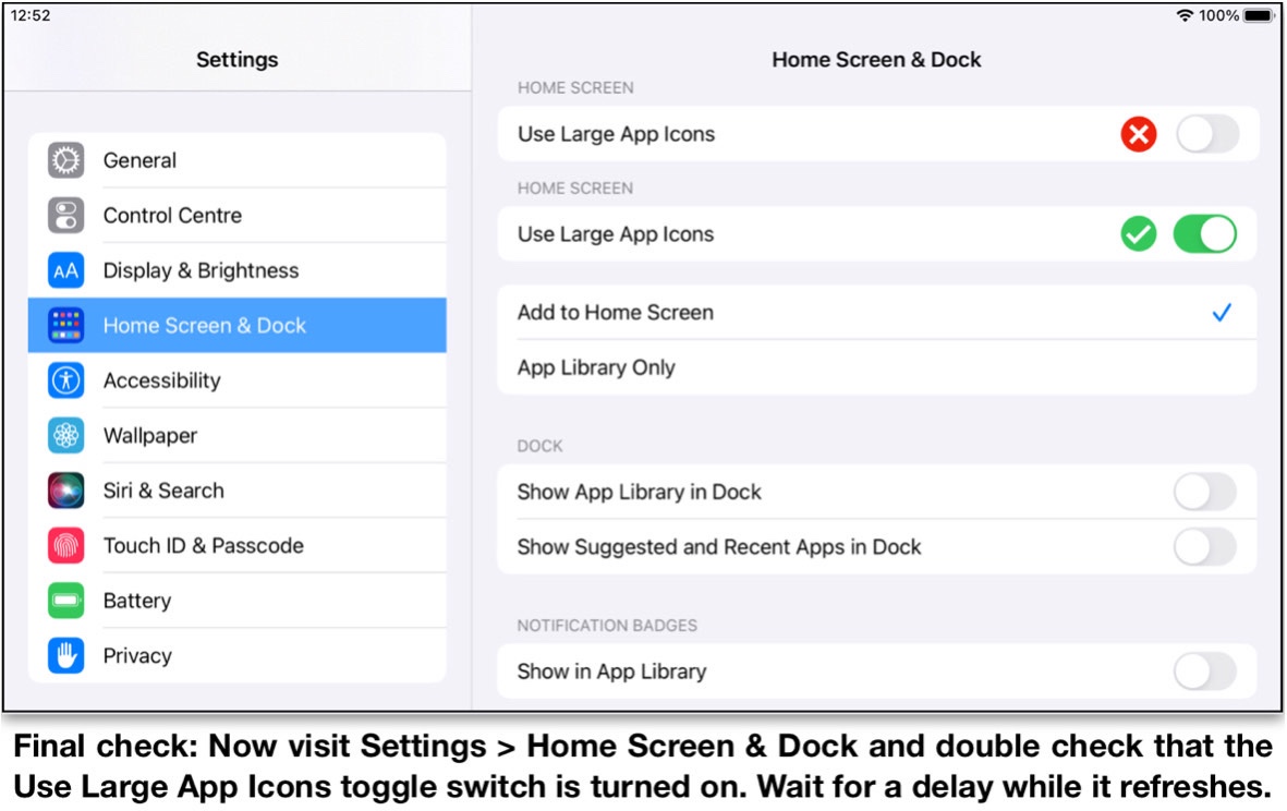


2. Delete all iPadOS 15 widgets or drag them off Home Screen workaround page.


3. Arrange Home Screen workaround page so app and or folder icons do not exceed 20, excluding any contained in Dock (as shown in landscape view below).
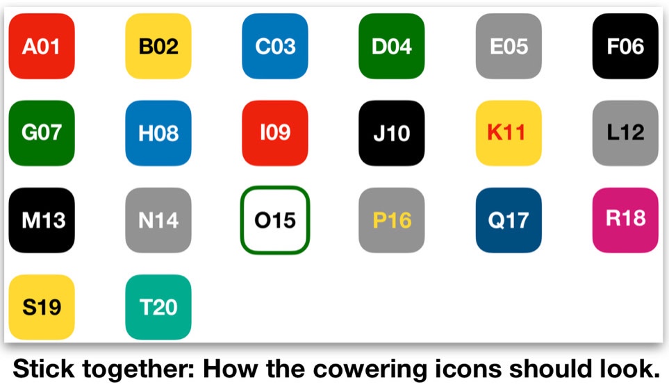


4. Open App Store. Search Post-it app (as shown below). Tap Post-it icon. Tap GET. Tap Install. Enter password. Tap Sign In.
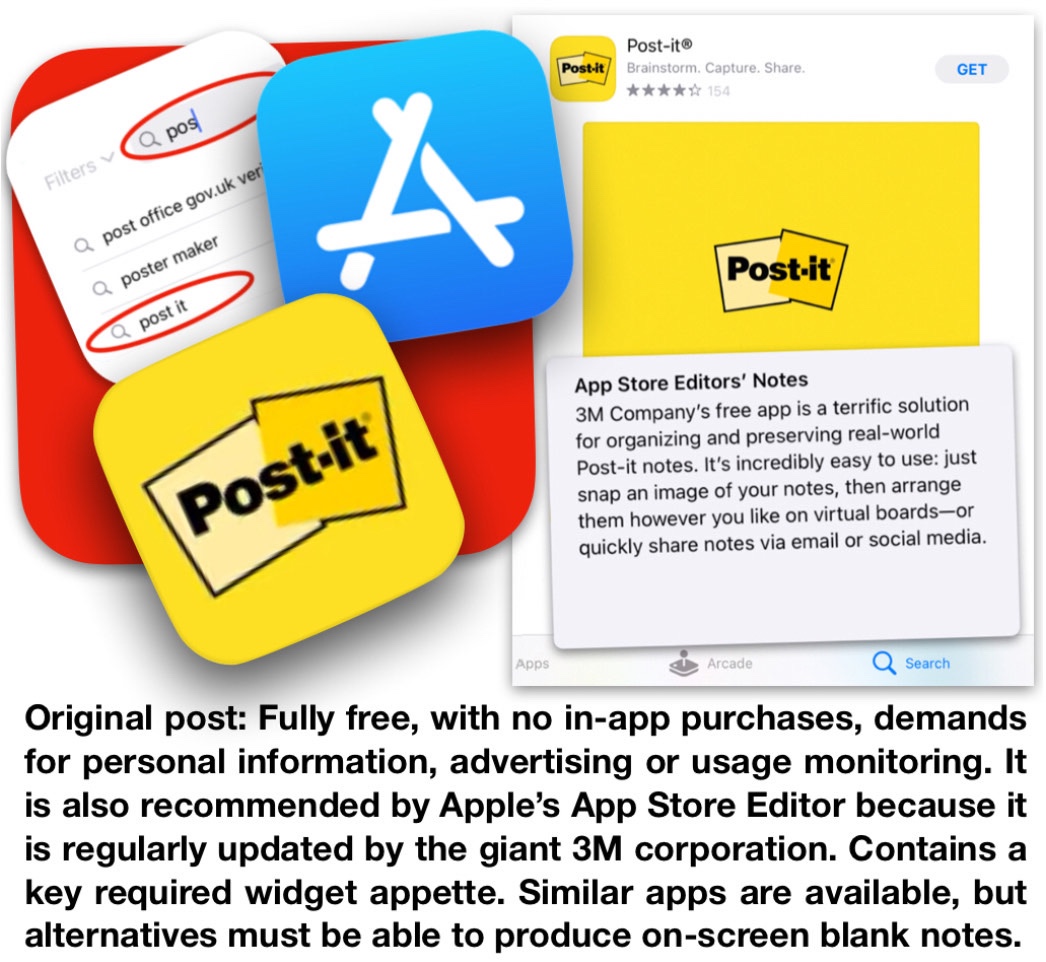


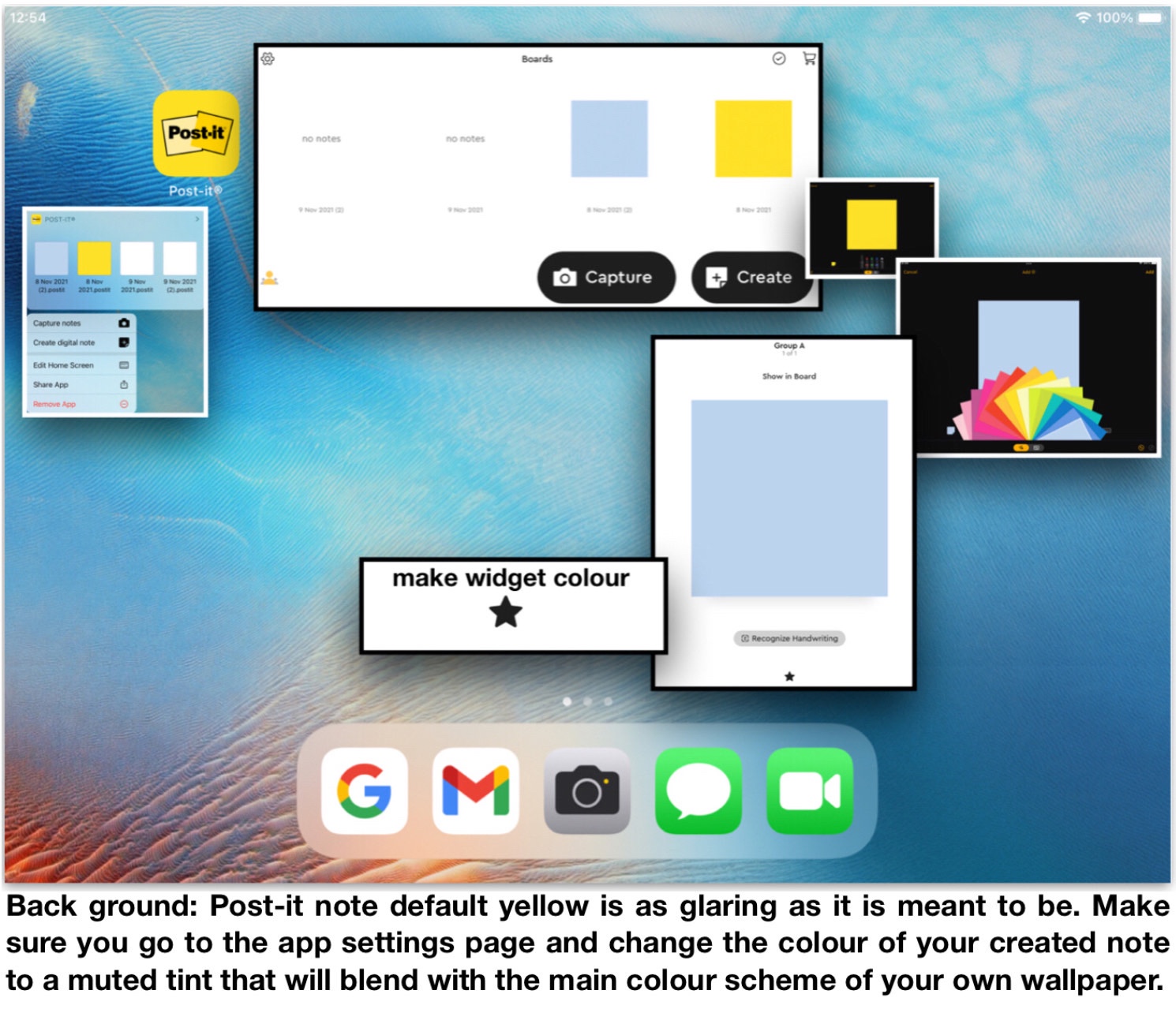
5. Drag Post-it app to separate Home Screen page. Open App. Tap Create. Tap small default yellow note. Tap personal colour choice from fanned deck. Tap Add + . Tap Cancel. Tap chosen colour square. Tap hollow star. Check star has turned solid black. Quit and forget main Post-it app.


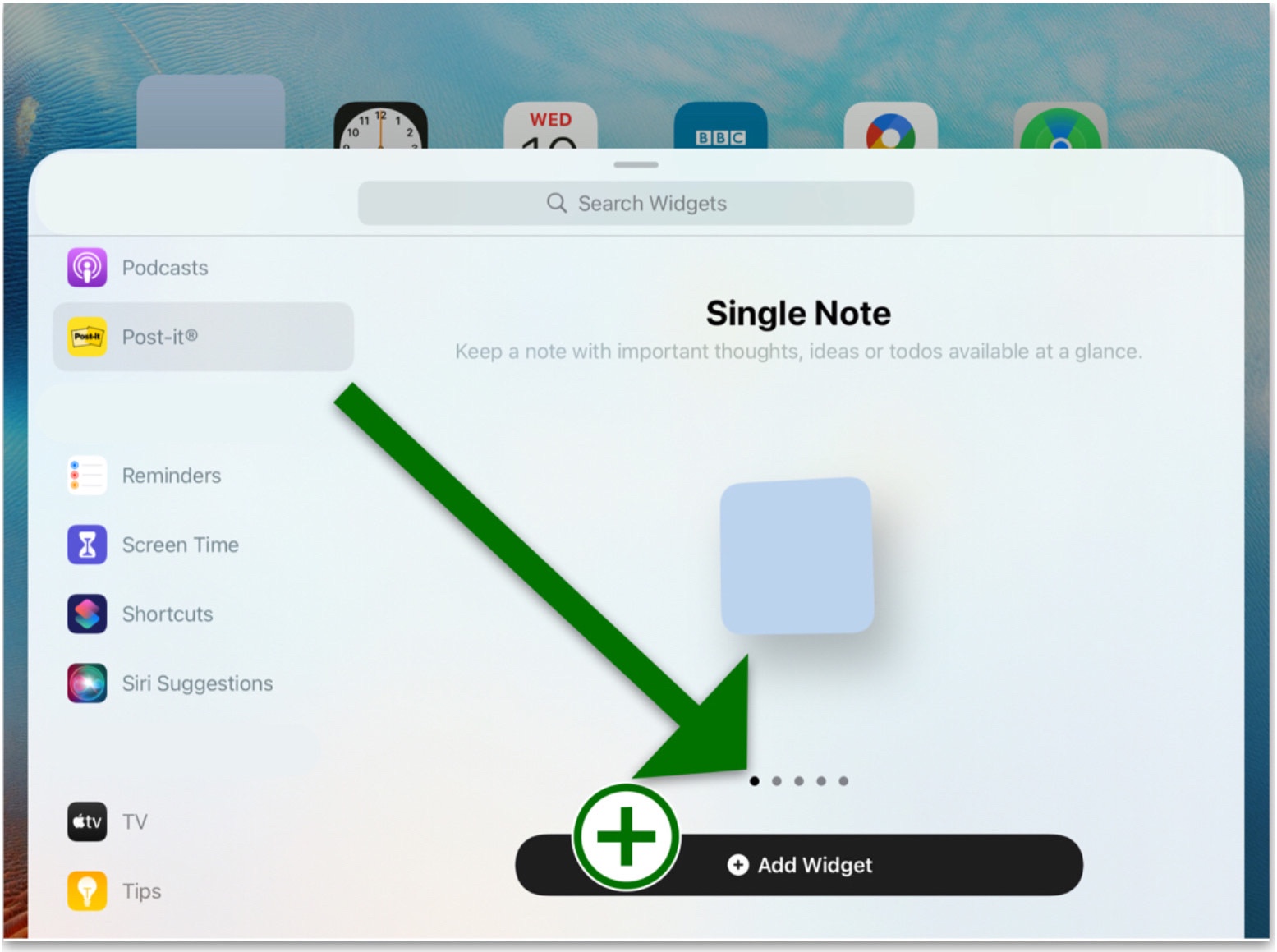
6 Touch and hold Home Screen workaround page. Tap +. Open Post-it widget. Select Single Note widget style (as shown arrowed below). Tap Add Widget. Repeat Tap +, Open Post-it widget, Tap Add Widget sequence until four widgets are added.


7. (1) Rotate iPad to portrait view. (2) Drag four widgets to top of Home Screen workaround page. Tap Done. (3) Use iPad in any orientation. (4) Icon herders can be placed to left or right in landscape view or top or bottom in portrait view. (5) Screenshoot icon herder colour as wallpaper to make them vanish.
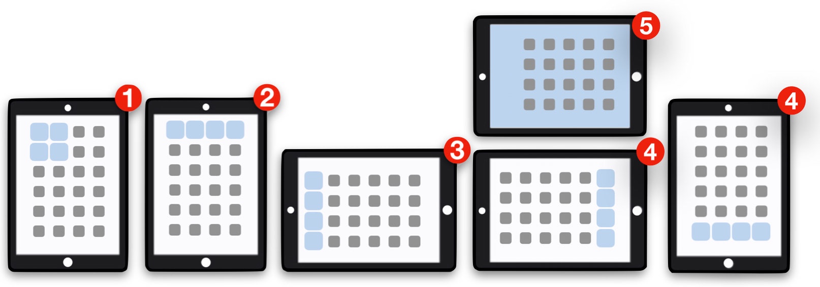


8. Repeat steps 3., 6. and 7. for further Home Screen workaround pages as required.


9. Er …


10. That’s it!


This technique makes the new iPadOS 15 screen format much less irritating as it subdues the worst aspects of its distorted perspectives and severely impaired unfamiliar user interface into the background.


The following screenshots show the improvements that the new iPadOS 15-a-14 Style Hybrid Home Screens can achieve.
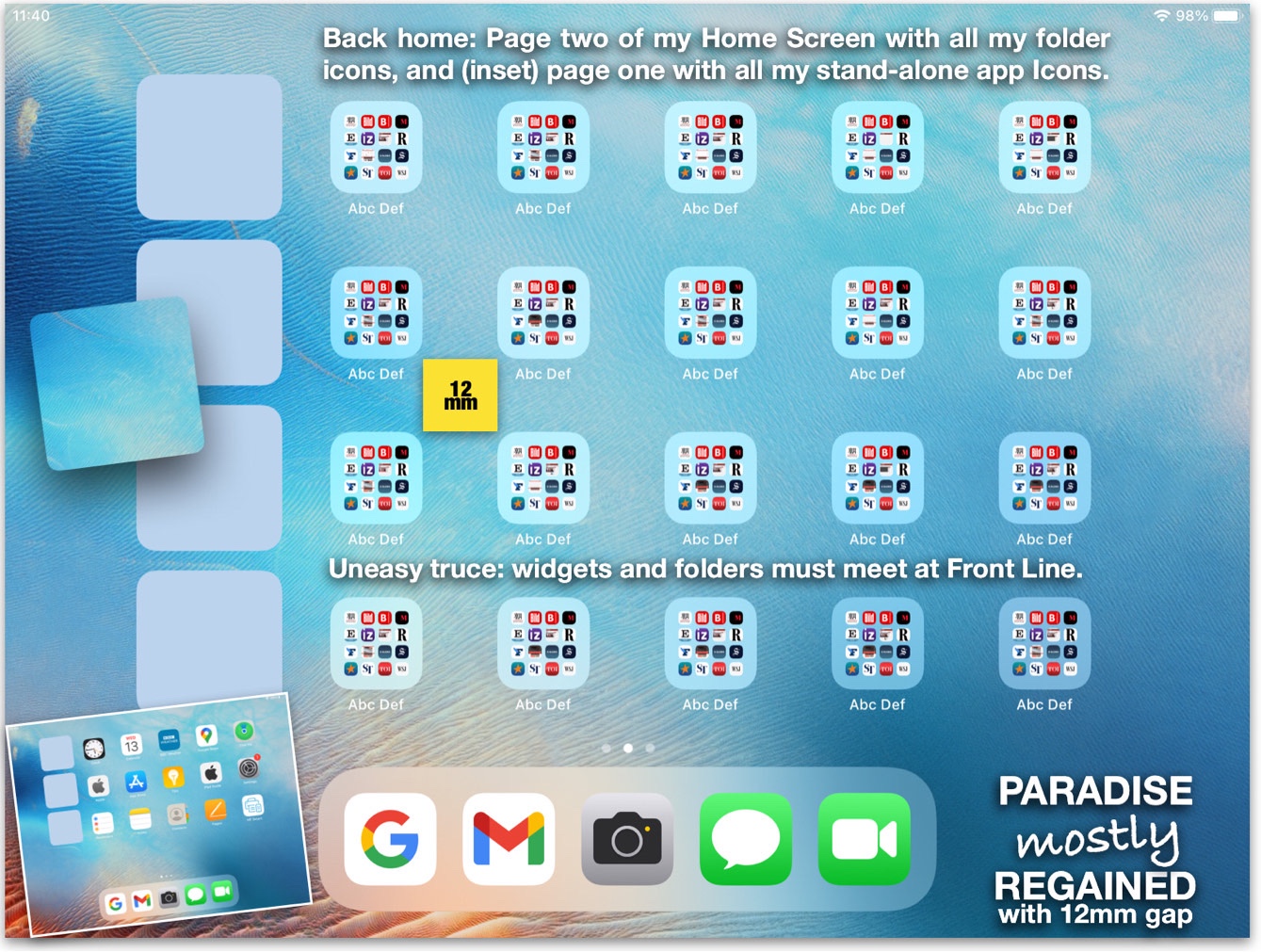


The iPadOS 15 restricted icon gap spaces have now been massively inflated again to three times their size and wayward icons have now been caged back into their old familiar 5x4 fixed grid positions.
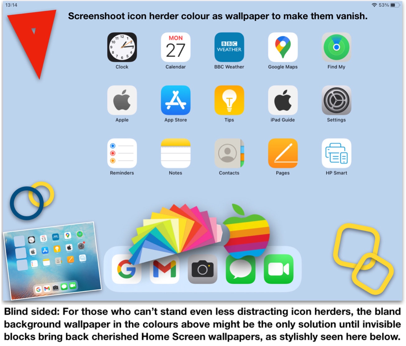


After developing the above techniques in October 2021, I have since made further advances with on-screen photo apps that can make icon herder widgets completely invisible against any original screen wallpaper of choice.
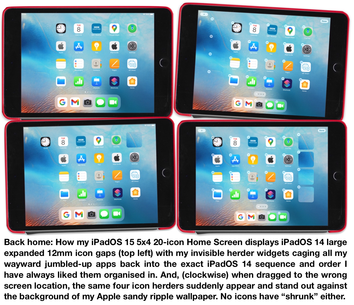


I hope to post more details on the best on-screen free photo apps that can produce the invisible widget screens above very shortly.


Yours helpfully,

Jock MacAdam


Mar 2, 2022 1:12 PM in response to JohnnyDawg

Dear JohnnyDawg,


Please accept my apologies for being distracted last week by the brilliant LotusPilot endorsement of the iPadOS 15-a-14 Hybrid Home Screen fix that added more respected independent confirmation the solution works.


It took my mind off what I intended to tell you. Instead of accepting your thanks, I actually meant to thank you very much indeed for posting that shrewd gem of a question that encapsulates all the real points about this issue.


Thanks to you, this thread has created the space to address the actual issues that will let iPad Updaters see the real facts so that more new and improved ways to fix the problems can be found.


The shift from wrongly blaming a toggle switch that isn’t broken to demanding iPhone-like Home Screen modelling widgets may still take time, but app developers are rarely slow to act when there’s a hungry market to feed.


Thanks also for remembering to highlight your phone report too - great stuff! As I suspect you know already, your result goes right to the heart of the matter. Hopefully more Updaters will now start thinking about this as well. 


It’s been a hectic last couple of weeks for the iPadOS 15-a-14 Hybrid Home Screen fix. Firstly, Apple recommended the solution. Secondly, LotusPilot also gave it the thumbs up. Now thirdly, yet more proof has been gathered once again that the fix still works on the largest iPads running the very latest iPadOS 15.3.1 software.


The newer 2022 iPad Pro 11-inch (3rd generation) running the latest iPadOS 15.3.1 software above was just unpacked this week. Bingo! As predicted, the hybrid 15-a-14 fix was like a pride of Scottish wildcats rounding up a herd of terrified haggis.


As previously with the earlier iPad Pro 11, every large app and folder was caged back into the old familiar bigger gapped strict 5x4 20-icon grid pattern in a matter of seconds without a moment’s hesitation. In an instant the old iPadOS 14 Home Screen format was reborn yet again.


Along with the latest iPad Air results. it now means there is no iPad that can withstand the power of the hybrid 15-a-14 treatment.


It has been a real pleasure to rub shoulders with you here and a real pleasure to read your kind words. This is the first time any community member has thanked me on the forum. I am also very grateful and much obliged for your double appreciation.


Yours thankfully,

Jock


Mar 4, 2022 1:53 PM in response to LotusPilot

Dear LotusPilot,


It was just another normal foggy Monday morning here in old XXXXXX town when my own world suddenly shattered into smaller pieces.


The moment I finished downloading iPadOS 15 was the instant all my app and folder icons imploded into tiny specks. An installer programme wrongly ignored my Bigger app size preference choices that had always been obeyed by all previous operating system updates.


As the new software first booted up, I was truly perplexed at the disarray that greeted me. Not only had my icons been downsized - and then some, they had also been jumbled up all together and scattered across my Home Screen pages.


To make matters worse, amid all this chaos, it appeared iPadOS 15 had taken an imperious (I’m-sorry-Dave-I’m-afraid-I-can’t-do-that) decision on its own behalf to crowd out all my tiny icons with giant widgets intent on land grabbing as much of my screen estate as possible.


iPad Panic


Leave out the swirling-mist muffled clang from the bell on the world famous XXXXXX XXXXX Bridge and this is a scene millions will never forget.


Those most interested in this thread will be familiar with a sinking feeling of panic in the pit of the stomach. This happens when nothing you do is bringing back that old iPad you knew and loved.


I too saw the shrunken icons. I too blamed the Use Large App Icons toggle switch. I too cursed the shrink bug. Only now do I know the amazing truth. There are no shrunken icons. There is no broken toggle switch. There is no shrink bug.


It all happened so fast is the motto of unreliable eyewitnesses the world over. What they “see” is usually not what happened.


To fix this problem - and or to find practical interim workarounds that you yourself have called for - iPadOS 15 Updaters need to discover what actually really happened. And, as the facts will show, that is a fascinating and very different thing indeed from what appeared to happen on the surface.


If inaccurate feedback is given to Apple nothing will be done to address the real problems at source. No “shrink” bug can be found that doesn’t exist. No toggle switch can be fixed that isn’t broken - no matter how many Updaters are urged to complain about them by high-level members.


Just last week, unhappy iPadOS 15 Updaters were advised to update their software yet again to include a “bug fix” for “shrunken” icons.


But the evidence doesn’t lie. I’m still betting myopic Mr. Magoo captures the illusive Loch Ness Monster long before any bug is found.


Only when we know what is happening, will it be possible to tell Apple what the problems are and for members to find more ingenious workarounds and for invisible widget experts to work their magic for iPad screens.


A phantom cul-de-sac software bug or broken toggle switch leaves us all trapped and powerless. Only the truth will set us free. The following is intended to snap iPadOS 15 Updaters out of despondency.


Good News


The superimposed screenshots below of my iPad running iPadOS 15 show the app icons on my Home Screen front page against a blank white wallpaper with the Use Large App Icons toggle switch set to off and then on.


My switch had never been broken. The same test has also been duplicated on five different iPad models with the same result. Members can test this out on their own iPad by importing their own screenshots into their Pages app to prove their toggle switch is equally innocent too.


The superimposed screenshots below of my iPad running both operating systems also show that large icons are exactly the same size in iPadOS 14 and 15, even although the new set have been moved to a slightly different location. This test was also duplicated on one other iPad model.


No “shrunken” icons. No “shrink” bug. No “broken” toggle switch. Big deal, you might say. For there is no disguising the fact that we all know there is still something very wrong indeed going on in the world (other than pestilence and war). But here’s the good news. iPad owners can now do something about it for themselves.


I hope this post has convinced you that something very strange is afoot with the new operating system. The fact that we all saw (and can still see) “shrunken” icons on our iPads that don’t exist should open our eyes in more ways than one.


Now that we’ve been reunited with our long lost iPadOS 14 Bigger icons, we need to know what is making them behave so strangely in iPadOS 15. Only then can we make them do what we want again. This is the extraordinary vital key at the heart of this riddle that has intrigued community members worldwide.


All of the above is why it is important to reply with details of any inaccuracies you think you have discovered. It would help if you explained their significance and relevancy, if any, to the matter at hand.


On your other point, I meant acknowledgement instead of endorsement.


Yours gratefully,

Jock


[Personal Information Edited by Moderator]

Feb 26, 2022 1:16 PM in response to LotusPilot

Dear LotusPilot,


Thank you very much indeed for taking the time and effort to go through my post on a solution for the great iPadOS 15 upheaval that Updaters have come to dread. I am honoured and very much obliged for any small insights, suggestions and corrections you might have to offer.


As the nonpareil expert on everything iPad you have been a great inspiration to me since I first joined the Support Communities a few months ago. The breadth, depth and volume of your knowledge in this area is truly astonishing.


As to your specific point on the application of the new iPadOS 15-a-14 Hybrid Home Screen, I am afraid I’ m a bit lost. Looking back at your first and second posts, you appear to have changed the iPads applicable to a 5x4 grid from an iPad mini 4 to the 7.9” and 9.7” models.


And this is where I am really at a loss. To my direct knowledge, I (and others who have repeated the same techniques and achieved the same results as me) have found the 5x4 20-icon grid on two iPad Air 2s, one iPad Pro 11 inch, one iPad mini 5, two iPad mini 4s and, by word of mouth, another eight various iPad models. This is both before iPadOS 15 updates and after the 15-a-14 Hybrid Home Screen fix has been completed.


To be clear, it is the icon herder widgets (invisible or otherwise) that alter the lay of the land - so to speak. It is the herders that force the larger gaps between icons back up to the greater pre-iPadOS 15 distances and it is the same herders that force the icons to adopt the 5x4 20-icon matrix again because they have no where else to go. That is why the solution only allows for 20 icons on each Home Screen workaround page at the start of the fix.


Please believe I have absolutely no interest in passing off something as a solution that is incorrect - even in the very smallest degree. I would therefore very much welcome your critical input so that this fix might be improved yet again and be made even better.


The despondency that the optically distorted perspectives of iPadOS 15 have generated among many older, poorer and visually challenged Updaters has been compounded by doomsayers peddling ludicrous untruths about “shrunken” icons and so-called “solutions” that involve throwing away iPads and buying new tablets from rival manufacturers.


I took up the challenge of finding this solution to help my fellow community members as I too once wrongly believed my icons had shrunk in half. I certainly didn’t walk around with a giant magnifying glass, that made small children hug their mums and start crying, because I thought my icons were too big for me.


Casablanca is my wife’s favourite film. I like the song fight scene. But it’s the final scene that has just reminded me it doesn’t take much to see that the problems of a few little icons don’t amount to a hill of beans in this crazy world.


That may well be so. For this world is very crazy indeed right now with a capital K. But, no matter how small the issue, it is always the truth that shall set us free.


Please accept my very warmest thanks again for your input. Any and all further points you might make - at any time on this or any other subject - will always be respected and welcomed here.


Yours gratefully,

Jock M.


[Personal Information Edited by Moderator]

Feb 26, 2022 3:36 PM in response to JohnnyDawg

Dear JohnnyDawg,


You are very welcome. It was my pleasure. If you have any problems, please do get back to this thread and I will try to help you further as best I can.


The post by LotusPilot - covering an area I only mention in passing - is also very helpful because it will allow you to keep your herders and icons apart as you organise each Home Screen page.


If you can find an iPhone transparent widget app that works on an iPad, I would be very grateful if you could let me know. This would bring the iPadOS 15-a-14 Style Hybrid Home Screen to a lot more people who need it badly.


Yours helpfully,

Jock M.


[Personal Information Edited by Moderator]


Apr 15, 2022 8:52 AM in response to JohnnyDawg

I made the mistake of being curious to what a widget was and trying new things. Added a battery widget hoping I could see % in the corner, instead it was a massive waste of space on my home screen so I got rid of it. But too late, damage done. Several more of these widgets were there, and all my apps out of order or missing entirely. Absolutely infuriating. It seems like they can’t do literally anything right these days.

Widgets rearrange home screen after upgrade

Welcome to Apple Support Community
A forum where Apple customers help each other with their products. Get started with your Apple Account.