nimbus9 wrote:
"I can plot a standard scatter plot, with SYS and DIA in different coloured points, but that is not satisfactory. I want a plot with a bar from DIA to SYS"
You can insert 2D Scatter chart and format it to look something like this.
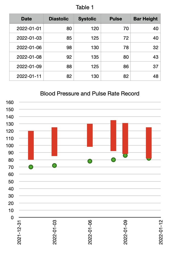
That's close to the format you posted, but you'll have to add a legend manually.
So what's the trick? You can add an error bar and format it to look just like the bar in a column chart. The length of the bars is derived from values from an extra column, here column E, which is simply the difference between C and B.
Some of the major steps
Select all the cells in the table and insert a 2D Scatter chart looking something like this:
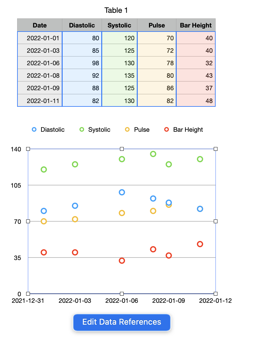
Click to select the Systolic series of dots in the chart and delete it (hit delete key). Do the same for Bar Height.
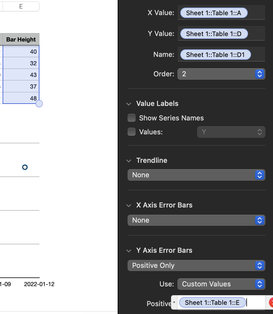
Click the Diastolic series and set Y Axis Error Bars to Positive only and Use: to Custom Values:


Click in the Positive box: delete the default 10 in it, and select column E in the table:
That should give you something like this (I think I clicked on the wrong series for this screenshot but it illustrates the idea):

Click the bars in the chart, thicken them, and format to taste.

Click each of the other series in the chart and format them in the Style panel to remove the Data Symbol, etc.
Format the rest of the chart to taste, and manually add a legend if you need one.
Error bars can be very useful in spreadsheet software other than for their original narrow purpose of showing statistical uncertainty.
SG