I came here with the same question and frustration, but then, after poking around a bit, I realized the following:
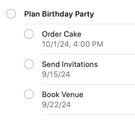
The current functionality in the Today Smart List makes sense because it treats each task and subtask as independent reminders, allowing for different due dates and times. This flexibility is important because not all subtasks need to be completed at the same time as the parent task. For example, if you have a reminder called "Plan Birthday Party" with subtasks like "Order Cake," "Send Invitations," and "Book Venue," each of these might have different deadlines. "Order Cake" could be due two days before the party, while "Send Invitations" might be due a week earlier. Showing all these subtasks directly in the Today Smart List could lead to confusion, as it might display tasks that aren't actually due today or duplicate reminders, cluttering the view.

If you want to see the complete structure of a project, meaning the parent reminder and all its associated subtasks with their respective dates and times, you can do so in the specific list where the reminder is stored. For instance, if "Plan Birthday Party" is in your "Events" Standard list, you can go there to view the parent task and all its subtasks in the correct order, with their due dates and times. This method keeps your Today Smart List focused on tasks that are due today while allowing you to view the full project structure in its dedicated list.
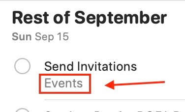
What would be nice, though, is if the app not only shows the location (list) where the reminder is stored (which it currently does):

but also allows you to click on that location and take you directly to the reminder within its list. This would be especially helpful if the list contains many reminders, saving time by navigating straight to the specific reminder. Another useful feature would be to right-click on the reminder and have an option like "Go to Location" that takes you directly to the reminder's exact spot within its list.