Hi Mimiir,
Mimiir wrote:
Also, with current solution you need NOT to use the A-column when working with multi XY. That is not intuitive.
Sorry, I forgot to mention that for XY Scatter Plots, the data must be in body cells. I was using a table where Column A happened to be a Header Column, so I avoided column A.
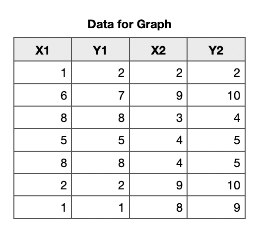
Here are the data in a table with no Header columns, and one Header Row (Row 1) for the labels.
The Numbers way with tables is to have a table for each specific purpose. This table is specifically for holding the data needed for plotting a graph. Then we can select whole rows or columns without selecting whatever else is in the table.
Mimiir wrote: A bit hard to find what to select and click to make that setting visible.
I do not know which setting you mean, so here are all the steps.
I selected whole columns: click on column label A then shift click on column label D

Insert a 2D Scatter plot. With the graph selected, click on edit Data References

The graph is Sharing X Values.

Now we need to click on the bottom left of the Numbers window and untick Share X Values.

I hope that is clearer. Please reply with questions.
Ian.