Heer is one I made for myself. It is pretty basic but it gets the job done. I'd post a link to it rather than describe it but 1) while there is no community rule banning links, the moderator has always quickly removed any links I have posted and 2) I would probably delete the linked file at some point anyway, making this post worthless if that is all it contained.
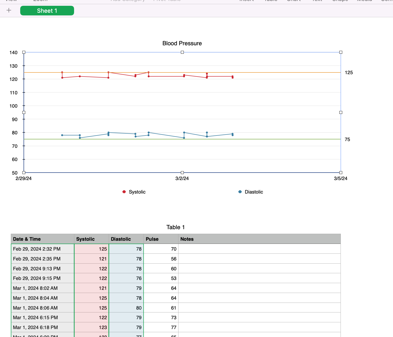
Data entry is in the table at the bottom. No formulas are in it. When it gets too long I start hiding the upper rows.
The chart is a scatter chart (the icon that looks like a bunch of + signs) formatted with connecting lines and two Y-axis reference lines and adjusting the colors and line stroke sizes and other stuff. You have to set/change the min and max dates for the X-axis as you go along. I use the chart on this sheet for recent readings. On another sheet (in the spreadsheet I actually use, not this copy of it that has made up data in it), I have a chart that has a much larger date range.
I don't chart my pulse rate. You could add that to the chart or make a new scatter chart for it.