Hi lawero,
Two cautionary questions before we get too much further into this:
Have you had success in creating the charts and analysis you want for this in your Excel version of the spreadsheet document?
Do your plans include exporting/importing the document back and forth between Excel and Numbers?
If either answer is 'yes,' you might be further ahead to use MS Excel 2011 for the Mac end, rather than Numbers. Compatibility between the two versions of Excel, while not 'complete,' will be better than the level of compatibility between Excel 2007 or 2010 and Numbers '08.
You wrote earlier in this thread: "Thanks, but that is creating more work. "
That's even more true of the current situation, where the same issue is the subject of two separate threads in this forum. Can we bring the whole topic into a single thread, please.
lawero wrote:
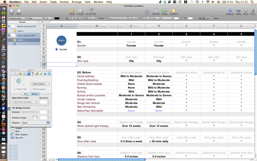
For example, lets say 100 people take the survey.
70 are women
30 are men
80 people say red light therapy (RLT) has worked very well for them
20 say it hasn't
What I would then like to be able to do is answer the question 'has RLT worked better for men or women?'
What I don't understand is how to get numbers to process the data as it is (in the drop down menus) or if I lump the figures together into 70 women and 30 men, how I extract that data to do the correlation.
Numbers '08 doesn't support COUNTIFS, which allows setting multiple conditions (such as 'Female' and 'Hugely Improved') for an item to be counted, so my first step would be to split the data into Male and Female sets.
There are several ways of doing this. The most direct is a simple cell reference (eg. =B3) enclosed in an IF statement that transfers the value IF the 'gender' cell in that column contains "Female".
Example: to transfer the Female's responses on row 45 (about where Q8, Facial redness should appear), say to row 105 on the same table, use this formula in C105 (first column recording a response):
=IF(C$7="Female",C45,"")
Filled down to row 106, the formula will pick up the response of the same person to Flushing/blushing:
=IF(C$7="Female",C46,"")
Filled to the right, the initial formula will pick up the response of the person in column D (if that person is labeled 'Female' in row 7).
=IF(D$7="Female",D45,"")
After doing the filling, copy the initial version of the formula, paste it into C104, then edit it to read:
=IF(C$7="Female",C7,"")
This one transfers the word "Female", where it occurs in row 7, to row 104, providing a convenient place to get a count of the number of responding females, if needed.
With this simple method, the columns where the respondent has not been identified as Female will appear blank (but actually contain a null string).
A similar set of formulas, where "Male" is substituted for "Female", will transfer only the responses for the persons labeled 'Male'.
Once you have those two arrays of responses, you can count the occurrences of each response for each question using COUNTIF. For row 105 (females' responses to Facial redness) the formula to count 'Got Worse' responses (first on the list) is:
=COUNTIF($C105:$CZ105,"Got Worse")
(The cell range allows for up to 105 respondents.)
The same formula, with the condition changed to fit, can be filled right to count the other responses to the same question, and filled down to count the responses to other questions.
If calculating percentages you will also need a count of the number of Females responding, and may wish to subtract the number of "Never had" responses.
If this summary is calculated on a separate table (recommended), all cell references will need to be edited (before filling right or down) to include the sheet name and table name of the referenced cell(s).
Regards,
Barry
