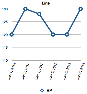
Numbers will graph the data you supply it. The break in the line is an accurate representation of the break in the data.
There are three ways to close the line.
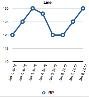
1. Delete the rows representing the missed days from your table. A Line Chart is a category chart, so the missing dates (jan 2 and 7) will simply be removed from the chart. The surrounding categories will close in to fill the space.
2. Calculate a data value for the missed day. The disadvantage here is that the calculated datum will display a data point on the chart that looks the same as a measured datum, which is a misrepresentation of the actual data.
Formula (Placed in C2, and filled down):
=IF(AND(LEN(B1)>0,LEN(B2)=0,LEN(B3)>0),AVERAGE(B1,B3),IF(LEN(B2)=0,"",B2))
B is the data column. C is the column used to supply data to the chart.
The formula looks at three cells in column B, the one in its own row (B2) and the two in the row above and below its own row. If both cells in adjacent rows have data AND the cell in its own row is empty, the formula calculates an interpolated value. If either adjacent row cell is empty, the formula returns a null string if its own row is empty, or the data from column B if there is data entered there.
3. Use an X-Y Scatter Chart. Unlike Category charts, where the dates are treated as labels, a scatter chart plots two data series—in this case the date of the reading (x) and the actual reading (y) against each other. A missing reading will still cause a break in the line connecting the data if its partner date is present. If neither part of the data pair is recorded (ie. if the row is removed), the line will be connected, and the x position of the data that is present will remain unchanged. (Same data as above, with Jan 2 and 7 missing. Note the absence of data points on the line for these dates—where the rising line crosses 125.)
To use a scatter chart, the dates must be recorded as actual Date and Time values, and must be in a 'regular' column, not a Header column (where they would be seen by the chart as Text).
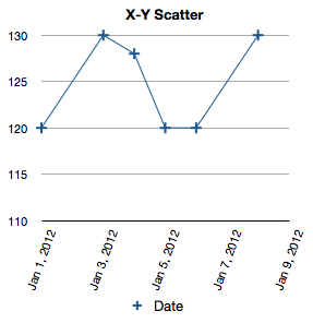
Option 3 gives, IMO, the best representation of the data.
Regards,
Barry