You can make a difference in the Apple Support Community!

When you sign up with your Apple Account, you can provide valuable feedback to other community members by upvoting helpful replies and User Tips.

📰 Newsroom Update

Billie Eilish is Apple Music’s Artist of the Year for 2024. Learn more >

Looks like no one’s replied in a while. To start the conversation again, simply ask a new question.

What are your thoughts on the New iTunes 11?

I for one am not very impressed! You lose cover flow, and the ability to resize your album art. Unlike previous versions where everything is not in just one area now your searching over the whole itunes for what you need to do. Its cluttered and instead of just editing one album your stuck at looking at all the other distractions instead of what your trying to edit. What are all of your thoughts on this new itunes?

iMac, OS X Mountain Lion, i7 16gb ram

Posted on Nov 29, 2012 9:11 PM

Reply
1,601 replies

Nov 30, 2012 11:16 PM in response to Porf

iTunes 11 was designed to bring the Mac version in line with the iOS version. Not sure of the wisdom behind this thinking.


iTunes 11 lost about 6 features that we were accustomed to in previous versions. I rarely used coverflow or the DJ feature. No loss to me. I did use show duplicates but there is likely an Apple script for that at Dougs Scripts.


The best you can do if not happy is to provide feed back to Apple about iTunes. They do listen. I complained as others did about the loss of color in the sidebar - they finally brought it back.


The current iTunes 11 is how it is for now - get used to it - use it - and soon iTunes 10 will be old stuff.


MJ

Nov 30, 2012 11:23 PM in response to Porf

Here is what it felt like using iTunes 11.


Imagine walking into a music store with the task of picking up a Weird Al album. You see the rack of hundreds of CD's and realize there is nothing separating them. No "A", "B"...nothing.


You assume that Weird Al must be in the "W" section, which must be near the end, so you walk down and start thumbing through albums. You realize you're only at "S", so you move on. Eventually you come to "W" and start looking for the album.


The problem is....it's not there. Maybe it's under "Y"...so you move along and thumb through various artists until you happen across the album you're looking for.


Imagine this same concept in a comic store, or a book store. Apple doesn't seem to understand the concept of hierarchy. If I am looking for a Weird Al album on my computer, I need to know this basic information


1. Artist Name and/or first letter in name

2. Album


That's all. I don't need to see the songs, or anything else. The new "Album View" used to have an option called "Group Albums" which would organize them in ways that made sense to the user. My library in iTunes 10.7 looked like this.
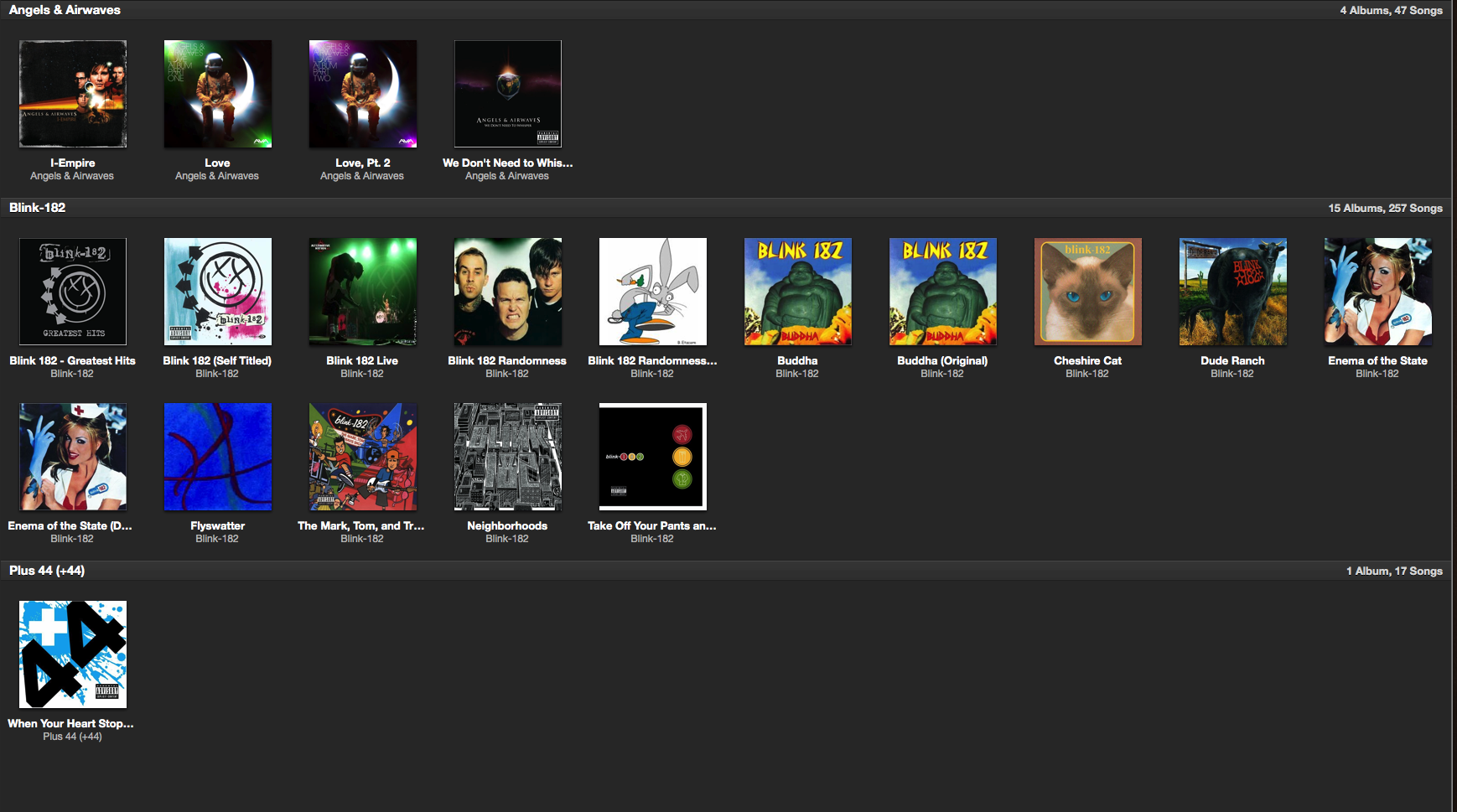

User uploaded file


You can see how quickly you can browse the high level information, and then narrow down to the album, then further to the song.


In iTunes 11, there is no such option. What you get is a grid (non-resizable), of every album in your library, with no separation at all. So when you're scanning the list, "Blink-182" may start somewhere in the middle of the row, or the end, or wherever.


This is a slow, and painful way to browse for music. Others have pointed out that I can switch to "Artist" view, but the problem is that it gives too much information. Each album is under each other, and information that I don't need at the moment is displayed. So, in that case I have to scroll down long lists of artists to find the album I'm looking for.


Here is what 10.7 looks like with (iTunes 11) view on.
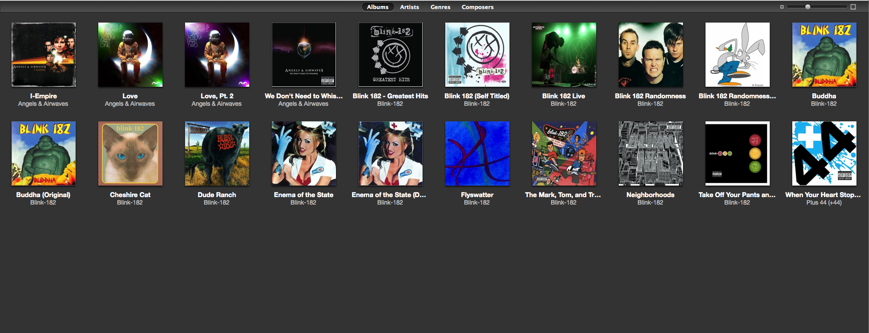

User uploaded file


Apple really took a step back with this version, for more reasons than the one I've described here. Their attempt to make everything i0S is creating this strange situation in which things aren't working as needed or expected.


Anyway, I went back to 10.7, and will stay there until things change.

Nov 30, 2012 11:35 PM in response to Porf

Becoming M$ Word?

No, Word is MUCH more logical program. iTunes was becoming so complicated because Apple does not have a clear idea what iTunes should do. This complexity SOMEHOW allowed to work around all those wrong decisions made during the development. Now - complexity is gone and absurdity of design becomes obvious.


Yet, the requested feature set of iTunes is so simple.

Still, I want to be able to sort albums in album view by artist, then year, exactly as I do with my physical CD's.

I want to see the year of album, the way it is printed on the sleeve.

I want to be able to separate my symphonic music from rock or jazz, and still browse it in the SAME way as the whole library, without stupid artist bars with random icons.

And, when I selected an album, I want to be able to see Album Artwork at 500x500 (not some kind of micro size song artwork) and song list in the same view.


Yet, they go to replicate the iPad style, which is itself convulted and wrong.

Why I cannot se a year of album in the albums list, why I cannot properly sort by artis (as in the screenshot by crazylegsmurphy) ?

Why if I click on the artwork button I see song artwork, not album artork? Why if I click many times to see the album's song list, another player pops up, now in black? Is one not enough?

Dec 1, 2012 12:07 AM in response to billyzhang

billyzhang wrote:


Cover Flow!!!!

Actually, Cover Flow was critically flawed.

If you scrolled covers back and forth, each time they were again written in memory, and if you scrolled long enough, memory would be filled up and system would start to swap.


It was so badly coded that in fact it is not surprising at all that it is removed now.

Bad thing, new features are not as carefully considered, as they should be.

What are your thoughts on the New iTunes 11?

Welcome to Apple Support Community
A forum where Apple customers help each other with their products. Get started with your Apple Account.