Hi Matt,
I would start by looking at the Charting Basics template and the Personal Budget template to get an overview of pie charts and how they work with tables.
SUMIF or COUNTIF is your friend here.
You'll find that the budget charts use SUMIF, but in your case, with the data table built on 30 minute chunks, each containing the category name for the activity you are engaged in during that time, the better choice is likely to count the occurrences of each category, then divide each count by 2 to get the number of hours for the chart.
You'll need a two column table to collect the data for your pie chart. The one in your initial post will work.
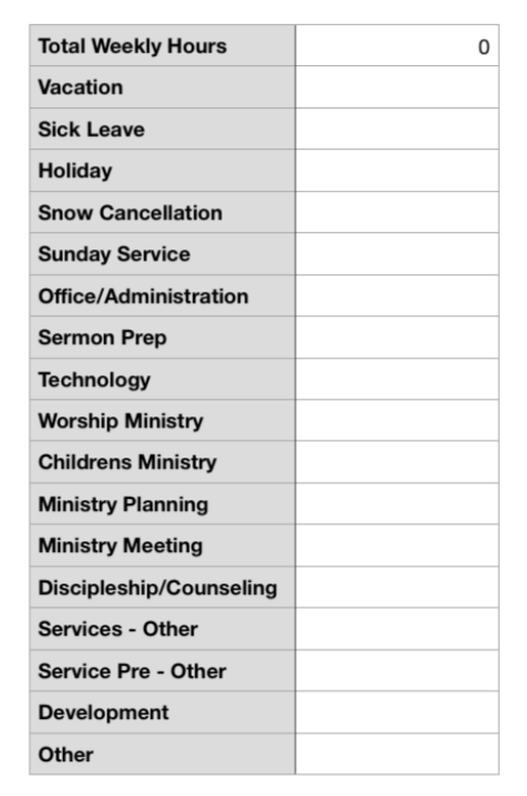
The chart is a Category chart, so column A of the table should be a Header column, and should contain the Category names. These need to exactly match the category names used on the pop-up menus in your data table.
I would move the Total Hours to the bottom of the table, and put it in a Footer row.
You may also want a Header row to hold a further label for the chart.
One issue I see immediately is the number of categories in your list. Pie charts in the current versions of Numbers have a colour palette of only six distinct colours in a set. With 17 categories, you'll have two slices on one colour and three of each of the the other colours. You may find it a little busy.
Your log table has 14 columns, seven containing the data to be counted, and seven containing time of day labels. As the time of day label cells will never contain one of the category names that is being counted, you can simplify the COUNTIF formula to count the occurrences in the full table (or in all columns of the table except the first to slightly reduce the number of cells involved in the count), rather than specifying a separate count for each category column, then totaling those counts for a final value.
Your formula for B2 on the table feeding the chart, then is:
COUNTIF(table-name::B:N,A2)/2
with the actual table name of the log table in place of table-name.
Fill the formula down the column so there is a copy in each row with a category name. The result will be a list of numbers indicating the number of hours spent on each task during the week.
Making the pie chart is a simple matter of selecting the cells containing the results, then choosing the pie chart for the charts button in the tool bar. The default chart may be just what you need and want. If not, explore the options available to make it fit your purposes more exactly.
Regrds,
Barry