Numbers error bars vanish with Standard Deviation

I'm learning Numbers. I click a chart I've made -> I choose Error Bars -> Positive and Negative -> Use: Standard Deviation -> all error bars disappear!! Standard Deviation of the data set should show as an error bar on every column!

With any other Use setting, it just puts in some default error bars whose value appears to be NOT the Standard Deviation, and cannot be changed. Changing the Range value does nothing.

Can someone help please?

iMac 27″ 5K, macOS 10.12

Posted on Aug 7, 2020 7:00 PM

Reply
Question marked as Top-ranking reply

Posted on Aug 8, 2020 6:51 AM

Without first seeing your data or the chart you want, take note of what the standard deviation error bars are. Look at SGIII's post and the chart he attached. All the error bars are the same. They are the standard deviation of the entire data set (the series he charted). If I understand what you are trying to chart, you have multiple (three) Y's for each X and want the standard deviation for each X. I am assuming you are plotting all three Y points for each X as separate series. You will need a column in your table for the average and the stdev for each set of three points. You plot the average as another series (then immediately make it the top series by changing it's "order" to 1) and choose your stdev column for the custom error bars. I changed the data symbol to a + and added connection lines, too. The base chart is a scatter chart in the screenshot below.


If I am off the mark, no problem, just ignore me. I know you said you had "stress measure for the before and after of 3 repeats of my experimental condition" which might really just be a chart of three points vs the chart I did.


36 replies
Question marked as Top-ranking reply

Aug 8, 2020 6:51 AM in response to diannetrussell

Without first seeing your data or the chart you want, take note of what the standard deviation error bars are. Look at SGIII's post and the chart he attached. All the error bars are the same. They are the standard deviation of the entire data set (the series he charted). If I understand what you are trying to chart, you have multiple (three) Y's for each X and want the standard deviation for each X. I am assuming you are plotting all three Y points for each X as separate series. You will need a column in your table for the average and the stdev for each set of three points. You plot the average as another series (then immediately make it the top series by changing it's "order" to 1) and choose your stdev column for the custom error bars. I changed the data symbol to a + and added connection lines, too. The base chart is a scatter chart in the screenshot below.


If I am off the mark, no problem, just ignore me. I know you said you had "stress measure for the before and after of 3 repeats of my experimental condition" which might really just be a chart of three points vs the chart I did.


Aug 12, 2020 8:58 PM in response to diannetrussell

Part of the problem here is there is a learning curve and you are jumping in full force without starting on smaller, easier projects first. But I think I now see what you want to chart, I hope. I don't think you are going to get everything you want. Starting with just the little bit of data you put together by hand for your first attempt at a chart:


  1. Select just the first row of data.
  2. Create a column chart.
  3. Click on "Edit Data References" below the chart
  4. Look at the bottom of the window where it says "Plot Rows as Series". Change it to "Plot Columns as Series". All the bars will become different colors and a legend should have been created.
  5. Click on the first column.
  6. In the sidebar on the right click on the Series tab.
  7. Select "Positive and Negative" error bars
  8. Use "Custom Values"
  9. Click in the positive entry box. Back over the default number then click on the standard deviation in the table for that column. Press Enter. Do the same for the negative entry. Repeat for the other bars.
  10. Move and resize the legend as you see fit.
  11. Change the bar colors as you see fit.
  12. Change the number of steps/gridlines and Max value for the Y axis as you see fit.
  13. Click on an error bar and change style aspects of it as you see fit. Do the same for the others


I did not see a way to label the error bars to indicate they are the standard deviation. You can add a text box to say that if it is necessary.


I will post an image shortly. I am trying to figure out why it keeps telling me I have "included content in your post that is not permitted" and then not letting me post it.


Aug 8, 2020 2:11 AM in response to diannetrussell

Hi Dianne,


We can't see what you see.

Make a spare copy of your document and delete, anonymise or hide sensitive information.

Post a screen shot of the data table that supplies data to the graph (chart).

Better, copy and paste the data into a reply in this forum. That will save us from having to retype.


What type of graph? It seems to be a column graph from your question.


From where are you calculating the Standard Deviation?

The Standard Deviation of what?


More information may lead to a solution.


Regards,

Ian.

Aug 9, 2020 3:02 PM in response to diannetrussell

Your data does not appear to be well arranged for making charts, though I have to admit I am still not clear what you want to chart and what you want it to look like. Charts really need all the data to be together. For example, if "M 1 BEFORE" is to be a series, all the "M 1 BEFORE" data needs to be one after another in a column or row. Same with the other data. If it is in your table in an easy pattern, like in your small screenshot where each set of data takes 6 rows and all "M1 BEFORE" data is 6 rows apart, etc., it can easily be transferred to a table for charting using simple formulas. .

Aug 11, 2020 4:02 AM in response to diannetrussell

Hi Dianne,


I am just thinking out loud after seeing your sketch and explanation.

Badunit wrote: " If it [the data] is in your table in an easy pattern, like in your small screenshot where each set of data takes 6 rows and all "M1 BEFORE" data is 6 rows apart, etc., it can easily be transferred to a table for charting using simple formulas."


Here is an interactive chart I produced some years ago. I realise this is nothing like your data table, but maybe we can adapt (and expand) the idea. If your data are in a regular pattern, then as Badunit suggested, we can "pull" relevant data into a small table for each chart.

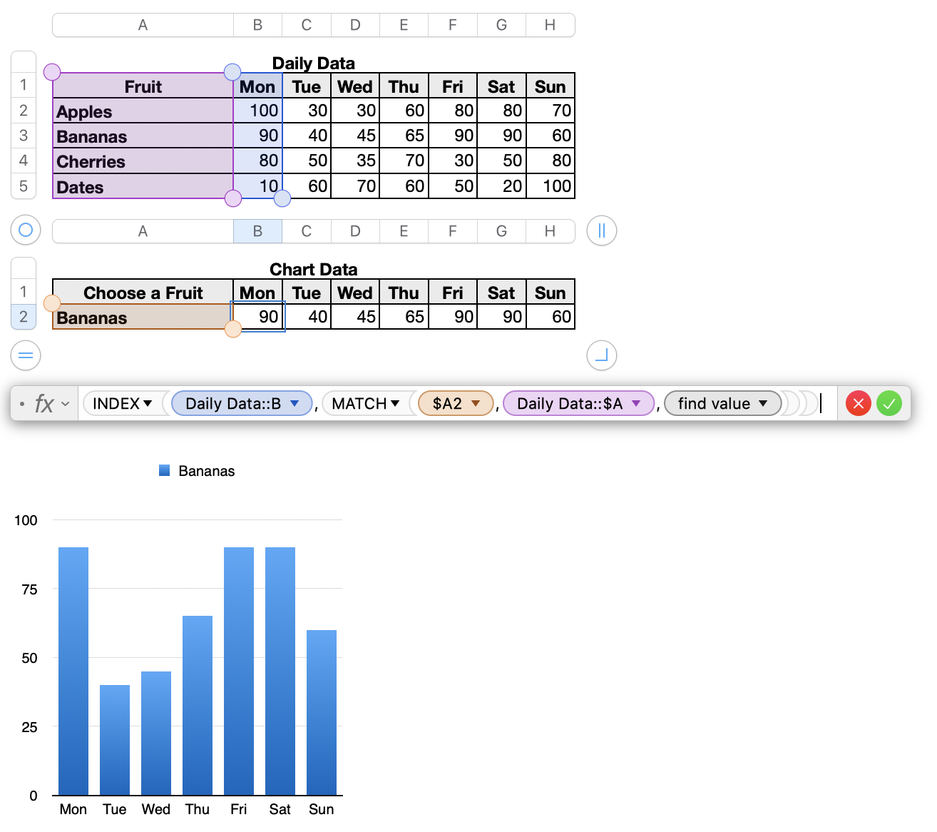
Chart Data:: A2 is a Pop-up Menu.

Chart Data B2 has this formula: =INDEX(Daily Data::B,MATCH($A2,Daily Data::$A,0))

Fill right.


To create another graph, choose a different value in the Pop-Up Menu:


As I said, I am just thinking out loud. Perhaps an interactive chart will speed up your process. (No, I don't mean the interactive chart in Template Chooser > Graphing Basics > Interactive Graph. While that is excellent, it seems too limited for what you want.)


Regards,

Ian.


Aug 8, 2020 1:27 PM in response to Badunit

Thanks Badunit,

My data is configured in columns not rows, therefore the Mean and SDEV are at the bottom of the columns not the left of rows. The format is how it comes from the app, and would be a HUGE amount of work to re-configure. The example I posted was a tiny fragment, for simplicity. Here is a shot of one full, incomplete, data table (of the 6 I need to analyze initially):

Aug 8, 2020 1:40 PM in response to Yellowbox

Thanks Ian,

To attach an image to my post I use the picture icon on the toolbar at the bottom of the compose window. For some bizarre reason it's working OK this morning even though it was faulting out constantly last night. Gremlins were indeed busy last night!

I'll process what everyone's written before I take the next step.


What I ACTUALLY want to chart is, for each of 6 study participants:

(Note that the table image I posted in reply to Badunit a few minutes ago is the table of ONE participant)

chart 1: Baseline (with the Mean and STDEV bars of all the baseline data points), compared with Before and After of condition M, (with the Means and STDEV bars of all their data points, respectively). In other words, not the STDEV of everything on the chart, but of each of the categories.

chart 2: Baseline compared with Before and After of condition Y, as per the M condition in chart 1.

chart 3: Overall chart of all 6 study participants for the datasets in chart 1 & 2.

Maybe this degree of charting is too much for Numbers?

Aug 8, 2020 2:14 PM in response to Badunit

Oh yep thanks, I get the rows vs columns thing. Because this webpage would not let me post any screen shots or recordings last night I could not show anyone what I was doing! I hope that here my first screen shot of a table (tiny extract of my data sets) and video recording of how I get Mean (Average) and STDEV will attach and play OK....

It is the Stress measure in Before and After of 3 repeats of condition M. (In my whole study to analyze there are 3 - 4 conditions, and dozens of measures, for each of 6 participants. Hopefully you can see an example of a full table for one participant, that I posted to you at 6:27 am...).

This thread has been closed by the system or the community team. You may vote for any posts you find helpful, or search the Community for additional answers.

Numbers error bars vanish with Standard Deviation

Welcome to Apple Support Community
A forum where Apple customers help each other with their products. Get started with your Apple Account.