You can make a difference in the Apple Support Community!

When you sign up with your Apple Account, you can provide valuable feedback to other community members by upvoting helpful replies and User Tips.

Looks like no one’s replied in a while. To start the conversation again, simply ask a new question.

How to animate this effect?

Hey guys,


I am looking to create a paint stroke type build in for an animated logo. Or any behaviour or technique that could introduce these elements in a cool way.


Can anyone point me in the direction of some decent tutorials in that? I couldn't find any that I liked the look of.


Thank you,


Posted on Jun 25, 2022 8:34 AM

Reply
Question marked as Top-ranking reply

Posted on Jun 25, 2022 11:32 AM

Hi Phil


I'll contribute what I can here, but I think this is something Fox is the expert on, so if he is around, hopefully you'll get some good instruction.


From what I can see here, you have two options.


1: If the asset needs to be 100% exact, then I would do the work needed to split the red and blue, so that they can be masked to create the overlap. Then, use an image brush as an image mask source so 'reveal' each element. So you will be using masks to create a 'scrub' reveal - rather than animating the strokes to draw in to form the elements.


When I work with this method of masking/wiping in to reveal - i find it is good to run the masks in 2 or 3 passes. The first source is set around 25% opacity, then the 2nd at around 60% and the last at 100%. Offset each pass by 2 or 3 frames - it creates a more organic looking 'wipe'.


2: You will use motions tools to reproduce the asset - in this case, you can 'draw in' the elements. So instead of using the image brush paths to create a mask source - you will use the paths directly to animate the graphic. It depends on what you client wants as far as that graphics being 100% perfect.


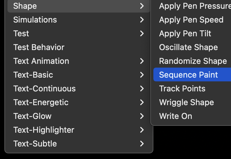
If you are going to go with this method, then you are better off animating your strokes with the sequence paint behaviour - by opacity - rather than using the path offsets to 'draw'. You can use both methods and stack them up - but i generally would rely on the sequence paint behavior. It is in the shape behavior category.


Using Motion's tools to reproduce that artwork exactly is going to depend on your skill set with brushes. You might find option 1 the easier way to work.


In your brush presets - 'traditional', look for 'chalk' and 'charcoal'. That are to the two options that will create that kind of texture.


otherwise, you can create you own custom image brush sources to get the right texture.


In the brush stroke parameters, use all the features available to roughen and distort for the texture: width over stroke, jitter, angle, scale x and y.


What kind of assets has the client provided - do you have psd or eps/AI files for this? Hopefully you can prep in the vector software to split up the red and blue.

2 replies
Question marked as Top-ranking reply

Jun 25, 2022 11:32 AM in response to PhilCF

Hi Phil


I'll contribute what I can here, but I think this is something Fox is the expert on, so if he is around, hopefully you'll get some good instruction.


From what I can see here, you have two options.


1: If the asset needs to be 100% exact, then I would do the work needed to split the red and blue, so that they can be masked to create the overlap. Then, use an image brush as an image mask source so 'reveal' each element. So you will be using masks to create a 'scrub' reveal - rather than animating the strokes to draw in to form the elements.


When I work with this method of masking/wiping in to reveal - i find it is good to run the masks in 2 or 3 passes. The first source is set around 25% opacity, then the 2nd at around 60% and the last at 100%. Offset each pass by 2 or 3 frames - it creates a more organic looking 'wipe'.


2: You will use motions tools to reproduce the asset - in this case, you can 'draw in' the elements. So instead of using the image brush paths to create a mask source - you will use the paths directly to animate the graphic. It depends on what you client wants as far as that graphics being 100% perfect.


If you are going to go with this method, then you are better off animating your strokes with the sequence paint behaviour - by opacity - rather than using the path offsets to 'draw'. You can use both methods and stack them up - but i generally would rely on the sequence paint behavior. It is in the shape behavior category.


Using Motion's tools to reproduce that artwork exactly is going to depend on your skill set with brushes. You might find option 1 the easier way to work.


In your brush presets - 'traditional', look for 'chalk' and 'charcoal'. That are to the two options that will create that kind of texture.


otherwise, you can create you own custom image brush sources to get the right texture.


In the brush stroke parameters, use all the features available to roughen and distort for the texture: width over stroke, jitter, angle, scale x and y.


What kind of assets has the client provided - do you have psd or eps/AI files for this? Hopefully you can prep in the vector software to split up the red and blue.

How to animate this effect?

Welcome to Apple Support Community
A forum where Apple customers help each other with their products. Get started with your Apple Account.