I am having this exact same issue with my 16" MBP M3.
I have a Mac Studio Display which has what I would consider a standard white balance/tint for most apple products, as it looks similar to my old 2018 MBP and my MBP M1 work laptop.
When I use the display with my work MBP M1 laptop, images will look (as near as makes no differences) the same between my MBP m1 display and the Studio Display.
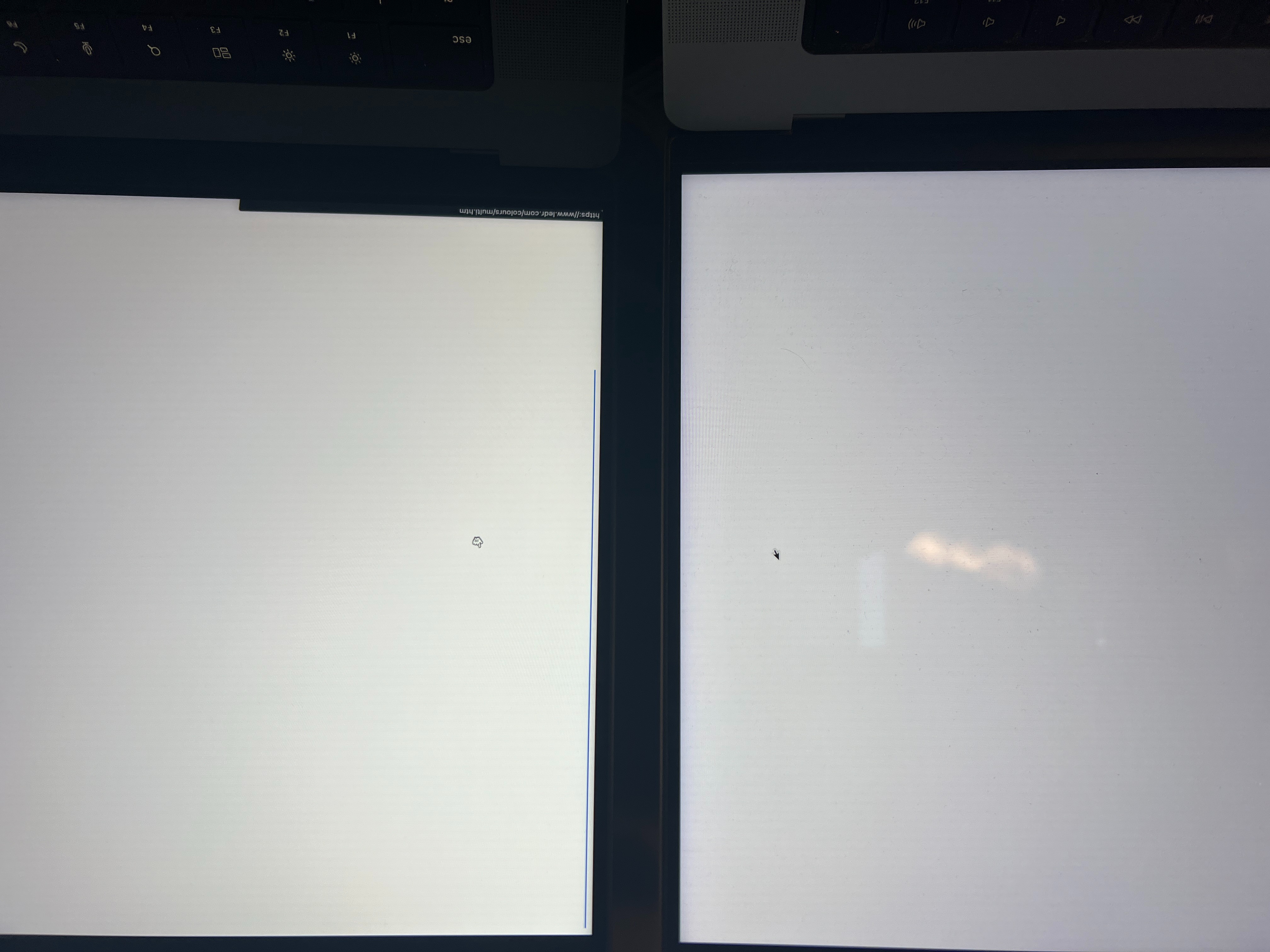
When I use my display with my new M3, the M3 has a strong yellow and slightly green cast to it. White balance is completely different than the display, and worse IMO. Whites on the MBP M3 clearly look yellow/warmer than whites on the Studio Display, and this difference in color balance/tint is visible across all images. The studio display in comparison shows what I would consider closer to a white color.
I want to note that I have tested this with all settings that might affect how the display looks turned off (True Tone, Night Shift, Auto Brightness Adjustment).
Similarly, comparing the new MBP M3 to my work MBP M1, the M3 looks overly warm and yellow compared to the M1, which shows whites much more cleanly.
I brought my MBP M3 to the apple store, and after doing side by side comparisons with other MBP M3s in the store and seeing the yellow tint, they agreed to replace the screen for me as well as re-image the laptop in case the issue was firmware based. Unfortunately, the new screen still has the same yellow cast to it, and still shows whites and colors completely differently than my MBP M1 and Studio Display.
Overall, I'm really annoyed. After spending $4700 on a computer of which the XDR screen was a huge selling point, I'm stuck with a machine that displays colors differently than most every other apple product I have. I'm not a professional colorist by any means and typically just use the default apple display profile as a baseline to color grade against, however the color tint on my laptop is so egregious that it will ultimately affect my ability to do any sort of color correction. If I end up being forced to use my studio display for all color correction, that defeats the purpose of a portable $4700 laptop and I should have just bought a Mac Studio.
Final thoughts: If I could return this laptop, I would (despite the machine itself working very well). Unfortunately, due to having having the screen replaced, my laptop is no longer eligible to be returned. The annoying thing is that this screen tint is one of those issues that once you see, it becomes an annoying itch that you can't ignore that will negatively impact everything I do (not just photo editing/Lightroom, but literally anything that involves looking at the screen).
Ultimately, I don't know if this is screen QC issue, a firm ware issue, or an OS Sonoma thing that results in this yellow screen. Regardless, I now have a $4700 machine that annoys me every time I use it.
Attached image: Uploading the image weirdly causes it to be rotated 180*, however the yellower screen on the left is my 16" MBP M3, and on the right is my 16" MBP M1. Both have True Tone, Night Shift, and Auto Brightness turned off, and are displaying the same image (https://www.ledr.com/colours/white.htm) in Chrome.