Thank you so much again again for all of your info!
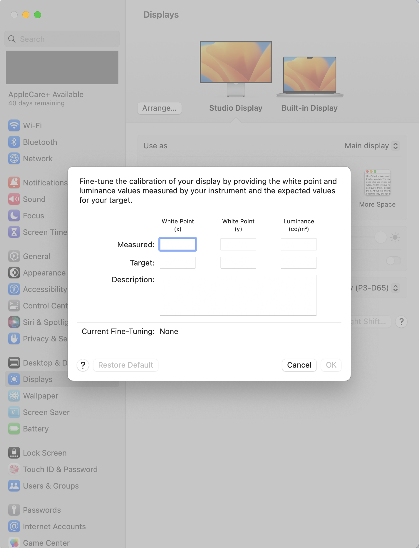
When I click on Fine-Tune Calibration, I get this:
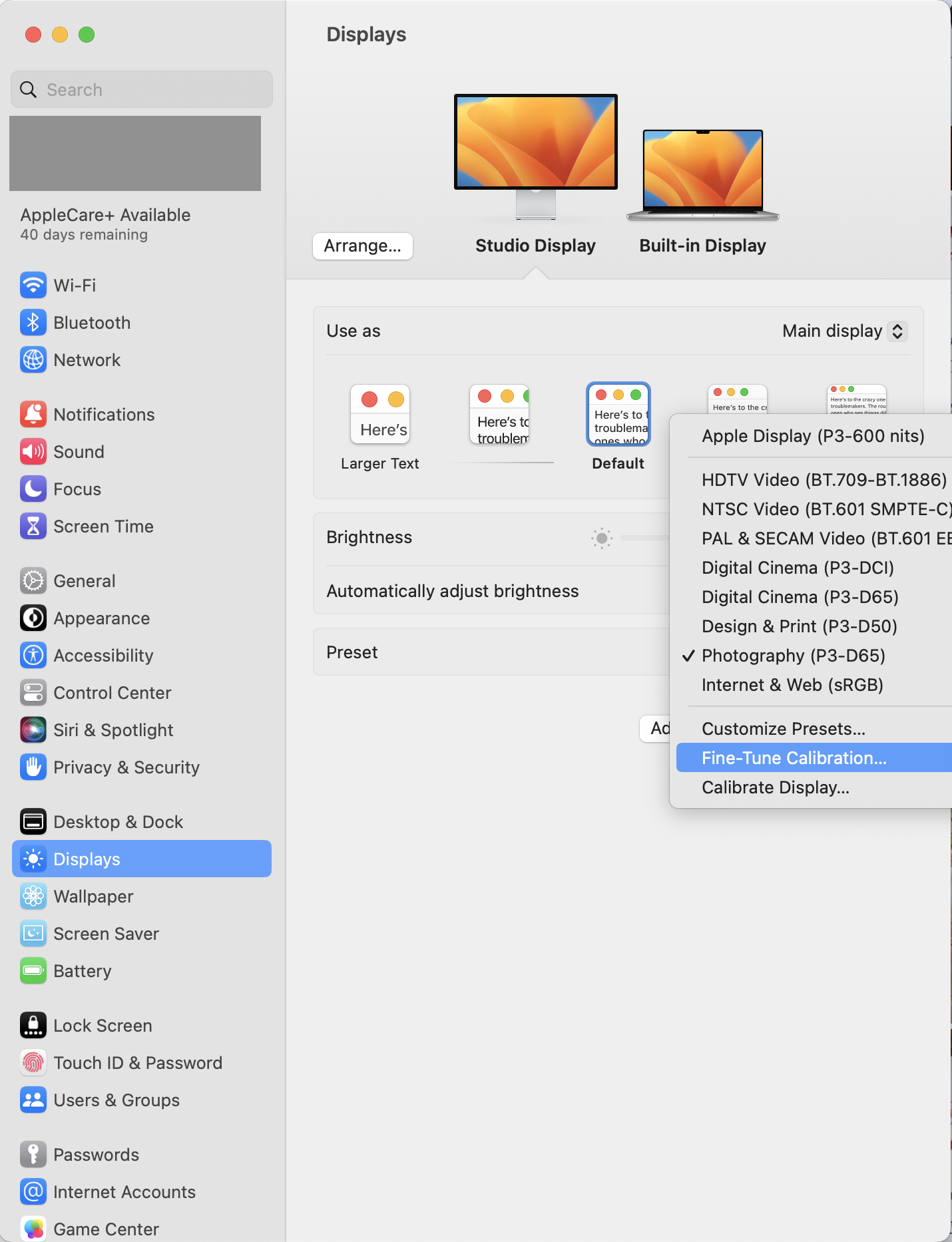
and when I click on Calibrate Display, I get this:
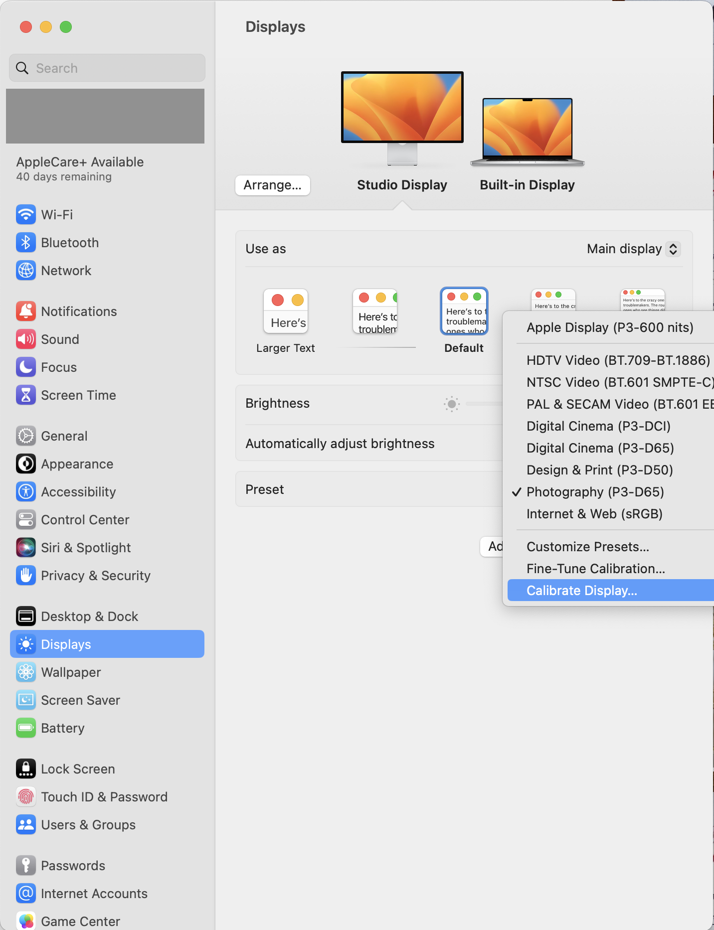
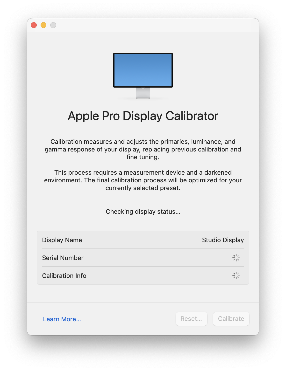
So still no Display Calibration Assistant – Expert Mode to be found.
Presently, I teach Adobe Illustrator and I do calligraphy.
I use Photoshop to work on my calligraphy photos for my online portfolio: https://flic.kr/s/aHsjY6c5mq
Since I don't print anymore, I tried the Photography (P3-D65) preset on both displays.
With this preset, my photos are red/blue on my Apple Studio Display and yellow on my MacBook Pro (especially the white paper in the photos).
I tried the Design & Print (P3-D50) preset on both displays, and everything is VERY yellow (the MacBook Pro being even more yellow).
When I use the default Apple Display (P3-600 nits) preset on my Studio Display and the default Apple Display (P3-600 nits) on my MacBook Pro, my photos are magenta/blue on my Studio Display, and magenta/yellow on my MacBook Pro. Also, the default presets are very hard on my eyes.
I obviously uncheck the True Tone option, but pretty much everybody I know, including ALL the computers at my college use it. I have to say that I'm VERY tempted to use this option because it makes it much better on my eyes.
My iPhone is yellow. My girlfriend's iPhone is red. My iPad is blue. My girlfriend's iPad is pretty much neutral.
Knowing all of this, it's very difficult for me to know where to position myself and what references are good and what workflow is to be trusted.
At the moment, all I want is for my calligraphy photos to display correctly on the Web (Flickr, Instagram, etc.).
Does the X-Rite device offer a user setting for my needs?
I will definitely check the video you shared.
Again, thank you so much.