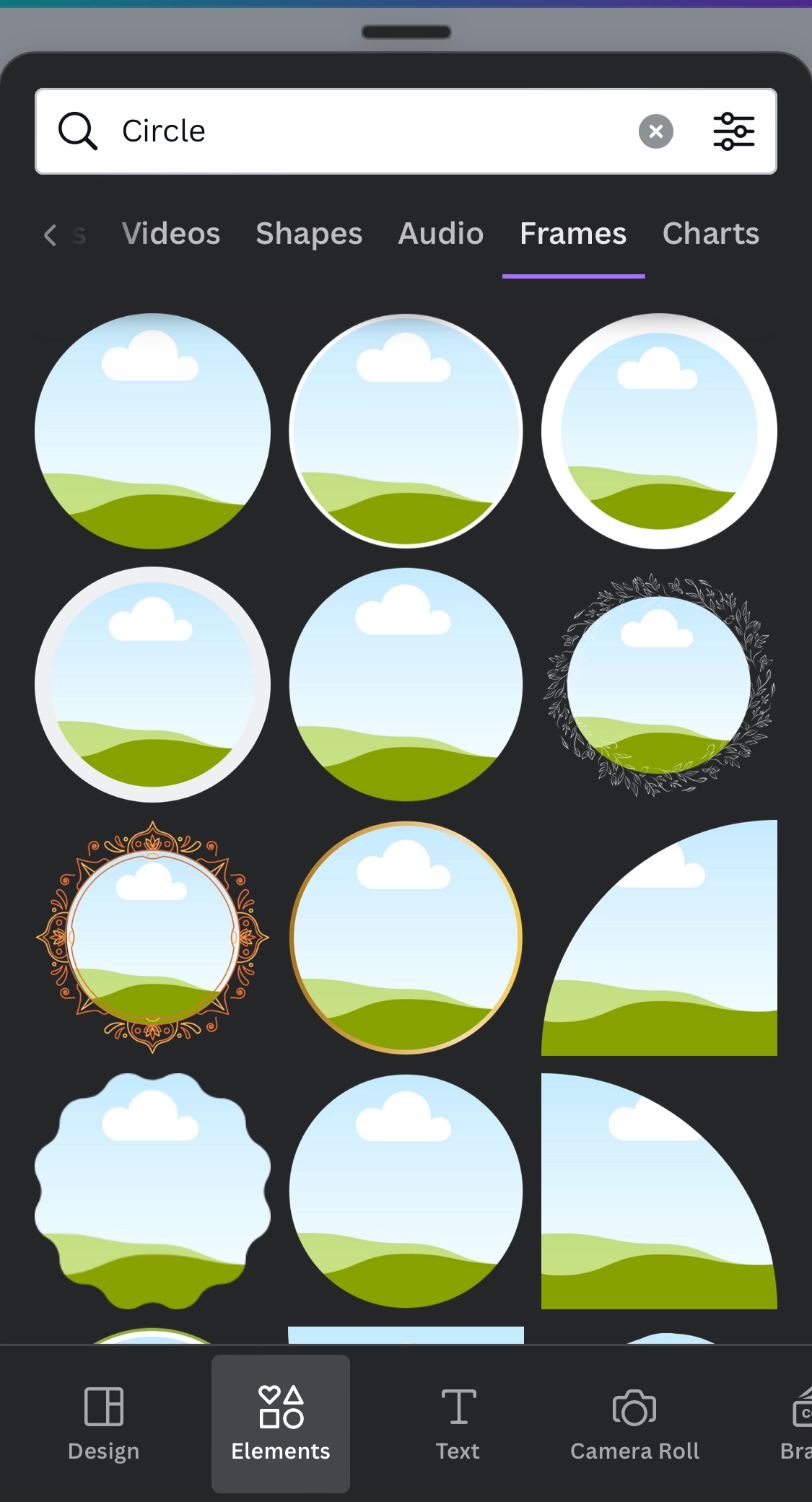
The only solution is to install Canva which is free, and just open your photo there and add a circle FRAME. Then put the photo inside the frame and pinch to wherever you want to zoom and save it like this.
I’ll be replacing my aging iPhone XS with a Galaxy S24. The tools there for photos now that it has AI are far superior.
it feels like I’m working with a dumb phone again like years ago with iOS4 when I couldn’t copy and paste. When we had to find crappy apps to do very simple things because our dumb iPhones couldn’t do it on their own.
they will add it again in iOS20 and sell it like it’s something new and groundbreaking. They’ll come up with a fancy new name for it too.


