Hello Debbie,
Bad luck for you. This is a topic I can talk about until I pass out. 😀
It's difficult to answer some of your questions without traveling to the Geek home world. But I get the impression you'll understand this.
Since I don't have something like an Eizo, should I be using Adobe RGB since it's a bigger color space than sRGB? That's another issue. I've always used sRGB on my other machines and have never had issues with my commercial printing. It's only now with this new machine that I'm having issues.
This won't be a short answer since it can't make sense in just a paragraph or so.
Any RGB space you want to use will do. It's all a matter of whether or not the vendor understands how to translate your working space properly. Doesn't matter if it's sRGB or all the way out to Wide Gamut RGB. sRGB is the default color space for web images for no reason other than even the cheapest monitor should be able to display that range of color. But no matter which one you settle on, the most important thing you can do for color management is an accurate monitor profile. Any reliance on the provided canned profiles is a 100% waste of any user's time. But, you already know that and are trying to get to a proper calibration.
Setting up a monitor is a two step process. Calibration, then profiling. Calibration is setting your color temperature (such as 5000K/D50), black point, brightness and gain. Not many packages do the last (EIZO does). Once the calibration is done, a profile is created based on those settings. What finally gets saved is what users only call a profile, but it also contains the calibration LUT (Look Up Table) that gets loaded to the graphics hardware when you choose it.
Many years ago, it was considered a very bad idea to use your monitor profile as your working RGB space. It made sense since the gamut of CRTs and early flat screen LED monitors weren't very good. They couldn't even approach Adobe RGB. Any newer, wide gamut monitor throws that old maxim out the window.
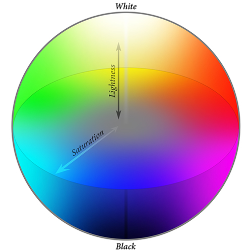
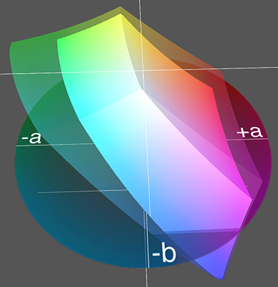
The very basics of color management: L*a*b* is everything we can see. This is the fixed model all color management is based on. The current being CIE Lab. It's usually visualized as a sphere. All possible color from white at the top to black at the bottom, surrounded by all fully saturated primary colors reducing to fully desaturated gray down the middle.
Any RGB space is a chunk of L*a*b*. Each RGB space represents what colors within L*a*b* a device can capture/print/display. I randomly grabbed a 3D model of something (I think it's Adobe RGB) and stuck it in this tristimulus. It's not a very accurate way to view this, but gives you the idea.
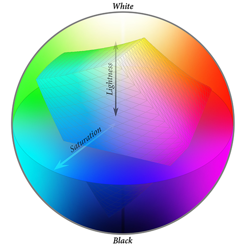
That's how your color management system knows where the RGB values of that particular space line up in L*a*b*.
So, what does that have to do with which color space to use in Photoshop? I'll explain that by why I use my monitor profile as my working RGB color space. Clipping is the main word here. That's when the color in L*a*b* can't be displayed on your monitor. It's in an area outside or your monitor's gamut and color range.
This can be a bad way to work on images. Especially if your working space is much larger than your monitor's profile. Such as, you have what looks like the saturated red you want on a shirt. But, you pushed the heck out of the saturation levels, not realizing you were well beyond the monitor's display limit (clipped). Sometime in the future, you purchase a new monitor that will likely have an even better gamut and color range. You open the image and that red shirt suddenly looks crazy red. What's wrong? Nothing, really. It always was that color, you just couldn't view it before.
Because of that, I limit my working space to what my monitor can actually display. That RGB space is just as valid as any other space. L*a*b* knows where the colors fit the same as it does for sRGB, Adobe RGB, or any other RGB space. And since it's a wide gamut display, that's plenty of color to work with.
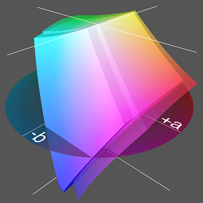
Here's some examples. This is my monitor's space vs. Wide Gamut RGB. As you can see, it's not a good idea to use this one as a general working space. It goes way out past my monitor's entire range, which means you can wildly oversaturate all of your images and not know it since you can't view those colors.
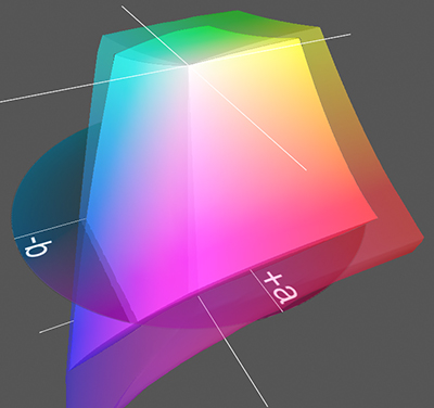
Here's my monitor again, but against Adobe RGB. You can see in front that Adobe RGB has more range than the EIZO can display in some cyans, blues and magentas. But since my working space stops at my monitor's profile, I can't accidentally push color out that far. And honestly, what I can use are already eye popping bright colors. I don't need the rest. On the other end, you can see how much red, yellows, oranges and greens I'd be cheating myself out of if I used Adobe RGB as my working space. The ability is there, but I'd be limited to the smaller range in those colors.
Using sRGB is seriously crippling yourself. Here's Adobe RGB vs. sRGB. It's obvious how small it is compared to what you could be using.
I my opinion, the new iMac's profile is what you should use as your working color space in Photoshop. Get the maximum usage out of your panel's gamut and color range without worrying about using over saturated color you can't see.
Since I can't see your monitor or ambient lighting conditions, I can't know how bright a luminance of 40 looks to you. Just be aware the lower you go, the more color saturation you lose. I use 80 not just because it's the default, but it gives me a midway point between paper white for CMYK work, and a brighter, more saturated screen for RGB work.
Side note, when printing as use the Colorimetric rendering intent. Too long to explain why. Just trust me it's far superior to Perceptual.