Hi Rich,
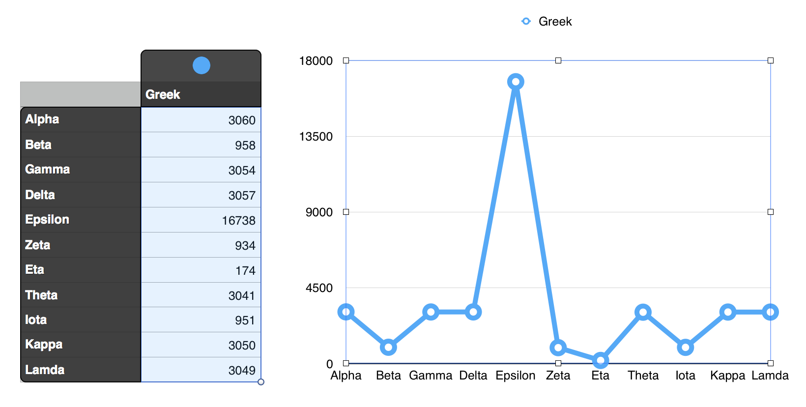
If you are making a "line chart" you'l have a single column of Data (B), and your Category labels will be in column A, which must be a Header column.
As this is a category chart, the categories will be spaced equally along the Category axis.
Here's a sample, with a description of the steps I took to produce the chart.

The image shows the chart as created by Numbers, after selecting the chart and clicking Edit Cell References to get the highlighting shown on the table.
Steps in creating:
- Generate an empty table with one header row and one header column.
- resize the table to have one body column (B) and eleven body rows (2-12)
- Enter the series name in B1
- Enter the category labels in column A, starting at A2.
- Enter the values to be charted in column B.
- Select the body cells containing data in column B. (B2-B12)
- Click the charts button and choose the Line Chart.
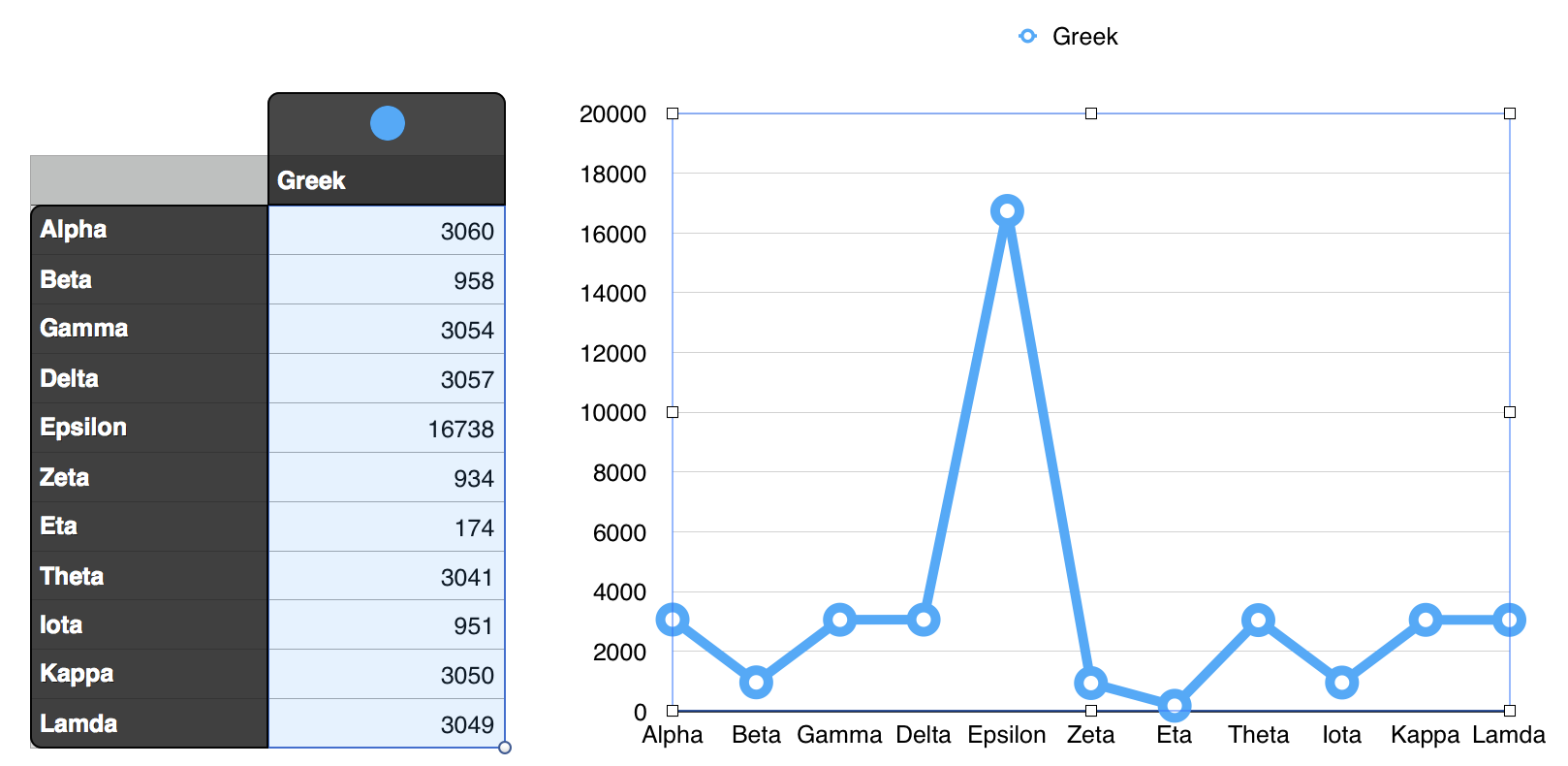
To more closely match your specifications, I made two changes in the Inspector, both to the Value axis (Y)
- Increased the Maximum value to 20,000 to match your rounding (with a larger MAX value)
- Increased the number of steps in the axis scale to 10, the next value that would result in rounded values on this axis.
After these changes:

As you mentioned, having selected the data, you should not need to "add chart data if it is already there AND is highlighted when you select the chary. If it is not highlighted, click the Edit Data reference button, then select the cells containing the data that is to be charted.
Regards,
Barry