iOS 17 gray call screen

I'm sure that I am not the only one. After the IOS 17 update was shocked to see that horrible gray call screen. Who in the technical department decided that was a good idea? and also moving all the buttons to the bottom of the screen. Certainly is vey ugly as far a I'm concerned. I know there's no fix for it here, just getting it of my chest.


[Re-titled by Moderator]

Windows, Windows 10

Posted on Sep 21, 2023 9:29 PM

Reply
Question marked as Top-ranking reply

Posted on Sep 24, 2023 7:43 PM

Then tell Apple here:


Feedback - iPhone - Apple


Similar questions

294 replies

Sep 23, 2023 4:50 PM in response to TheLittles

As I said the call screen has always been black, incoming or outgoing calls. Now with IOS 17 the call screen is an ugly gray color, with all the buttons that used to be in the middle now moved to the bottom. I'm not even sure if apple now why? I put in a request to apple support and was booked for a midday callback, that was 3 days ago.

Oct 11, 2023 10:22 PM in response to evan405

Hey Evan, I have indeed submitted feedback - once for the lack of contrast issue with the gray background, and a separate time for the awkward repositioning of the call buttons. I really hope other users do the same and that Apple is listening to our heartfelt concerns. Please do create another post concerning the smallness of the digits of the in-call keyboard. That is yet another issue which needs attention. All this gives me even more appreciation for just how much the original iOS designers got right. It's so easy to mess things up by not thinking through how most people actually use their phones - especially in a business setting. Cheers!

Oct 12, 2023 7:24 AM in response to Dogcow-Moof

Hello Dogcow-Moof. I appreciate your response and that you like the new screen. Aesthetic preferences aside, it's a functional issue for me. Maybe my vision is not as good as it used to be, but the lack of contrast between the text and gray background means I have to have my brightness on max to have any hope of reading the display in daylight, and that drains my battery faster in addition to causing me unnecessary anxiety. Plus the gray pixels are wasting energy by being needlessly energized at all on OLED displays - dark backgrounds are more energy-efficient on OLED.


Apple used to pride themselves on accessibility - allowing users without perfect 20-something vision to still enjoy the Apple experience. Dark mode was a huge advance - allowing the full color of the OS to be experienced while still maintaining excellent contrast (without having to go to some sort of ugly monochrome high contrast mode). So for me personally, Apple has degraded the usability of my beloved iPhone. It's like an old friend who for no good reason had a radical personality change and is now difficult to interact with. It didn't have to be this way. A simple user-selectable toggle switch to optionally get the old look and functionality back would make everyone happy I think. I hope you would be open to that and could advocate for it.

Nov 6, 2023 4:46 PM in response to lobsterghost1

Lobster, as people here have pointed out repeatedly, actively using and relying on the call screen during a call is common for many of us using earphones or the speakerphone mode - especially if we are managing a conference call for work. So we are not all pressing our phones against our heads on calls. Many of us are also simply more comfortable having the RF transmitter in our phones at arms length from our brains during calls anyway. For me personally, I have trouble actually reading display text on the gray background, aesthetic considerations aside. That's a functional accessibility issue. Dark Mode should mean Dark Mode.


As for button repositioning - people will put up with interface changes which provide utility without taking too much away. But swapping existing button positions around on such a vital and memorized screen is akin to putting the digits of the keypad in different order. It’s as if the 9 and 7 keys had been swapped for no apparent reason. Sure the 9 is still there, but why create the cognitive burden of learning a new position for it?


Aside from the accessibility issues with the gray call screen, most troubling for me is the End Call button now being crowded together with the others. I’m afraid to have my thumb anywhere near the button cluster during an important business call now. It used to be safely separated from the main cluster at the bottom of the display. That was functional genius - every little detail went into that original call screen design and it was completely thought through. If any of the original iOS designers ever read this, I would like to thank them from the bottom of my heart for providing us with such functional design excellence for so many years. I can still look at the iOS4 call screen from some 15 years ago and feel right at home with it. Now I'm just lost in disbelief over needless change.


We are not Luddites here resistant to any change at all. We just need to have back what worked so well for so long. That’s all. 

Nov 14, 2023 7:31 AM in response to evan405

Agree with what I've read here. ... Firstly, yep, I have already used the link to report my dislike of the new 'Gray' color, as well as the layout in general. - For me, it's like some others have noted. I too have some issues with my eyes, and I find the new color much harder to see overall. Plus, though I do use AirPods mostly, when I do have to use the phone with my hands, I do prefer just one handed operation. But with the buttons moved to the bottom, it makes it harder since I have to hold the body of the phone lower down in my hand, making it easier to drop it, since the buttons are harder to reach one-handed now. (All this was reported)


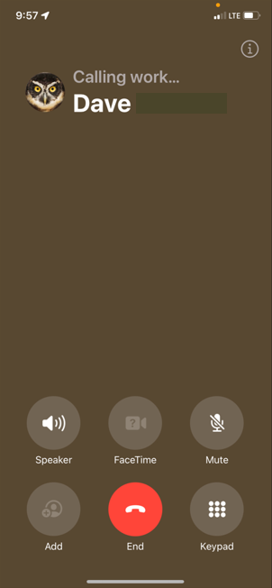
Since I just updated recently, I'm still fairly new to all this, but found it odd when I happened to call my office phone, it actually shows up a light brown? This is the only number I've seen do this so far, with all others being in the awful Gray, but was just wondering if anyone else seen similar? Plus, like was stated, the new layout does require one to have to do additional scrolling when contacts have multiple contact numbers, which to be honest, most of my staff and contacts do. Just a very poor design layout in my opinion.


iOS version is 17.1.1


Screenshot of the brown background...


Dec 3, 2023 12:02 PM in response to Patrick Weisser

Hello again~ I myself have disabilities including visual ones and agree with kindness being important. I take issue with the fact that once simple facts are stated by one of the most caring senior contributors in this entire forum who is as selfless as one can be received a reprimand. That is not kind. Plus … I don’t see any where in this thread that *Dog-Cow-Moof* said anything one way or the other about liking this change. You can have an opinion but no one else can? It takes a lot to work for those “points” here and we are all just volunteers. So a simple thank you means more than anything. Leaving feedback for Apple is the only way this issue will possibly be addressed.


~Katana-San~


Feb 26, 2024 10:56 AM in response to evan405

The Calling screen was actually transparent which was so innovative & clean. If you had a poster for a contact that would be kinda blurred/transparent while in the call, for contacts without a poster your wallpaper would just be blurred in the background. It was so aesthetically pleasing. However now this gray screen thing is just so ugly......so much so that I actually cring when making a call. If you have a custom poster for someone the way it's blurred now isn't quit transparent if that makes sense, just a blob.... not clean. To be honest this seems like a whole step back, how do you go from a transparent screen to an almost soild one? It also makes the buttons look less sophisticated, the font way too bold & starch white. I thought transparency was the future, everything just looks choppy and less refined. The only neat thing about this new update is how you can customize your own contact poster and control how your viewed when you call another iphone user.

Feb 28, 2024 10:10 PM in response to Jakestaxxx

Jakestaxxx wrote:

Default call screen on new IOS 17.3.1 out of place
The new default call screen on new IOS 17 And 17.4 out of place its confusing and looks and feels bad. It would be great if we could set a default call screen by ourselves so we could customize back to the way it was before, however it looks for the people who don't have personal contact cards, people who have disability's. Making these changes every other month is not good for disabled people who don't understand technology. so please give us this option in IOS 17.4

Tell Apple:


Product Feedback - Apple


Your suggestion that because someone is "disabled", they don't understand technology is a bit not nice. "Disabled" could mean they use a wheelchair. Or they have a heart condition. Or any one of a huge number of things that don't prevent them from understanding technology. Also, just for the record, being old doesn't mean you don't understand technology.

This thread has been closed by the system or the community team. You may vote for any posts you find helpful, or search the Community for additional answers.

iOS 17 gray call screen

Welcome to Apple Support Community
A forum where Apple customers help each other with their products. Get started with your Apple Account.