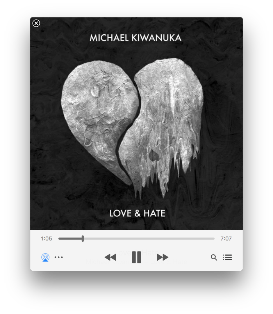
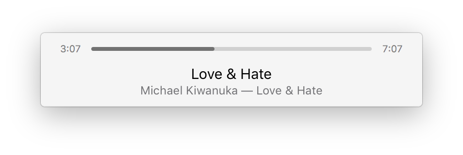
After tinkering around this is what I can say pretty definitively about the new user interface ...
Large Artwork - Track info displays by default. On mouse over track info changes to transport control.

Small Artwork - Accessed by manually resizing the window. Neither track info nor transport control displays by default. Transport control displays on mouse over. Track info does NOT display ... even on mouse over which is a step back in functionality.

Thumbnail Artwork - is totally gone. Track info displays by default. Transport control displays on mouse over.

So I like the clean, new look. But I don't care for how there's no way at all to see Track Info anymore when displaying the "Small Artwork" which is my default view. I can get to it by displaying "Large Artwork" so it's not the end of the world. More of an "annoyance". I never use the "mini" view personally but I can imagine that for those that do the removal of the "Thumbnail Artwork" is an unwelcome change as well.
PS: As someone with a software development background I can see what Apple is doing here. The "Track Info/Transport Control" window is likely a single, reusable piece of code now. And I suppose from a "Developer" perspective that's a good thing. But these days I'm a "Product Manager" type and if it were my team I would have insisted that the shortcomings above be addressed as a "usability" issue.