MJfitness wrote:
Everything about this update made the watch worse. I have to jump through hoops just to find out where the watch battery life is at.
Pressing a button is a HOOP? What world are you living in? It is one movement of a finger. Just as swiping up was one movement of a finger.
I don’t understand why Apple decided to update and make it worse but I think anyone with a watch agrees that they should change it back. I also can’t ping my phone and the instructions on how to do it with the new update do not work at all. This update was a major downgrade. I was going to buy a new Apple Watch soon but might just switch back to Fitbit now
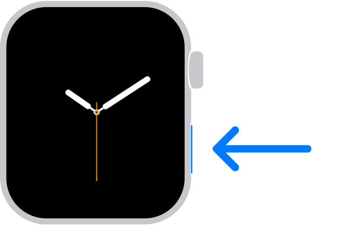
No, this was a HUGE improvement in the usability of the watch. With the old, bad implementation you could only open the control center to check the battery, or find your phone by FIRST making sure a watch face was displayed, then swiping up from the bottom of the screen, carefully avoiding any Complications on the bottom corners of the screen (or you would get the weather or your calendar instead).
By moving that function to the oblong button on the side of the watch you open the control center by just a quick press on that button. You don’t have to exit the music control app, or the workout app, or any other app on the screen to go back to the watch face screen, swipe up, see what you need, then somehow navigate back to the app you were using.
